Design for inclusion:
Inspire people, create change
We are inkl. Each day we design inclusion: with products and services, strategic consultancy and accessible wayfinding systems.
At inkl.Design, the focus is on diversity. That’s why we think, design, consult, produce and research with a lot of curiosity and know-how to make design work for everyone.
Whether for clients in the cultural, educational and social sectors, in tourism or business, we are all about practical, well-designed and meaningful solutions that respond to the needs of people and the demands of places.
Inclusion is our aim. Design is our tool.
We for you and all for inkl.

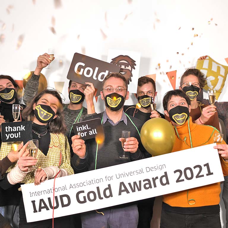
Gold and Silver for inkl.Design
In an effort to set the right tone for a really great news, we formulate with due objectivity: We are pleased to announce that inkl.Design has won the IAUD Award 2021 in Gold and the IAUD Award 2021 in Silver.
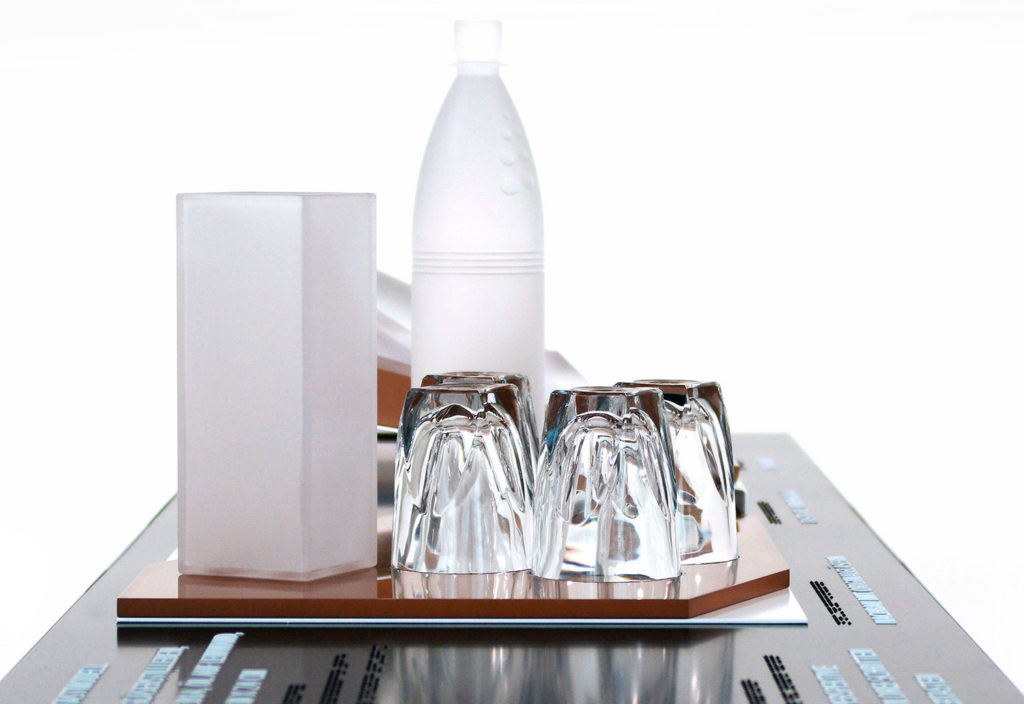
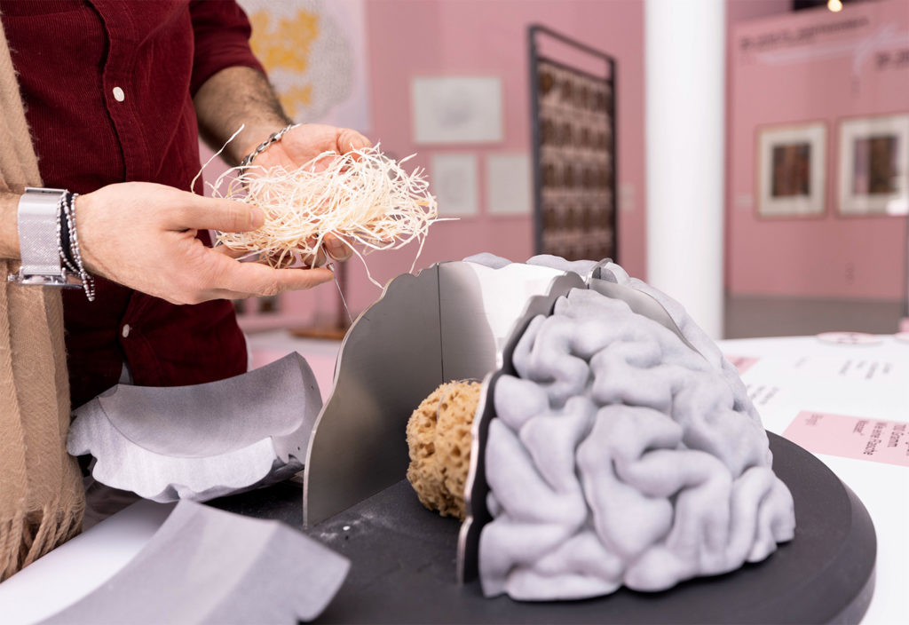
The projects could not be more different and show the whole repertoire on which inkl. plays virtuously: The Neanderthal Memories Project in Mettmann scores with the playful communication of knowledge about the Stone Age for everyone. Our award-winning work at the Dachau Concentration Camp Memorial Site sets standards in terms of safety and usability.
The jury of the International Association for Universal Design is top-class. All the more reason for us to be delighted about this recognition. Don’t worry, we’ll keep our feet on the ground and only freak out for a second: Aahhhhhh! That’s it.
Back to work!
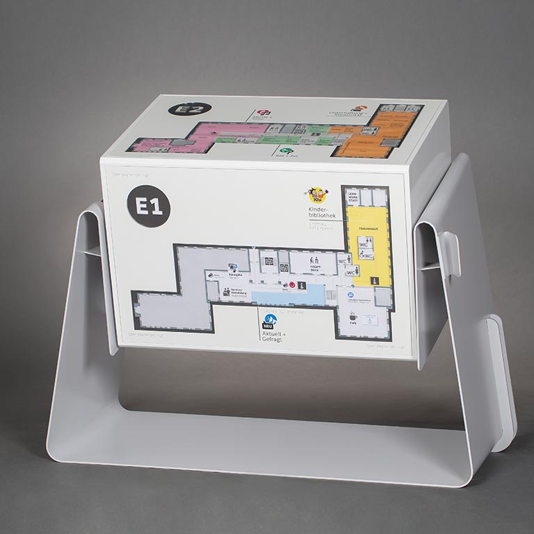
Inclusion in the Hamburg libraries
What happens when a large state library takes up the slogan: “We want to become the second living room for the people of Hamburg”? It can’t avoid the topic of inclusion. Where millions of users borrow books and other media, communities use work spaces and hundreds of books are read every day, all people should be included and find what they are looking for. That is why we have been working on this change with the Bücherhallen Hamburg for many months.
An inclusion concept is in place, now it’s time to implement it. For the bookworms and learners of German, the partially sighted, the wheelchair users, the experts and the first-time readers, we will make the Hamburg libraries fit for the future.
We will report more soon.
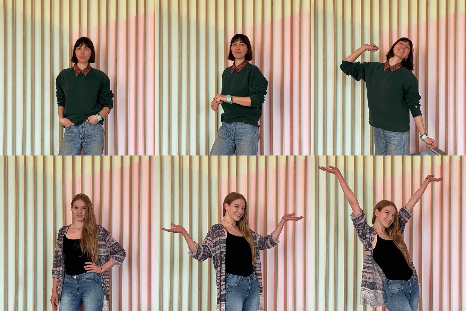
Hello to Elisa
and Miriam
Despite the unstable weather, one thing is certain: spring is in the starting blocks. Just like the two new interns Elisa and Miriam. They will accompany us in this summer semester.
Elisa Machmer is studying product design at the Weißensee Kunsthochschule Berlin. Miriam Pujiula Buhl is studying Visual Communication at The Braunschweig University of Art.
Welcome to our team.
We are looking forward to working with you.
Orientation in unfamiliar buildings
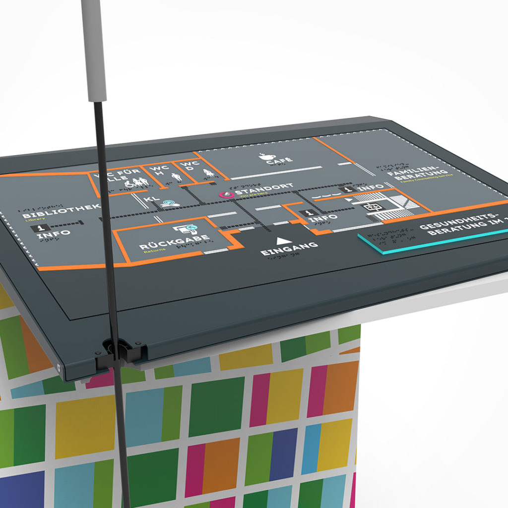
In the entrance area of a district center in Munich there will soon be an orientation plan. In the entrance area of a district center in Munich there will soon be an orientation plan. What is important to us inkl.designers is that our plans are for everyone.
Information and room names are written in Braille and profile letters and are visually complemented by clear icons and high contrasts. The floor plan is also raised. This enables people with visual impairments to find their way around the room independently by touch. Of course, the plan is also easy to reach for people in wheelchairs.
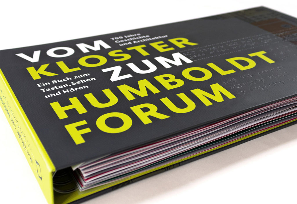
Stand out with Braille!
Do you also want to? Then we have something for you! Because we not only design, we now also print everything that has to do with Braille.
Whether it’s business cards, stickers, brochures, maps or whatever, we can realize it for you.
Ask us and discover our possibilities!
Even small steps help
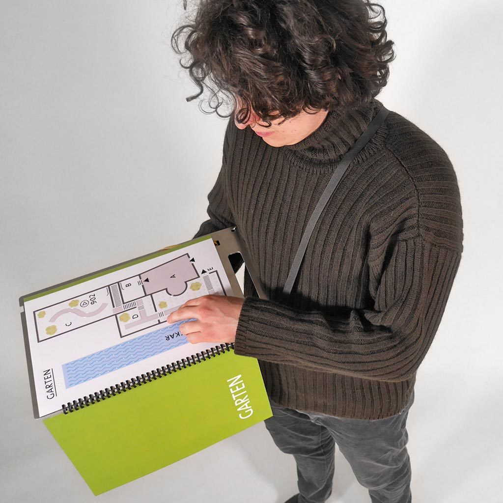
It is not always necessary to undertake a large-scale project to improve the accessibility of a cultural institution. Because before changes are not made due to a lack of money, small steps can also lead to a bigger impact. Mobile orientation maps, for example, make it possible to get an overview of a building. Equipped with tactile lines, they provide necessary information not only for blind visitors.
We produced these maps for the Museum Hölderlinturm in Tübingen. Together with an audio guide, an important inclusive offer is now available.
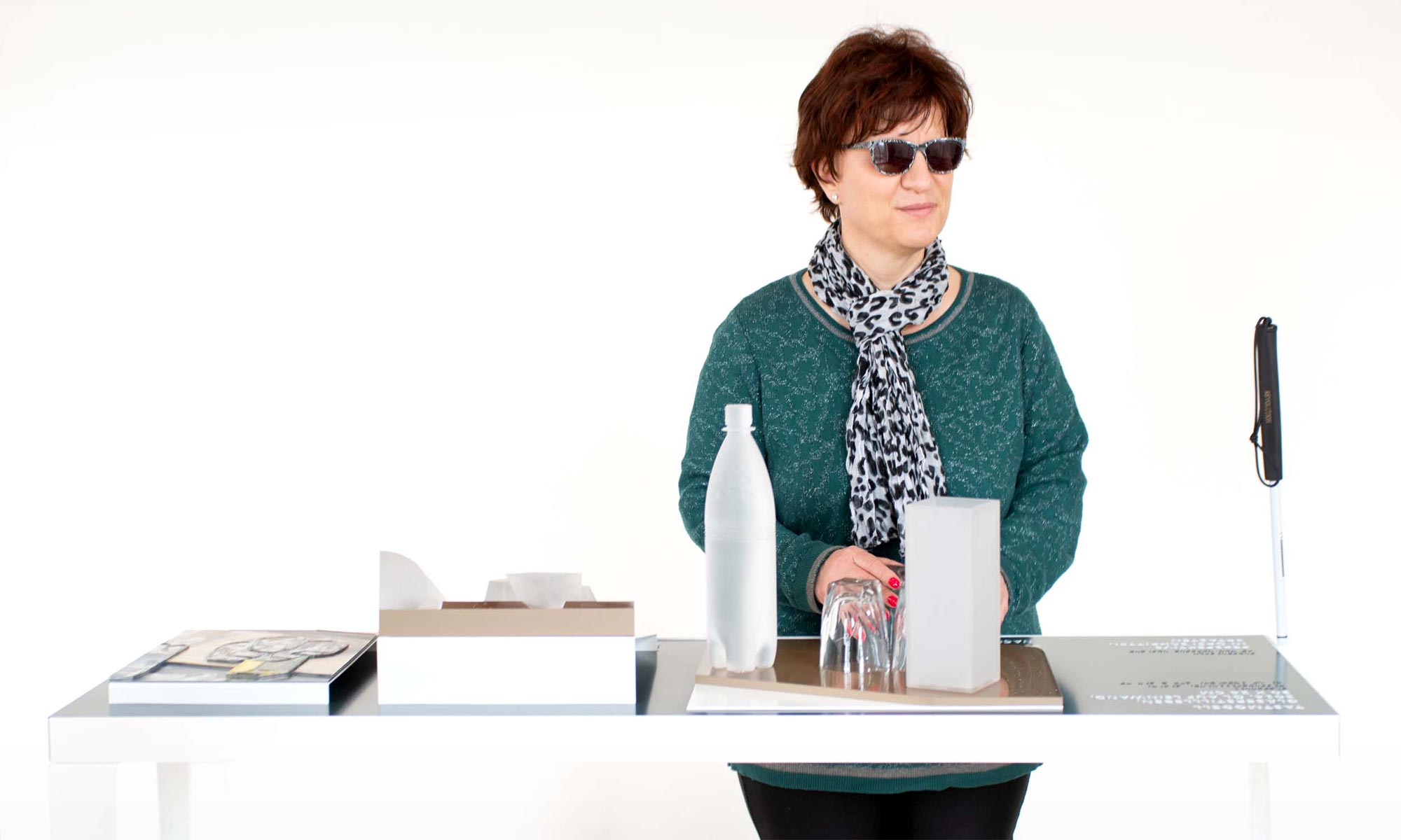
Christopher Lehmpfuhl on the project at Gottorf Castle:
“I am very pleased
that blind visitors
also have access
to my paintings.”

