Dräger & Lienert

Corporate Design

You don’t usually blare out things like that, but here we have to do it. We from inkl.Design are a little bit in love with our customer Dräger & Lienert. We have been advising this company for many years. It is growing bigger and bigger and its inclusive software products are in great demand, even internationally.

Dräger & Lienert equips workplaces for visually impaired and blind people. And they do that so well that those people can easily compete in the job market in terms of efficiency, despite their limited eyesight. For more than 25 years Dräger & Lienert has been developing inclusive software solutions that can be applied to the most different work environments. The DL products enable their customers to operate on eye level with their fully sighted colleagues and be competitive. More than 15 partially globally leading software solutions for administration, organizations, call center and contact management excite us. The only provider in Germany, Dräger & Lienert equips workplaces across all manufacturers with hardware like computers, braille displays and Penfriend. This way every workplace receives the most coherent solution.

We are happy to have contributed to the Dräger & Lienert success story with our corporate design. Besides designing a professional website, we also fine-tuned the company font, created a new logo for the presence in the international market and designed suitable product marks. A color concept makes the Dräger & Lienert-presence, designed by inkl.Design, well rounded.

We are particularly proud of a comprehensive set of product portfolios, we have created with magic. They present the complex DL software solutions in a comprehensible and clear way, for fully sighted as well as visually impaired people. With these portfolios Dräger & Lienert acquires new customers at trade fairs and conferences. Of course, thanks to inkl., all content is available as accessible PDF files.

Portrait photo of Hans-Jörg Lienert and son Yannik
Illustration of stylised coloured braille dots as
Detail image of an icon of the product brand DL Verein
Presentation of the packaging tape as an advertising medium with slogan "here is inclusion in it".
Illustration of the defined corporate colour orange
Photo of the DL Easytask module. The software simplifies workflows for blind people
Detail image of an icon of the product brand DL Contact Manager
Web views of the DL product brands on the computer screen
Photo with some DL VoiceClips developed by the company
Photo of a correction sheet of the product marks still being processed
Illustration of the grey tone defined for advertising applications
Detail photo of a trade fair stand with various hardware modules and advertising banners
Photo of leaflets with product descriptions of the Company
typographic representation of the Daytona house font in conjunction with the company's logo
Detailed view of the Daytona house font with orange fonts
Photo of a Penfriend , a talking marking system for blind people
Illustration of the anthracite tone defined for advertising applications
Illustration of stylised coloured braille dots as a design element
Illustration of an icon of the product brand Contact Manager with advertising slogan "DL, what else!"
Photo of a car sticker with logo and word mark of the company
Photo with fair presentation of the VoiceClips by Yannik Lienert

 Graphic Concept

The new logo on the underlaid photo with dark background
Detail photo of the company's leaflet.
Illustration of the signets of the company's most important product brands
Schematic representation of the colour palette and the DL logo in combination with other icons
Web views of DL product brands on smartphone, tablet and computer screen
Representation of the packaging tape as an advertising medium with the slogan "Inclusion is in here".

Custom type

typographic representation of the Daytona typeface edited for the company
typographic detail view of the edited Daytona typeface characters

Design in Detail

Detail photo of leaflet titles with logo of the company and a business card.
Photo with inclusive business cards of different employees. The business cards are folded in three parts. The standardised and easy-to-touch braille is applied to the pages with transparent varnish.
Draeger and Lienert envelopes with braille
Photo motif of various stickers for Dräger and Lienert, printed with normal typography and transparent Braille font
Photo with some DL VoiceClips developed by the company
hand feels the Braille on the tablecloths specially designed for Dräger and Lienert.
Advertisement with product descriptions of the
Foto von Faltblättern mit Produktbeschreibungen des Unternehmens.
Illustration of orange stylised Braille dots as a design element

Project Details

Project Scope: Consulting, positioning, continuous brand development of the main brand and subbrands, logo design for main and subbrands, development of a user friendly layout concept for visually challenged readers, development of a concept for inclusive information materials for visually impaired and blind readers, custom type, layout and graphic design, web design, production management

Schwerin National Museum

Adventure Space

Boring. Dusty. Uncool. That’s what most kids will think about a visit to a museum. So it was a genuine challenge for us at inkl.Design when we teamed up with Schwerin National Museum to bring their art collection to life for younger visitors. Our task was to surprise and excite them. Our solution was to turn the Gallery of Old & New Masters into an adventure space, so that the children would be at the heart of the whole thing. A hands-on approach was essential.

In the room children can let their artistic and imaginative selves run riot. Specially selected materials for do-it-yourself activities, along with brain teasers, puzzles and games, closely related to the varying exhibitions, encourage 5 to 10 year olds to get involved. They can draw, stamp, stencil, build, glue, and investigate new and unfamiliar worlds, with full artistic licence. Specially designed workstations provide plenty of spaces for all types of activity. Drawers, packed with a variety of materials inspire junior detectives and explorers to make their own journeys of discovery through play. New and appropriate materials are supplied for each different exhibition, whether just a pencil or a range of exotic spices (for the museum’s Passage to India exhibition). And of course, works produced by young artists can be immediately framed and exhibited on site.

inkl.Design his the major creative force behind every element of the adventure space, from concept, to layout and final execution. We also incorporated a characterful guide, the mischievous, moustachioed ‘Kurti’ who acts as escort and introduction to children as they find their way round the adventure space.

Our long-term collaborator BALDAUF­architektur devised the interior design and child-friendly furnishing. Every component of the furniture is specially designed for disability access and children with mobility issues.

Detailed view of the coloured canvases. The back canvas is printed with colourful scribbles. The logo of the adventure space is placed on it. On the left of the picture you can see a corner of the blue canvas with white lettering.
View into the children's adventure room. The picture presents the chest of drawers with its colourful drawers from a wide-angle perspective. Above it, several large, black pendant lights. In the background, four colourful canvases are leaning against the wall. To the right of the dresser are small cube-shaped shelves mounted in two rows against the wall. They are illuminated by adjustable silver desk lamps.
Shot of two large canvases hanging next to each other on the wall. Both show illustrations of the character "Kurti" in different settings: Riding a horse as well as posing for a painter in the Allgäu landscape. Cyan-coloured lettering is placed on the illustrations.
A close-up of the entrance tickets to the adventure space. It features an illustration of the character Kurti and the logo. Admission is free.
A sun-yellow coloured surface.
Opening of the experience space. Children stream through the entrance and break through the paper panels with which the entrance was covered before the entrance.
The picture shows a section of the room. An elongated board in portrait format with text information in a cheerful font, decorated with coloured graphic elements, is mounted on the wall on the left. On the right side of the wall is a white pin board, decorated with some children's drawings. In the foreground, a drawer is in focus, decorated with illustrations of pens, scissors, glue sticks and other office supplies. Inside, the children find all kinds of pens and paper tools.
Three children are sitting at a table and drawing. Colourful drawings are spread out on the table, with colourful felt-tip pens on top.
Detailed view of the experience room. Part of the surface of the chest of drawers can be seen, in which a hole has been made. This is marked with the word rubbish and a large magenta arrow. Around the hole there are funny pictures of things that can be disposed of here.
In the background, a detailed coloured child's drawing of various working tools, such as pens, scissors, ruler; on top, a thick wooden crayon.
A frontal exterior view of the Schwerin State Museum. It is a representative building in the style of the Greek Renaissance from 1882. The historicist architectural style, which uses above all a striking entrance portal with Ionic columns and a large staircase, is typical of this period.
The picture shows our colleague Luise setting up the experience room. She is bending over the dresser, which is decorated with a picture of our character 'Kurt'. The illustration shows 'Kurt' sitting at the table and painting a picture with a brush. On the chest of drawers are all kinds of tools needed for the construction.
Children drawing photographed from above. Colourful self-painted children's pictures are spread out on a table. Different coloured felt-tip pens are scattered on them. The children are busy drawing.
A detailed representation of the colourful scribble, which is a characteristic design element of the corporate design.
A detailed view of a drawer. It is designed with an illustration of our character Kurti and the title: Drawer for explorers. Below is a second elongated drawer designed with a colourful puzzle piece graphic.
Someone is holding a laminated card designed with colourful scribbles. It says in white writing: All white.
A sun-yellow coloured surface.
A blue coloured surface with a saying on it: "Creativity is an affair between heart and brain.

A Glance at the Room

Two pictures in portrait format show the experience space. The first picture presents the chest of drawers with its colourful drawers in the side cut. Above it are several large, black pendant lamps. In the background, four colourful canvases are leaning against the wall. To the right of the dresser are small cube-shaped shelves mounted in two rows against the wall. They are illuminated by adjustable silver desk lamps. The second picture shows our colleague Luise setting up the experience room. She is standing in front of the chest of drawers, with a large open drawer to her left. On the chest of drawers are all kinds of tools needed for the construction.
View into the children's experience room. The walls of the room are white, like a blank canvas. One wall has a white, slat-like pin board. This is where the children's self-painted pictures will be hung later. The centre of the picture is dominated by an oversized chest of drawers, which rises in a step-like manner and is equipped with many colourful drawers. Inside are lots of craft materials and instructions for the children. In front of the chest of drawers are three grass-green cube-shaped seats. In the background, four large colourful canvases, varying in height, are leaning against the wall. They are printed with quotations in funny fonts and colourful graphic elements. The room is lit by several black pendant lamps in modern industrial style.
Two detail shots of the experience space. In the first image, a blue, square canvas is in focus, presenting a quote by the artist Yoko Ono in a white, diagonally arranged, cheerful typeface. Behind the blue canvas, a slightly higher canvas can be seen. It is printed with colourful scribbles. On the left in the foreground, a corner of the chest of drawers with many colourful drawers can be seen. The second picture shows another section of the room. An oblong board in portrait format with text information in a cheerful font, decorated with colourful graphic elements, is mounted on the wall on the left. On the right side of the wall is a white pin board, decorated with some children's drawings. In the foreground, a drawer is in focus, decorated with illustrations of pens, scissors, glue sticks and other office supplies. Inside, the children find all kinds of pens and paper tools.

Corporate Design

The picture shows four colour fields (black, orange, light green, magenta) for use in the adventure space, coloured lines in the upper left corner that serve for the graphic design of individual elements and the logo of the adventure space - a white lettering composed of different types on a magenta background in the form of an opulent picture frame.
Lettering from the experience space composed of different fonts
In the background, a detailed coloured child's drawing of various working tools, such as pens, scissors, ruler; on top, a thick wooden crayon.
A close-up of an open drawer. Inside is a laminated card designed with colourful scribbles, on which is written in white cheerful script: Rediscover things, is written on it.

Character

Illustration for the temporary exhibition "Kunstraub/Raubkunst"; the figure Kurti with Napoleon hat on a horse, to the right of it the lettering
black and white illustration of the figure Kurti on a blue background, to the left the lettering "Kurti" in white
Black and white illustration for the temporary exhibition "Fluxus"; six drawn figures sit around a table, speech bubbles with the word "Art" above their heads.
Detailed view of the piece of furniture in the experience room; here the school tray, which serves as an extendable table, with a small illustration by Kurti.

Details

Photo taken during installation; on a table is a sign informing that not all areas are finished yet, plus various working tools.
Close-up of the experience room. The picture shows a drawer designed with illustrations of pens, scissors, glue sticks and other
Detailed view of the experience room. Part of the surface of the chest of drawers can be seen, in which a hole has been made. This is marked with the word rubbish and a large magenta arrow. Around the hole there are funny pictures of things that can be disposed of here.
Two children proudly hold their self-painted pictures in their hands.

Project Details

Project Scope: Exhibition concept, exhibition design, exhibition didactics, development of childfriendly contents and tasks, illustration, logo design, graphic concept, graphic design, production management, since 2014 continuous updating according to the special exhibitions

University of Rostock

Wayfinding System

Rich tradition and a spirit of innovation are trademarks of the University of Rostock. As one of the oldest universities in the world, it has a well-earned reputation as a centre of higher education in the Baltic Sea region. But the wayfinding round the historic campus in the city centre had become a bit worn and dated when they approached us, in 2013, for a design scheme to make directions throughout the site both universally accessible and user-friendly.

Before our renovations, and the provision of a new interior layout for the listed building, students and visitors, with or without disabilities, had a hard time finding their way around the university’s headquarters. A maze of corridors, passageways, staircases, and lifts turned any attempt to arrive on time for a seminar, or even to locate a particular room into a major challenge.

A pioneering solution was needed, one that would blend in with the historic buildings, recently revealed in all their original beauty, with a restored colour scheme.

Naturally, it was particularly important for our clients that the signposting should not stick out like a sore thumb. We came up with neat and elegant solution.

Our collaboration with a sign maker produced a revolutionary, cost-effective way of making a series of touch-friendly plastic moulds and reliefs. Signs and display stands prioritise detailed information using these elements. Eye-catching icons and Braille displays in prominent positions make university life easier and more enjoyable for everyone.

An exterior view of the main building of Rostock University with a view of the main entrance. It is a magnificent building in the style of the Mecklenburg Neo-Renaissance. In the foreground is a meadow. Trees with green crowns slightly obscure the view of the building.
A close-up of a signpost of the guidance system. You can see a white number "1" in a golden circle on a black background. This is the indication of the floor you are on.
A photo from the working process. A two-dimensional printout of the tactile floor plan lies on the raised final product of the tactile plan.
A photo from a frog's-eye view of the staircase of the right wing of the university. Cut in the centre of the picture is a display of the guidance system.
Photo of a display stand on the second floor. The display includes a tactile floor overview and a graphic of the individual building sections. It stands in the middle of two cream-colored stone columns. The building's stairwell is visible in the background.
Representation of the color orange defined for orientation purposes.
Close-up of a threshold print of the floor overview. This was made in the process to test the heights and sizes of the individual elements of the tactile floor overview.
Close-up of a tactile handrail lettering with Braille and profile lettering. The finger of a person feels the Braille lettering.
Representation of the color medium blue defined for orientation purposes.
A close-up of the raised lift pictogram on the tactile floor map
A tactile floor overview in vertical position. A person uses a finger to feel the braille lettering indicating the location.
Detailed view of a threshold print of the tactile floor overview. The viewpoint with the corresponding Braille lettering and the wheelchair pictogram can be seen.
Representation of the color light green defined for orientation purposes.
Detailed view of the overview diagram of the individual building sections. In focus is the courtyard extension, which is marked in red.

Signposting in Space

A view into the entrance area of the University of Rostock. In the background of the picture, the staircase leading to the first floor, with a few people in motion out of focus. On the right you can see a black stand with light-coloured lettering, an element of the signposting system for the University of Rostock.
A display stand, part of the wayfinding system, photographed in the bleed. Information is printed on a black background in white and yellow lettering. In the background, a hallway of the university and another element of the guidance system are out of focus.
The image of a display of the guidance system on the right side of the picture in section. On it the information about the floor and the rooms. On the left in the picture the magnificently decorated staircase of the middle building.

Graphic Concept

Various white pictograms are shown on a black background on an iPad. These are the pictograms for marking the lift, the ladies' and gents' toilets and the barrier-free toilets, which are marked with a wheelchair user. Slightly hidden by the I-Pad are sketches of the wheelchair user pictogram.
A graphic view of the individual signs of the guidance system. To estimate the dimensions of the elements, there are silhouettes of a standing figure and a wheelchair user
An overview graphic of the individual building sections of the university. The background is black. Each section is marked with its own bright color. A font layer indicates the name of the areas and the numbers of the rooms located there. The image of a display of the guidance system on the right side of the picture in section. On it the information about the floor and the rooms. On the left in the picture the magnificently decorated staircase of the middle building.

Inclusion in Use

Two pictures side by side. On the left picture a shot from the staircase. In focus the wooden handrail with tactile handrail labeling. In the background, out of focus, a young woman with long hair climbing the stairs. On the right picture a floor overview in the crop on the right
A detailed view of the tactile floor overview. Two hands feel the braille lettering indicating the person's location.

Project Details

Project Scope: Analysis of orientation needs, conception of wayfinding system, conception of barrier-free elements (2-sense principle), development of tactile printing processes in cooperation with manufacturer, layout and graphic design, production management

German Federation of the Blind and Partially Sighted (DBSV e.V.)

Yearbook Weitersehen

The German association for the Blind and Visually Impaired (DBSV e.V.) is something like the mother of all support unions for blind and visually impaired people. For over 100 years, as an umbrella organization, the DBSV advocates the needs and matters of those who see in a different way. Of course, a mother ship like this is traveling fully loaded with stories. We are making sure that those stories are read.

For some years now, we design together with DBSV e.V. its annually published book in which blind and visually impaired people have a say, social processes get examined and policy makers get addressed. The constantly changing coverage of new aspects like culture, mobility, or education make the live through different eyes visible.

To make the book accessible to as many members of the DBSV e.V. as possible but also to the interested public we design it „all incl.“. Clear layout, big type, explaining illustrations, photography, barrier free PDF and a supporting DAISY-CD – all of this inkl.Design offers one-stop.

Photo of a blind man frolicking on a lawn with his guide dog.
Photo of page 7 with the full-page illustration "The world of the sighted is our world too". It shows: two young people, one of them blind, on their way home from shopping, a blind girl with a guide dog walking to their right and, again, a blind young person with an iPod next to her. All fashionably dressed and walking independently.
A blue colour surface
Detail photo of the caption "To love films, you don't have to see them
Photo of a hand-drawn illustration of a footballer.
Photo with view of the cover of a DBSV yearbook
Photo of a blind man orientating himself at the floor guidance system in a railway station with a blind man's long stick
A hand-drawn illustration of a poem about the pitfalls of a journey entitled "A train journey, it's funny". It shows a blind man with walking boots and a blind man's stick, half sitting on a portly woman.
One dark green coloured area
Detail photo of the cover of an issue page presenting the grade transfer service DACAPO.
Quote from the State Councillor for Culture of the Landschaftsverband Westfalen Lippe, Dr Barbara Rüschoff-Thale: "Inclusion really has to start in the minds.
Photo with the covers of "Weitersehen" 2010 to 2016
Detail photo of a double page spread with an article. On the right side the headline "On the way to an inclusive school", next to it a portrait photo of a blind child reading at school.

Accessibility in Detail

Illustration of an exemplary double page of the yearbook on which the visually impaired-friendly design elements are highlighted. The following are highlighted: the clearly recognisable heading, the centre line separating columns of text, arrow icons at the end of a page pointing to the continuation of the article on a subsequent

A Glance at the Book

View of the cover of "Weitersehen 2022" with the focus on experiencing culture and inclusion as well as the Daisy CD for the magazine.
Detail view of a section of the cover of Weitersehen 2017, on which the title can also be seen in Braille.
View of the double-page spread of an article on inclusion at school. On the left, a photo of a happy-go-lu.
Detail of the headline of an issue page. A field report with the headline "I've liked TV since I was blind
The singer Joanna Zimmer introduces herself. On the left, a photo in a summer outfit with large sunglasses; on the right, a self-portrait written by her.
Detail photo of an issue page with a strikingly designed headline "There's music in this week" and a colour illustration of musicians

Photography

Two individual photos arranged side by side: On the left, Mrs Renate Reymann next to parked cars in front of the theatre in Schwerin. On the right, a portrait of a friendly smiling Klaus Hahn in front of a grey wall.
Group photo of tourists in Berlin - two adult blind brothers and a blind wife with a sighted daughter. They are standing on the platform in front of a red double-decker regional express.
Two individual photos arranged side by side: On the left, a visually impaired woman with a mobile phone in her hand and headphones in her ear. In the background a bridge on which a red train is running. On the right, a blind man with a long cane in his hand in front of a parapet. Behind, a harbour complex with ships, cranes and a lighthouse.

Illustration

Image of a hand-drawn illustration: two young people, one of them blind, on their way home from shopping, a blind girl with a guide dog walking to their right and, again, a blind young person with an iPod next to her. All fashionably dressed and walking independently.
Illustration of a comic strip: Three blind adults make music - a saxophonist, a coloured blind pianist and singer, and a blind guitarist.
Illustration of an instruction for attaching replaceable foils to mark the menu lines at the serving points
Hand-drawn illustration for an article on the Marrakesh Treaty, subheading "The way out of book distress". It shows a world map with mountains, trees, ships, planes and birds. In the different regions of the world, people are shown reading in different ways.

Project Details

Project Scope: Development of a user friendly layout concept for visually challenged readers, recurring annually: layout and graphic design, illustration, photography, image editing, production management

Monument to the Battle of the Nations

Accessibility Concept and Wayfinding System

It’s better to see where to go at first glance, isn’t it? Before the renovation of the most significant monument in Saxony – The Völkerschlachtdenkmal (Monument to the Battle of the Nations) in Leipzig – we were commissioned to create an accessibility analysis. Furthermore we created an accessibility concept, which means we worked out how people with different forms of disabilities can access the monument and learn about it.

For the first time this project wasn’t only about the constructional accessibility but also about the communication of the museum’s content.

On the basis of our accessibility concept the renovation has been realized since 2012.

In order to make it really great we also designed and realized an inclusive wayfinding system for the building and the park. The different levels and accessibility possibilities to the monument are now much easier to understand. With modern pictograms and multilingual information signs Leipzig is now prepared for all who come to gaze in amazement.

A grass-green colour field.
A sign to the lift in white with a black pictogram. Below that, a green sign with the number for the audio guide.
The monument, a tower-like building made of red-brown clinker in the front view. In front of it is a water basin. All around is the green park. Some visitors are wandering around the grounds.
Photo of Gregor Strutz pointing out an orientation board designed by Inkl. Design at the Monument to the Battle of the Nations in Leipzig.
Pictogram "Passage forbidden“
A small information board showing a detailed drawing of the building's dome is mounted on one wall of the stone masonry.
A picture from the design process. A detailed drawing of the monument in cross-section hangs on the wall. Someone is describing notes stuck to the drawing.
A picture of the observation tower. There are two signs on the stone balustrade with warnings and information.
Section of a general plan with marking of the cashier's office building".
Piktogramm „Audio Guide“
Illustration of a green orientation sign for wheelchair users
The pictograms were printed out during the working process for closer inspection and pinned to the wall.
Sketch sheet from the design process of the wayfinding system
View into the building through a glass wall. On it is a token representation of the monument.
Graphically greatly reduced image of the monument for use in the orientation system
An image from the design process. A strip of a colour fan with gradations of green tones lies on a section of a detailed drawing of the monument, on which some areas are highlighted with green tones.

Accessibility Concept

Section of the accessibility concept for blind and visually impaired visitors developed by incl. Design
Markings in the site plan to show the planned locations of museum services for blind and visually impaired visitors in the monument
Illustration of the tactile model "Monument to the Battle of the Nations" for blind and visually impaired visitors and people in wheelchairs
Illustration of the marking of the compass direction as well as the warning "Danger of falling" as a pictogram, with Braille and profile writing on the wall of a viewing platform.

Graphic Concept

Overview of the pictograms of the orientation system and their application on information boards
Orientation board in the outdoor area to reach the monument with special routing for wheelchair users
Overview of pictograms with path markings and warning and prohibition notices

Wayfinding System

Figure in two parts. Left: Photo of an orientation board with a description of the path relationships between the ticket office and the main entrance. Right: Photo of a complex orientation board in the open-air site showing the entire complex.
A picture of the observation tower. There are signs on the stone tower wall with information on how to access the dome.
Focus on an information board showing the monument in cross-section. In the background, the imposing monument can be seen stretching into the cloudy sky.
Photo of the three-dimensional tactile model of the Monument to the Battle of the Nations in Leipzig and the corresponding orientation legend for the visitor levels
Photo with two blind people orientating themselves on the tactile model

Project Details

Project Scope: Extensive accessibility analysis, accessibility concept for visitors in wheelchairs, for blind and visually impaired visitors, museum concept for blind and visually impaired visitors, analysis of orientation needs, conception of wayfinding system, conception of barrier-free elements (2-sense principle), concept tactile model, layout and graphic design, icon family, three-dimensional illustrations of monument and park, production management

Menüpartner

Dinner is Served!

Design is like food: You eat with your eyes and if it is arranged nicely the taste will be twice as good. inkl.Design set an opulent table for the customers of Menüpartner with an appetizing design.

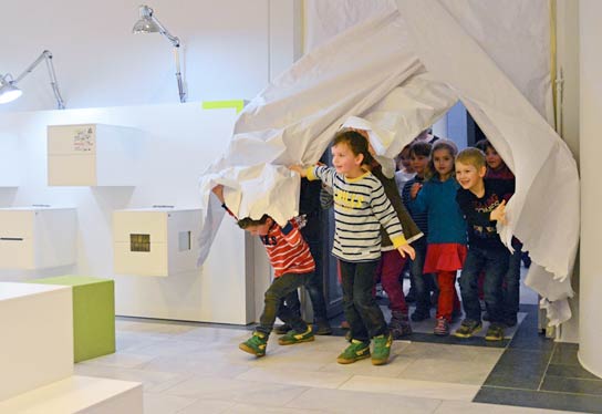
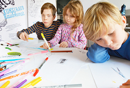
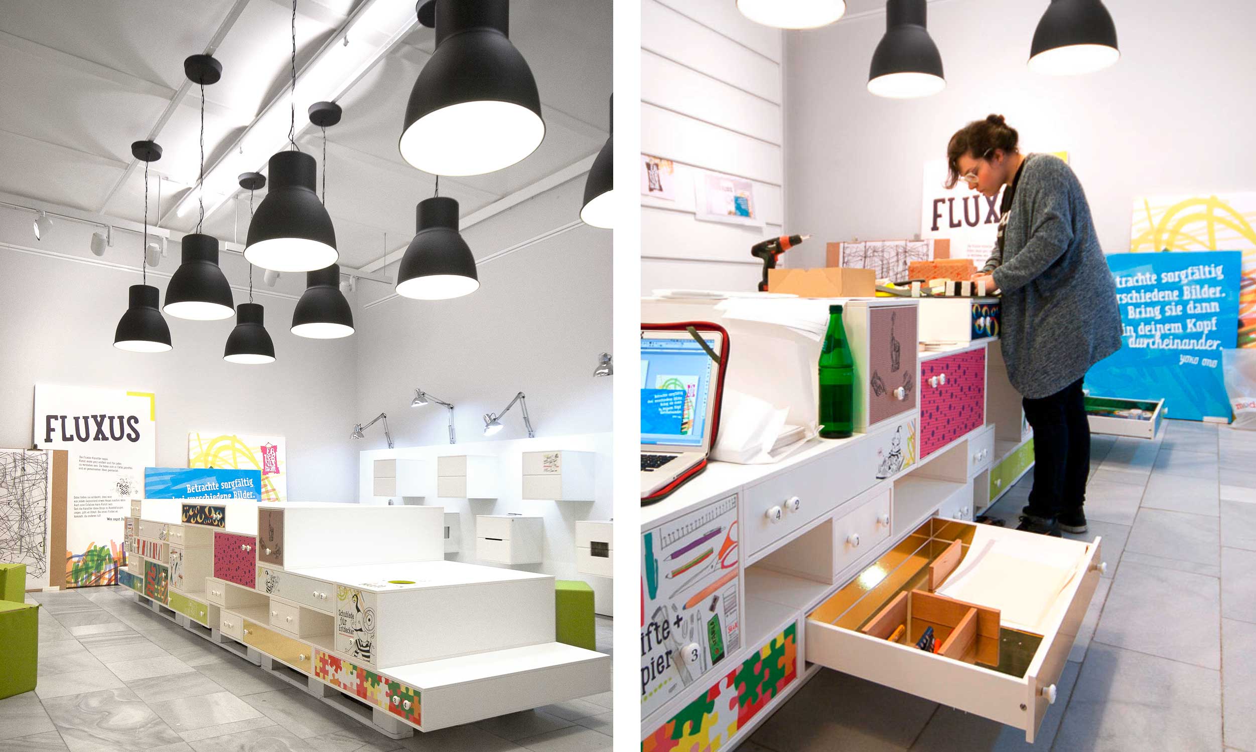
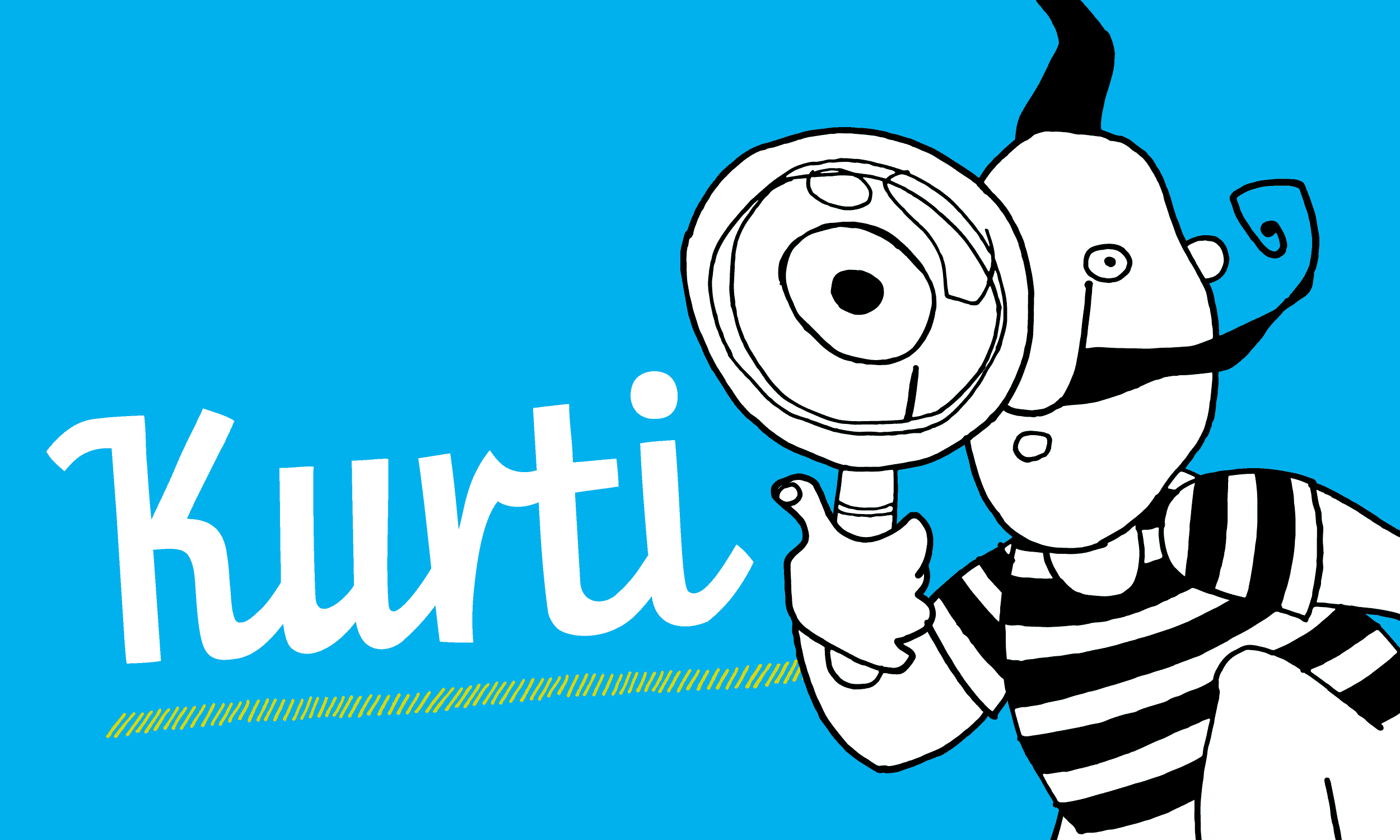
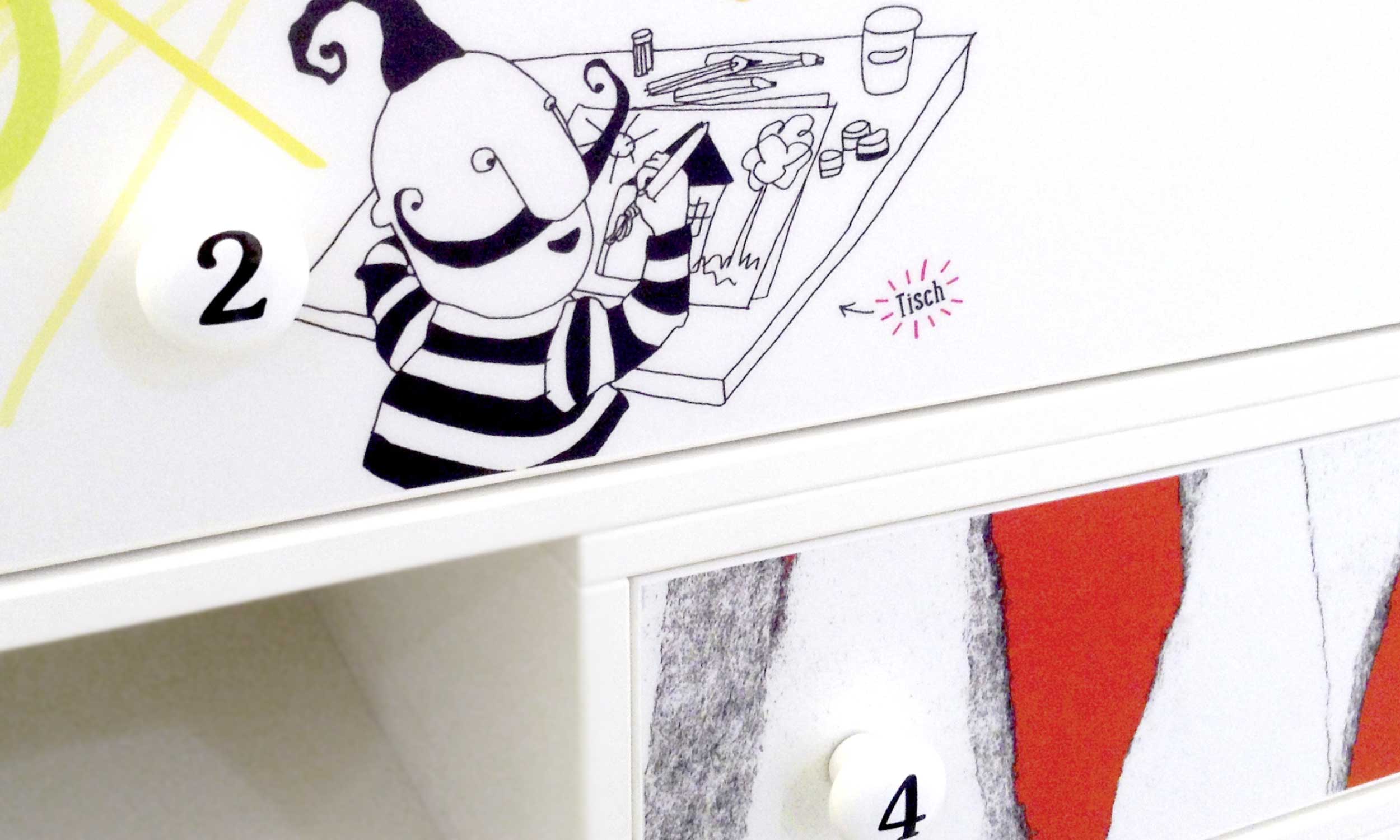
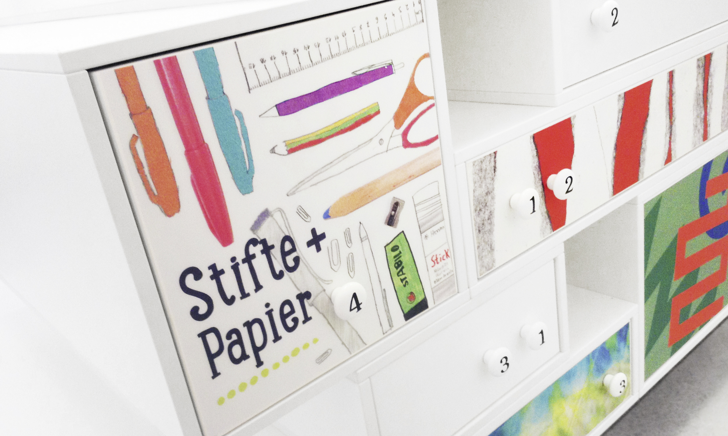
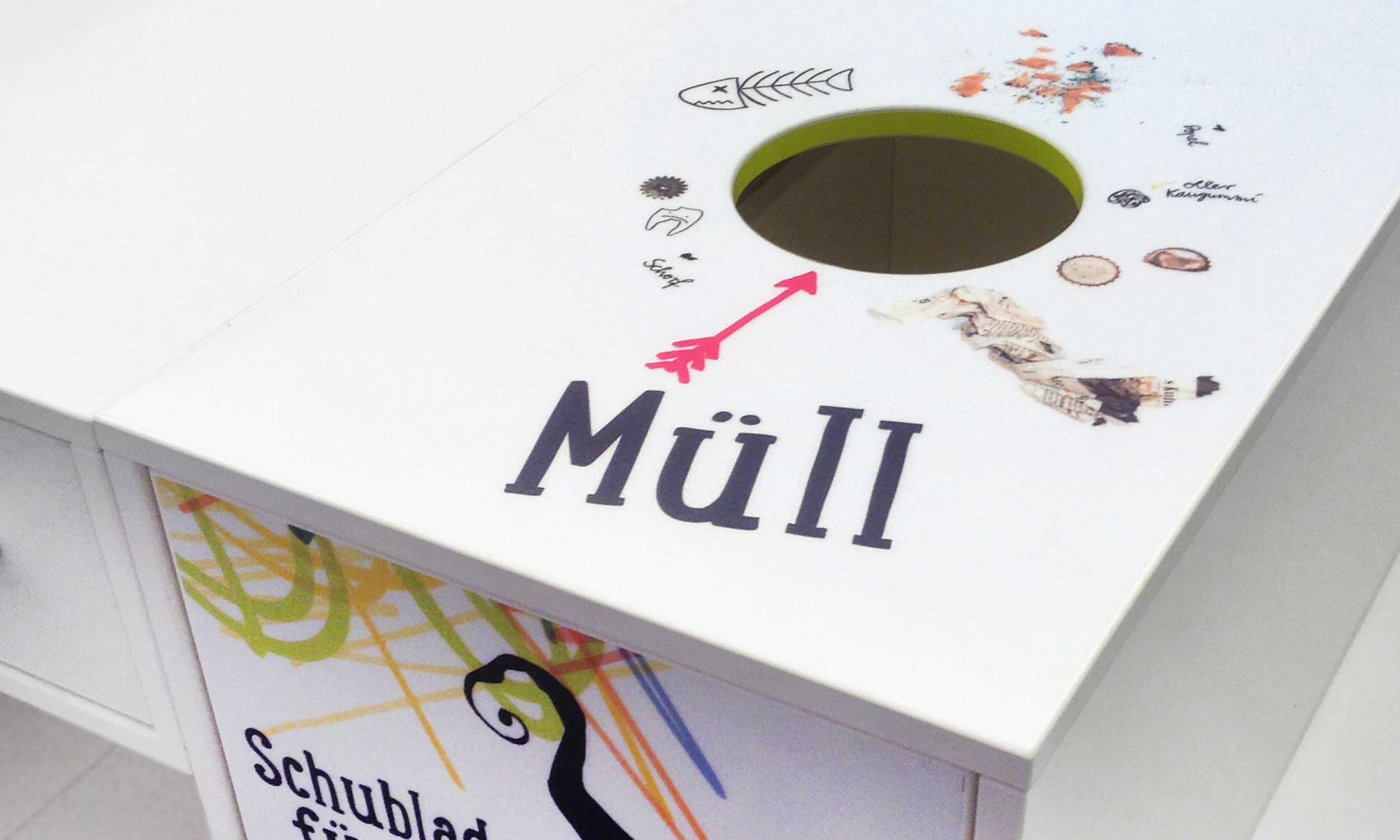
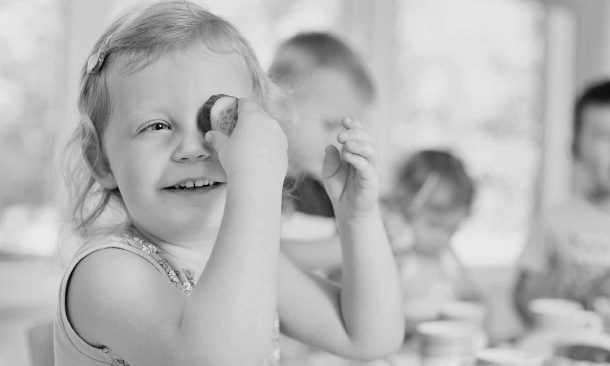
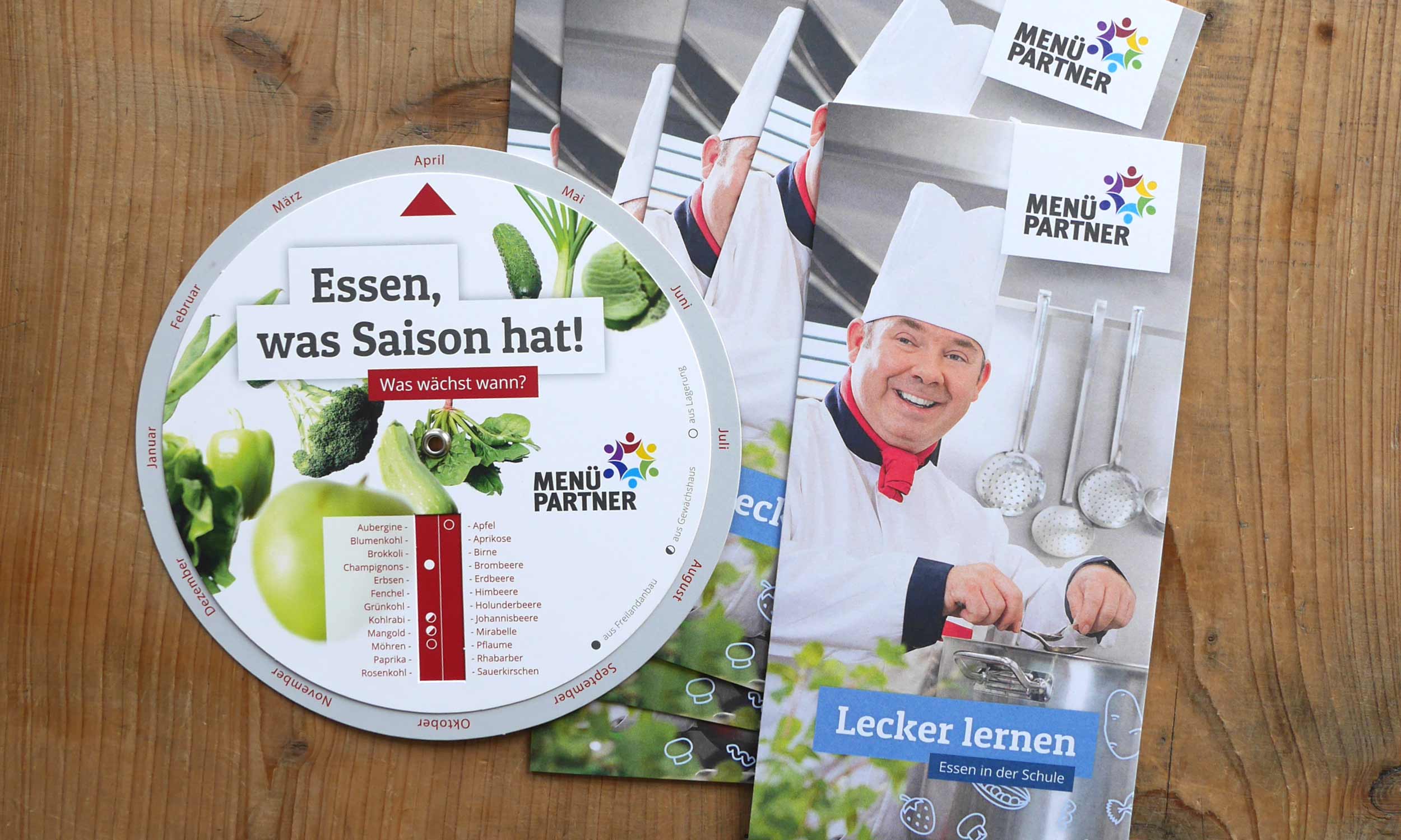
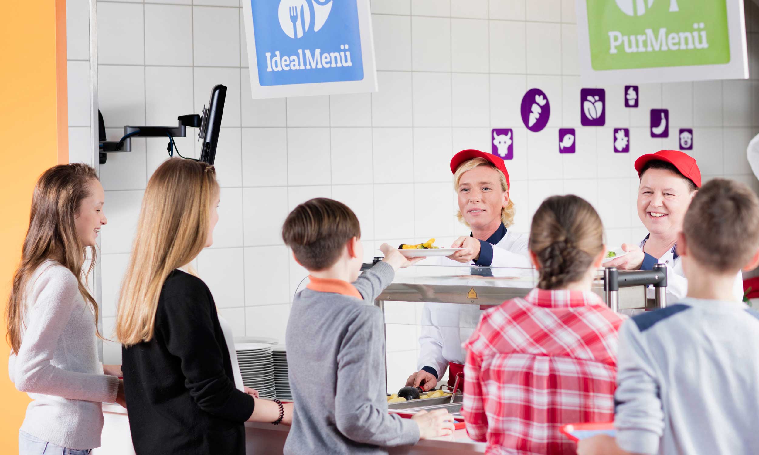
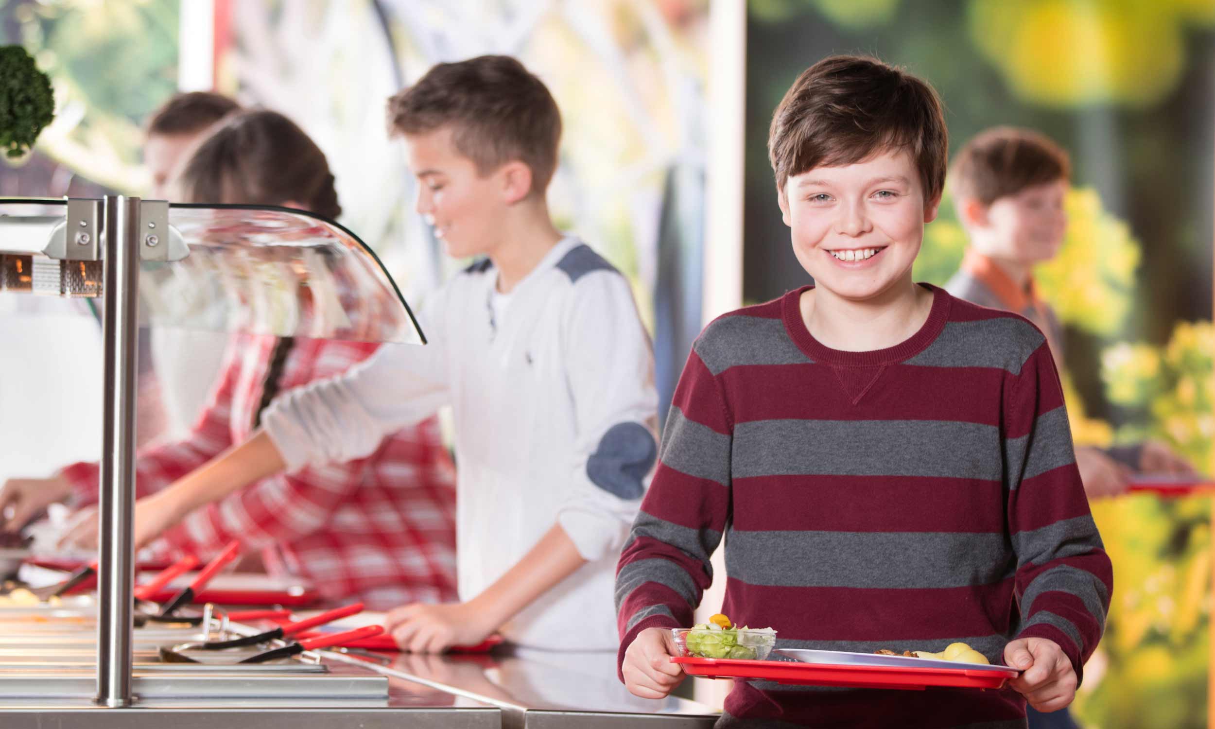
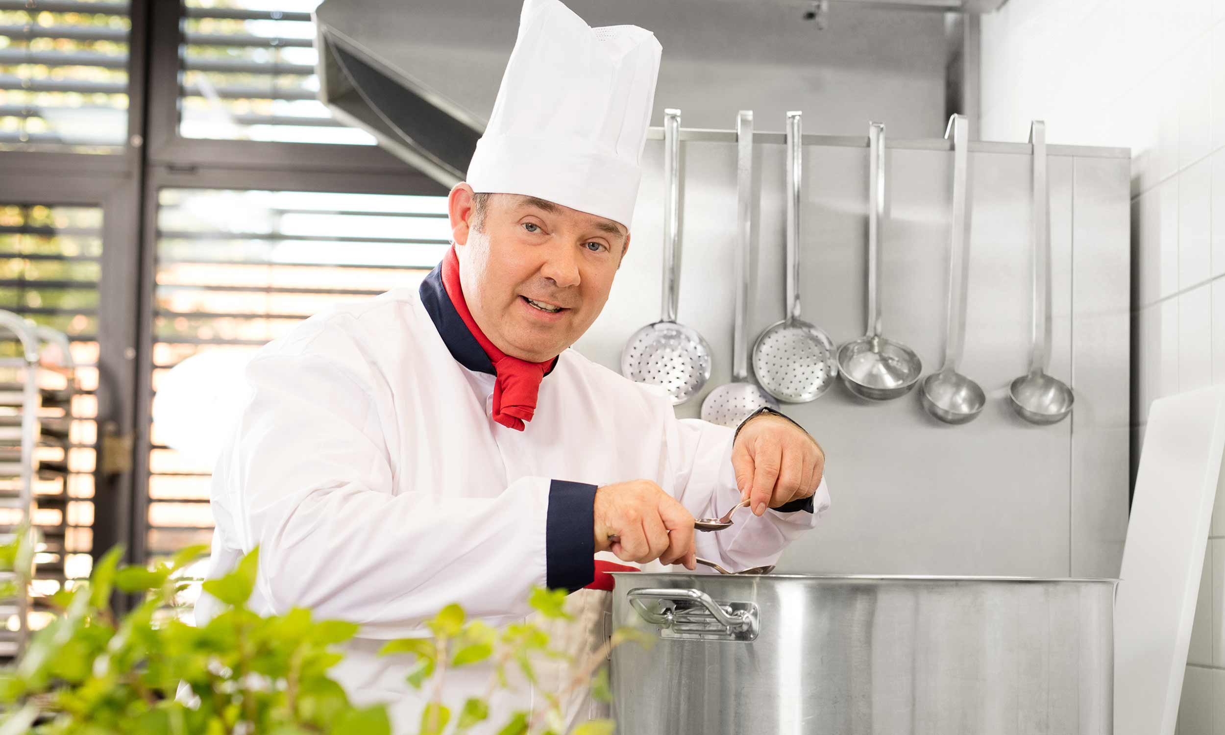
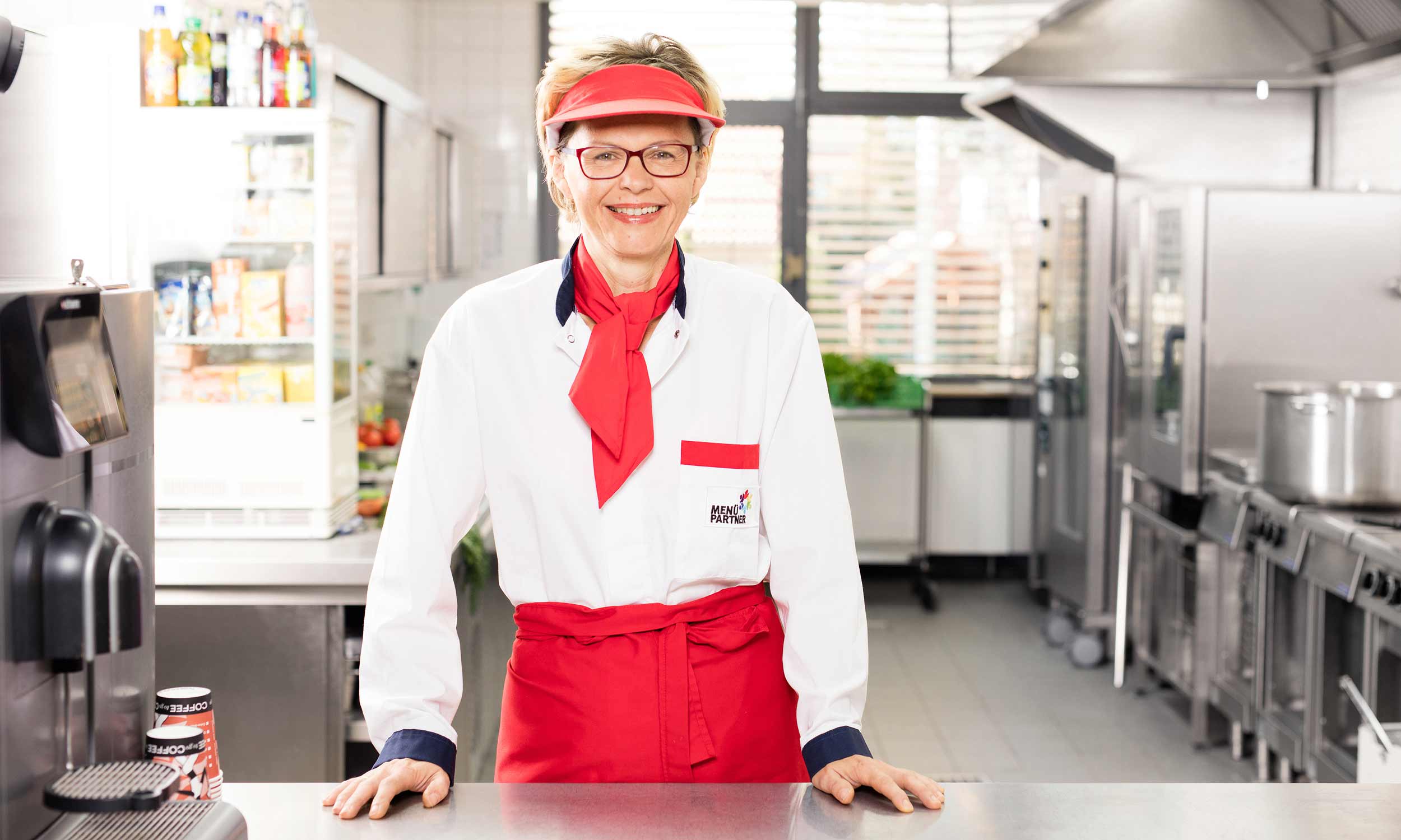
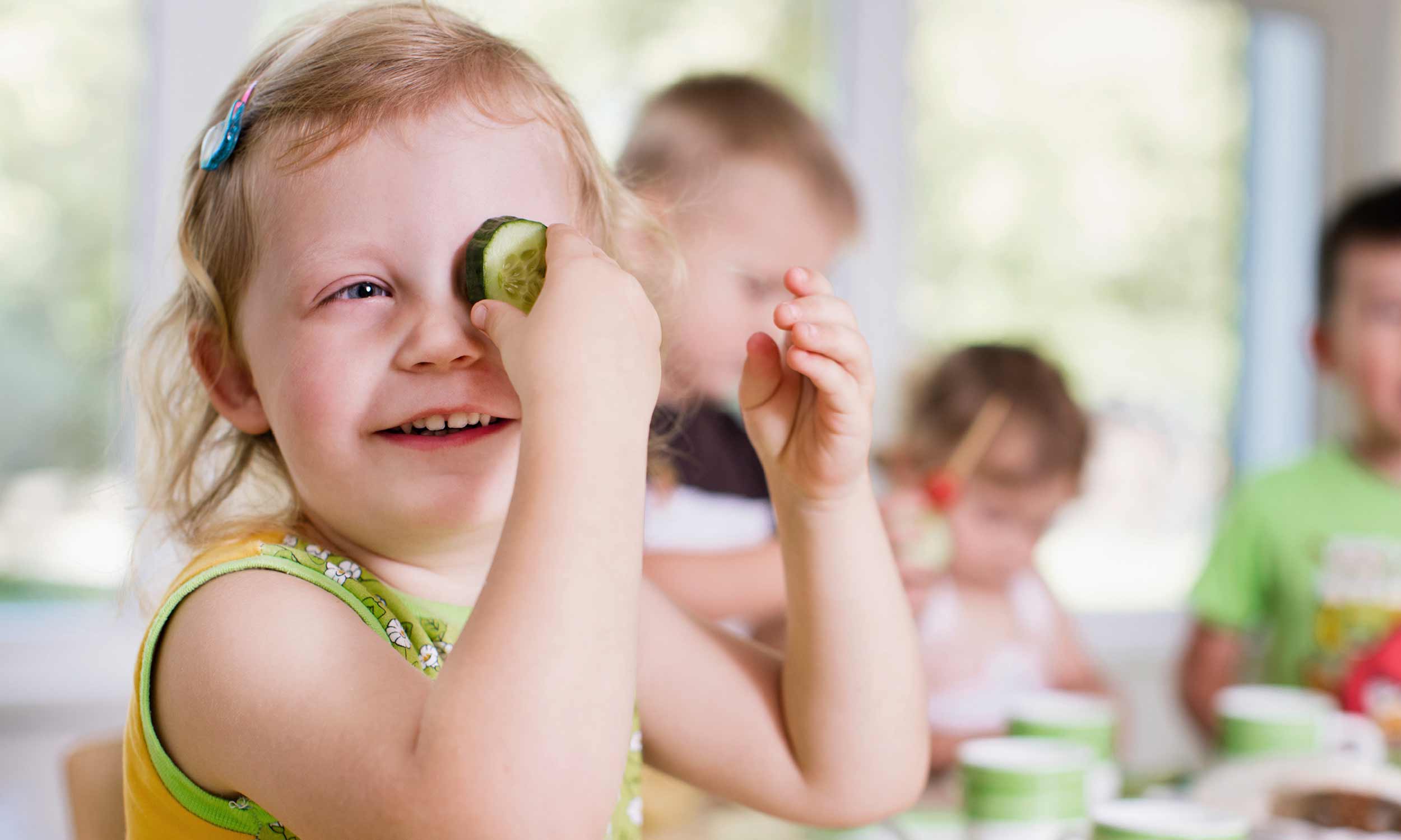
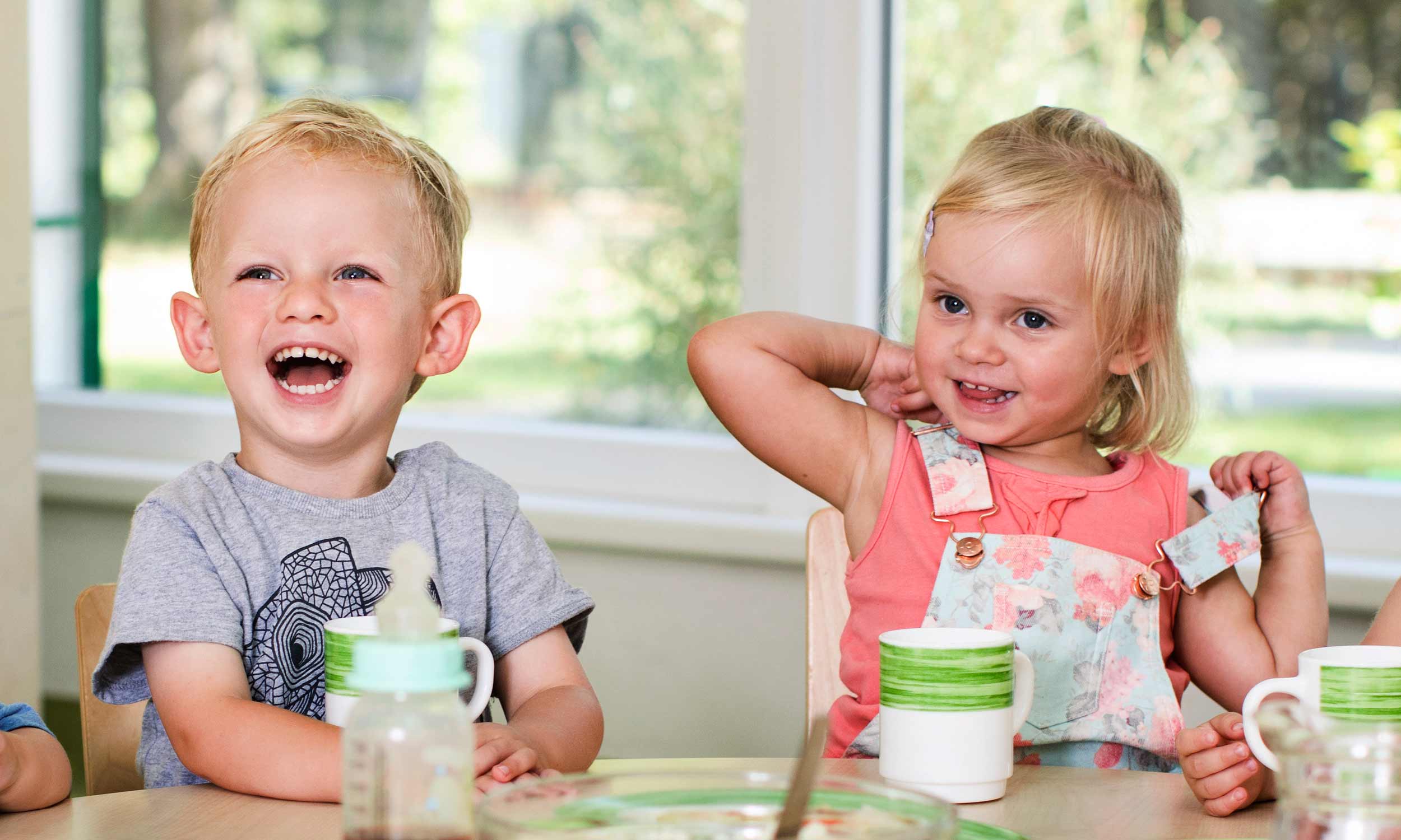
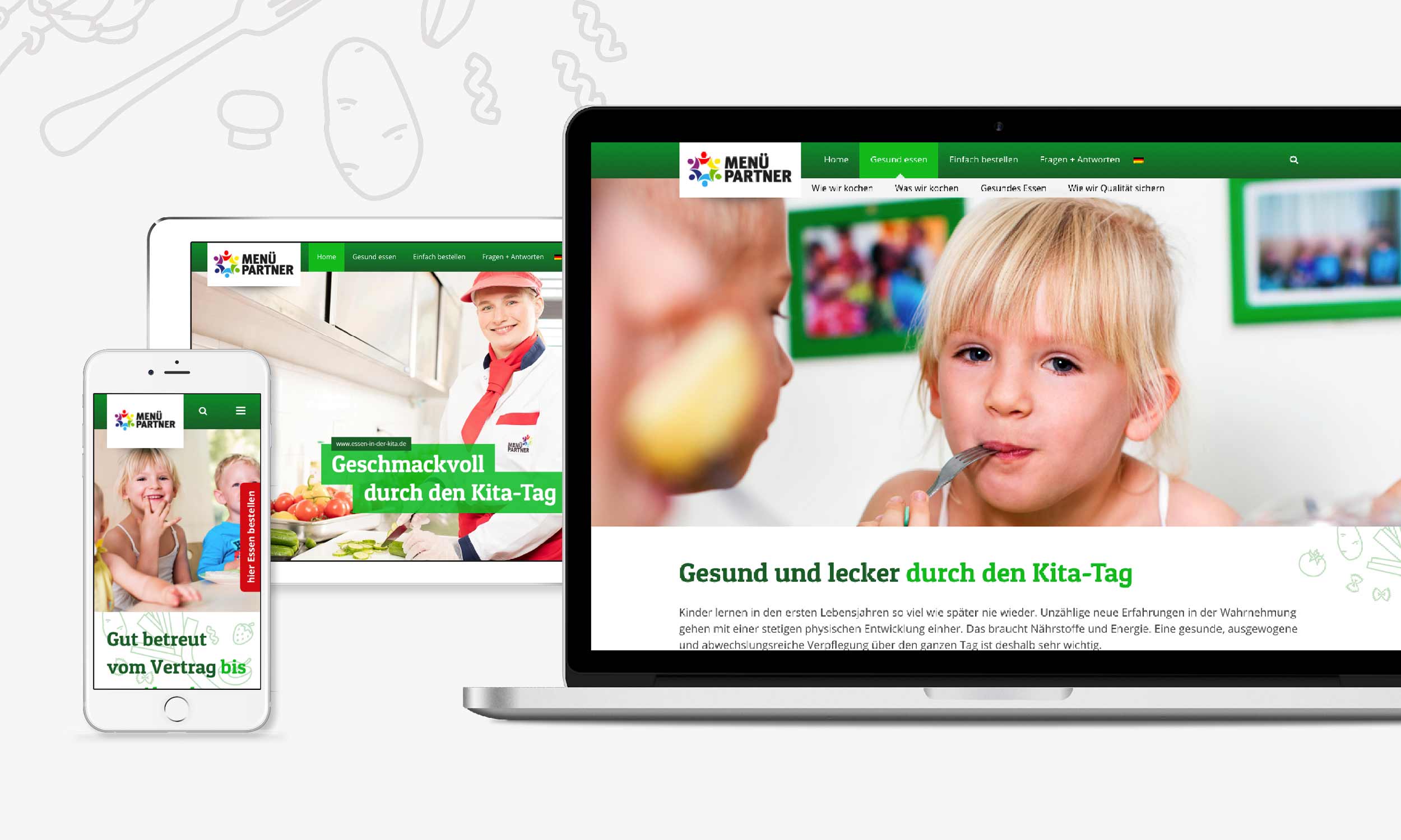
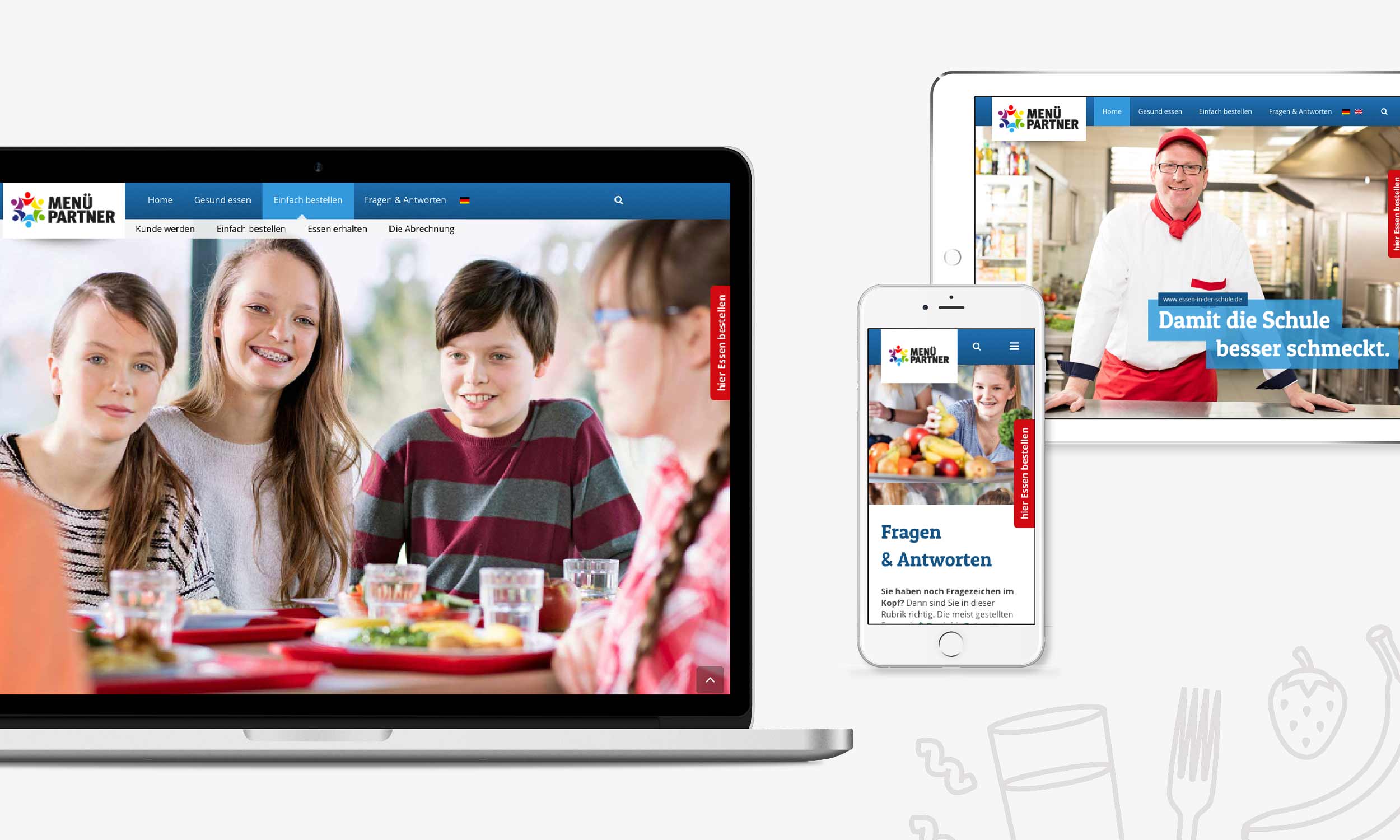
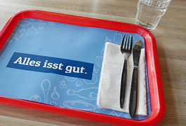
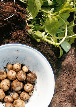
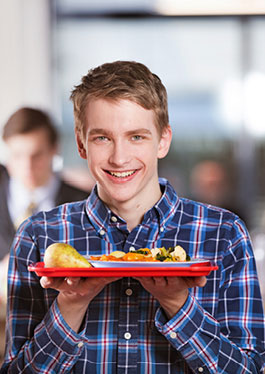
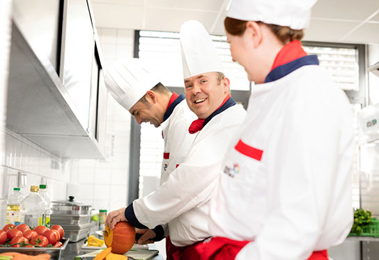
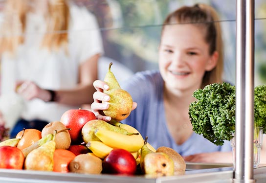
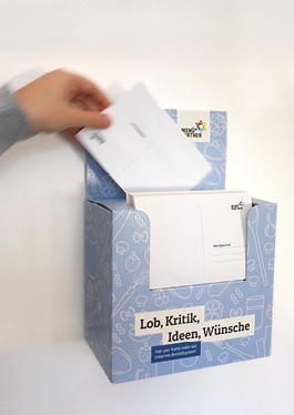
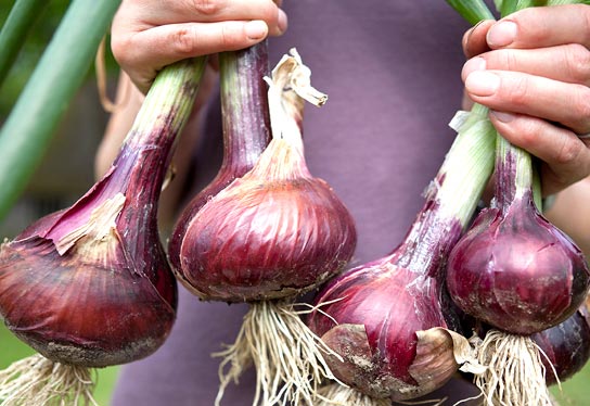
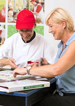
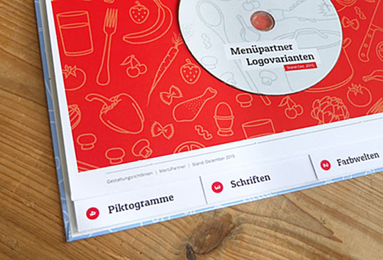
Menüpartner offers meals for kindergartens and schools in all of Germany. With its constant striving for excellence at a reasonable price this company speaks the same language as us. You can now also tell by their presence that Menüpartner is honestly interested in their little customers: We developed a whole design system for Menüpartner, with a sustainable modular design: colour schemes, fonts, pictogram systems, a fresh imagery and many analogue and digital publications were created by the hand of inkl.Design.

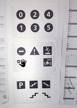
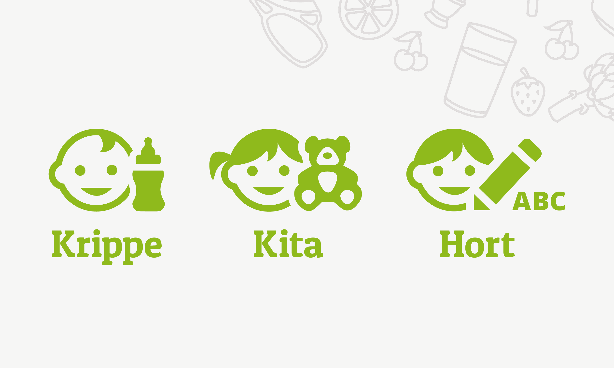
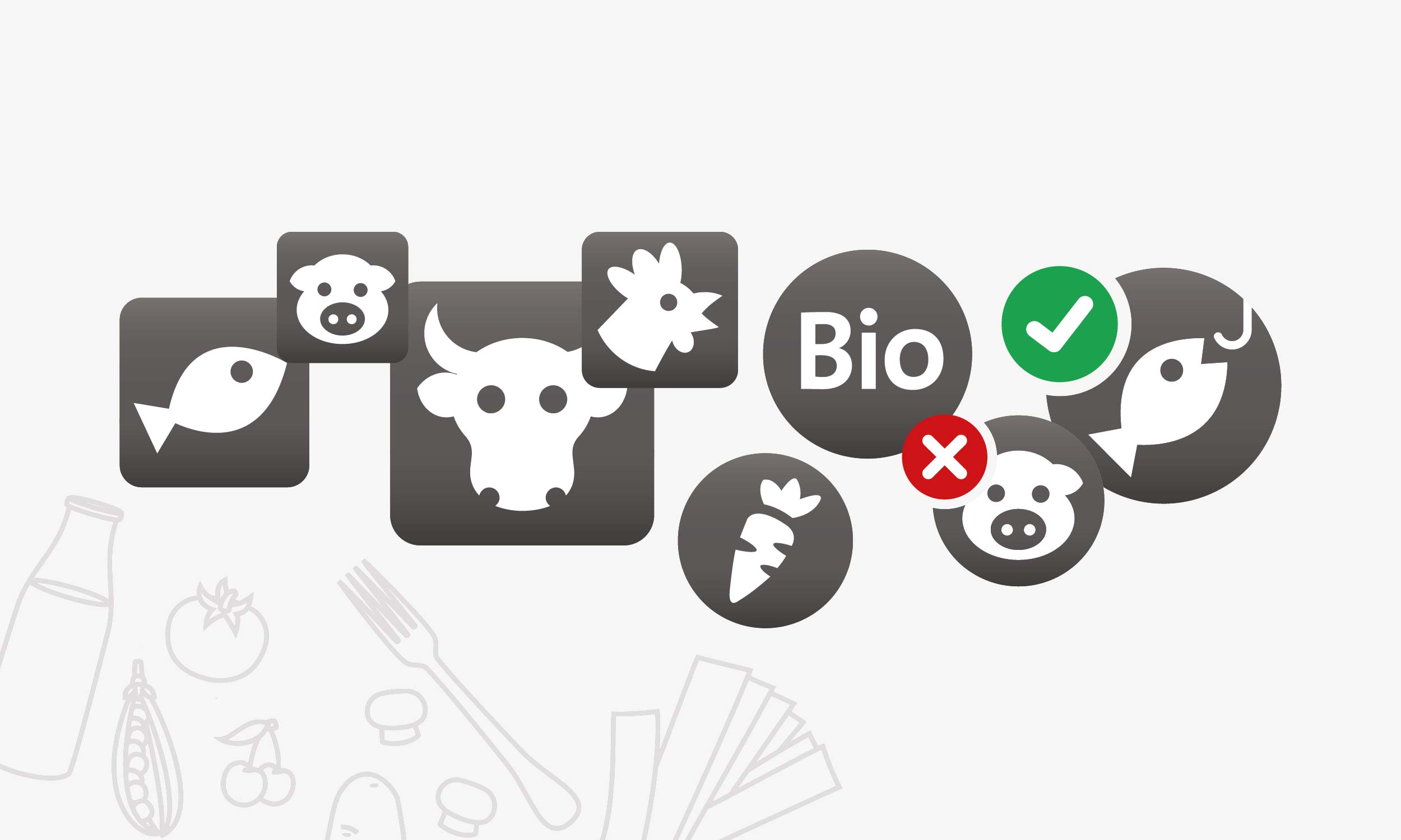
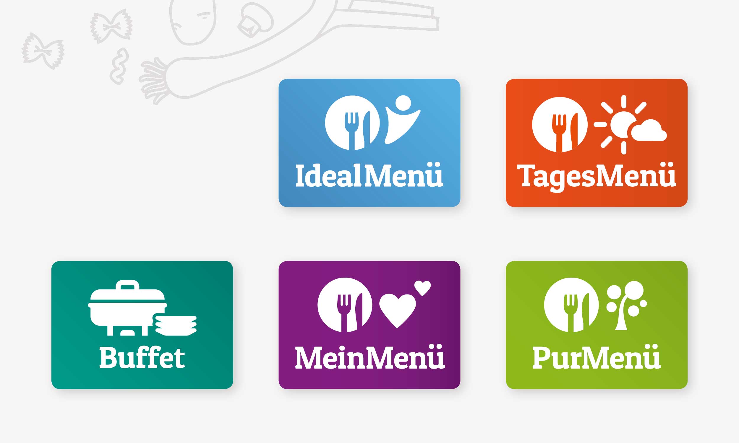
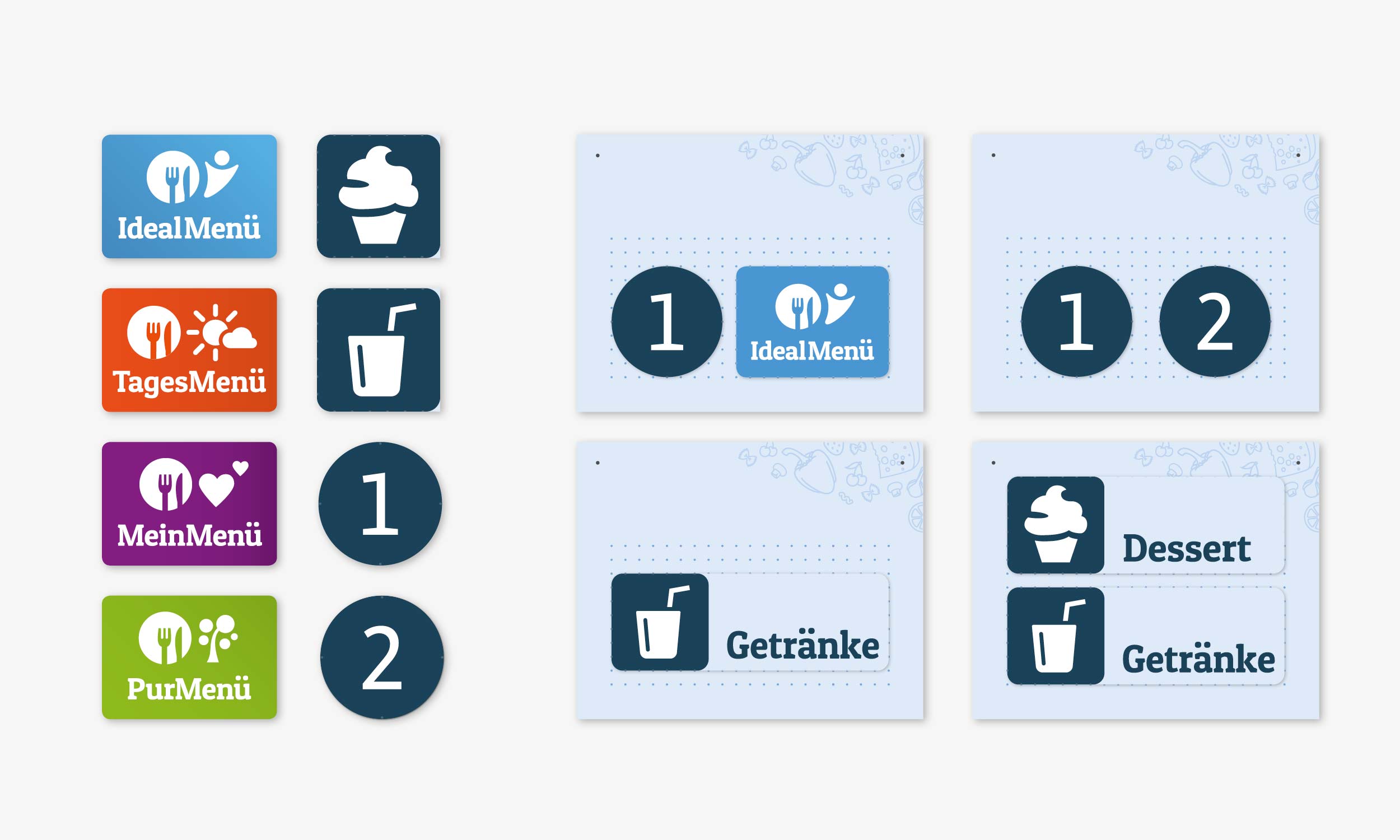
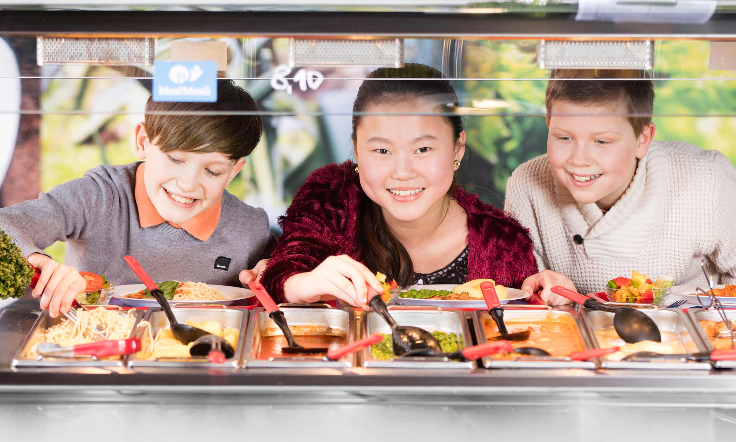
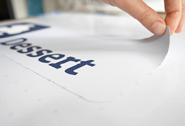
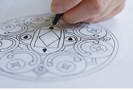
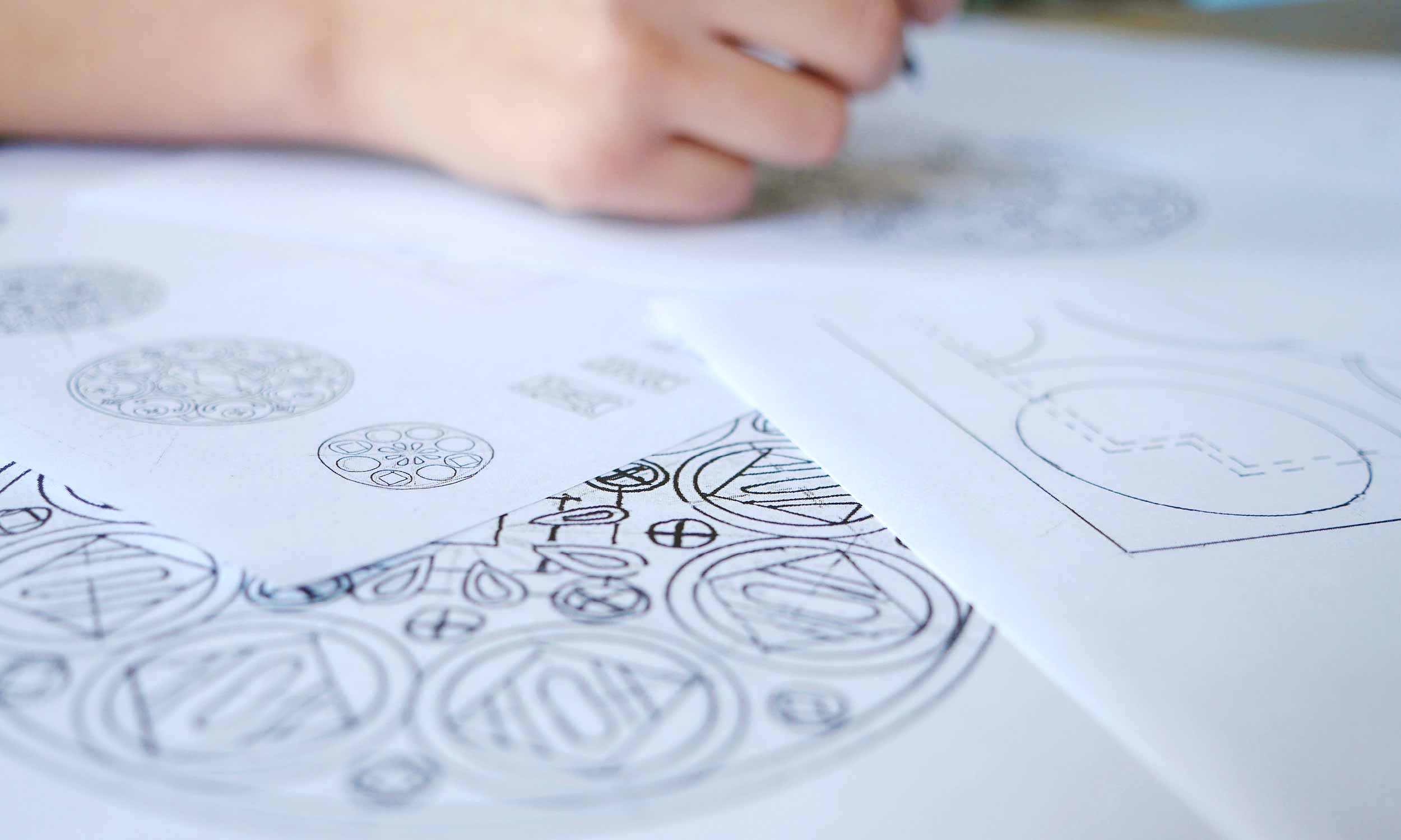
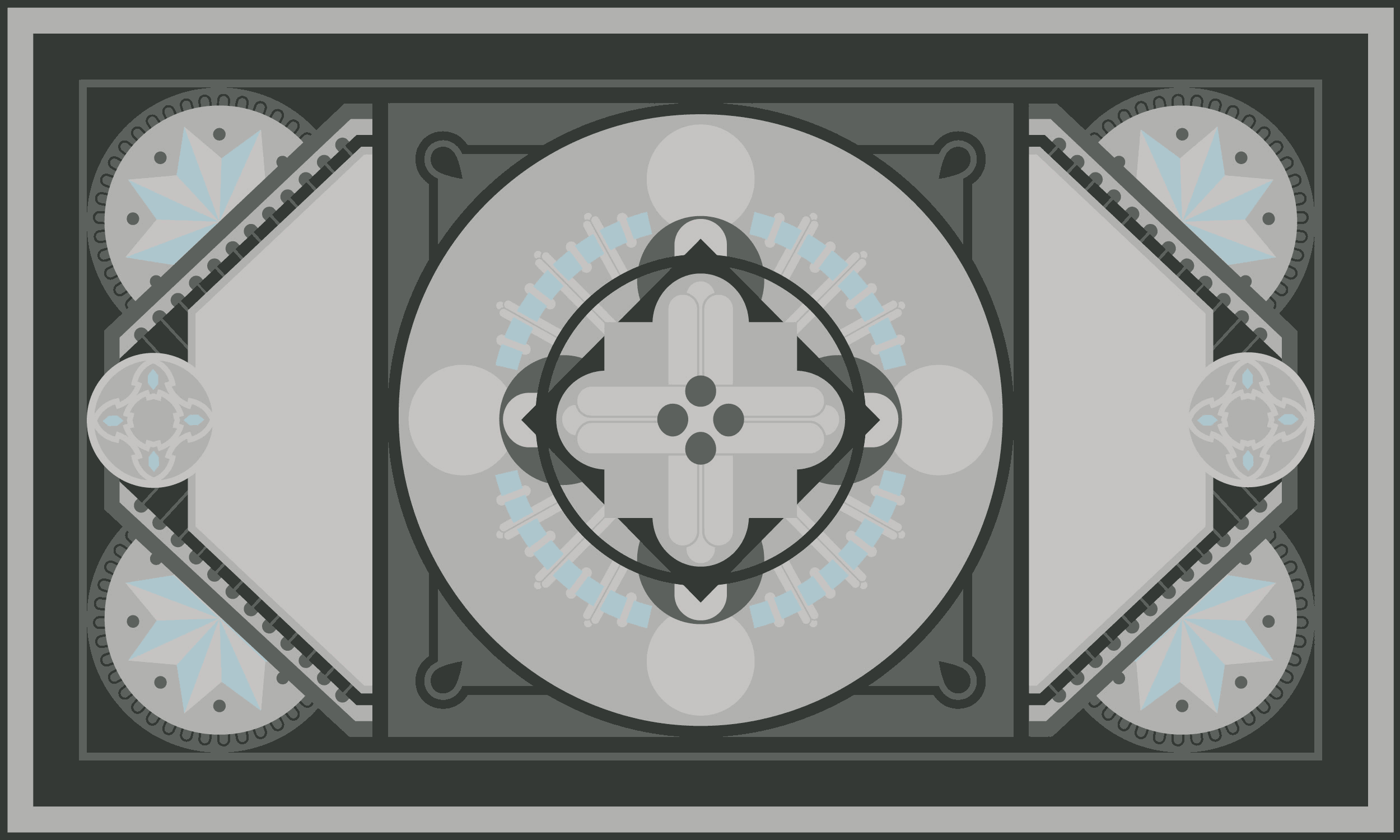
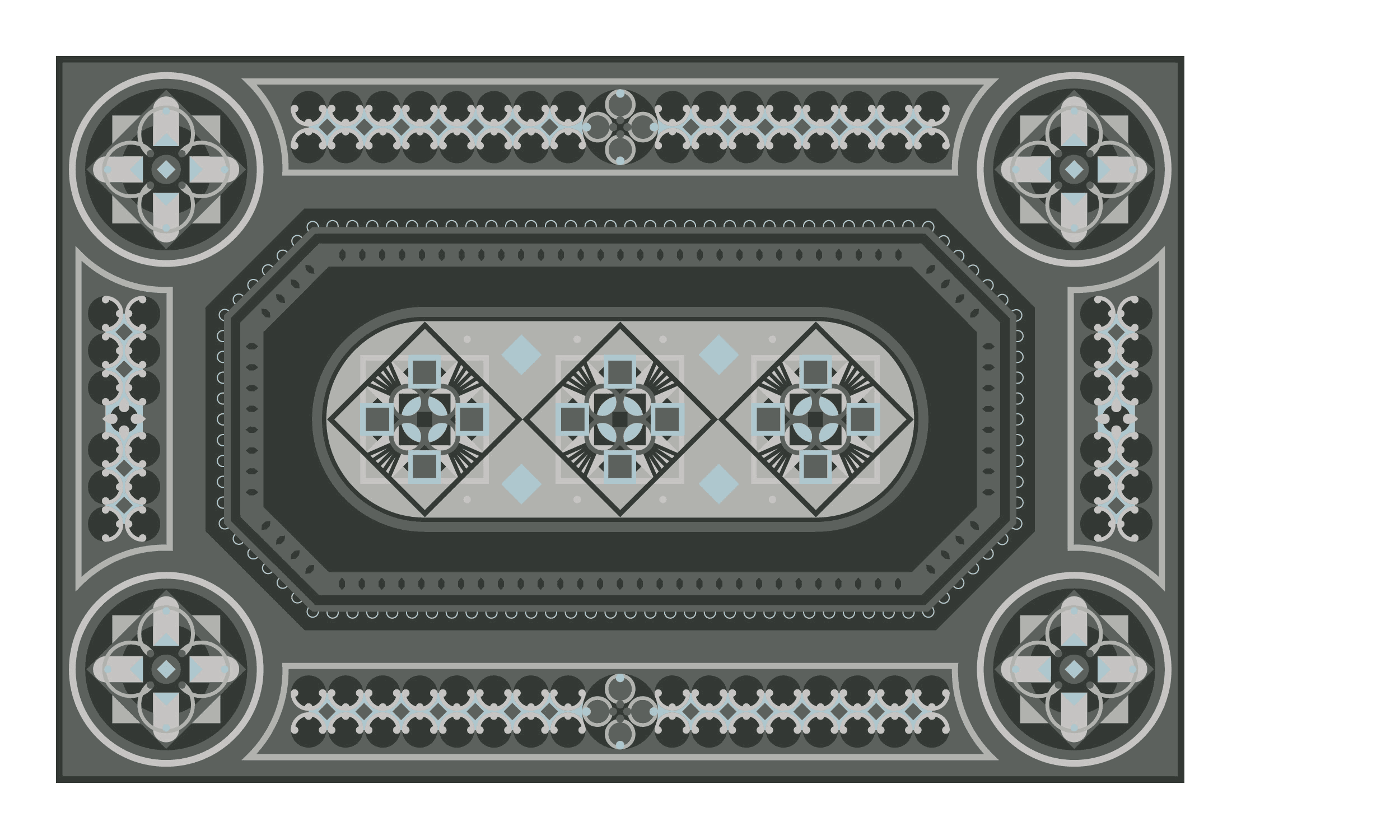
No more misunderstandings – our pictogram systems explain the ingredients of meals, like fish, pork, beef and sub-components like dessert or salad. Each menu line has its own pictogram. Breakfast, lunch and snacks, meal for daycare center kids or school kids; from now on every little gourmand can tell what will end up on their plate immediately.

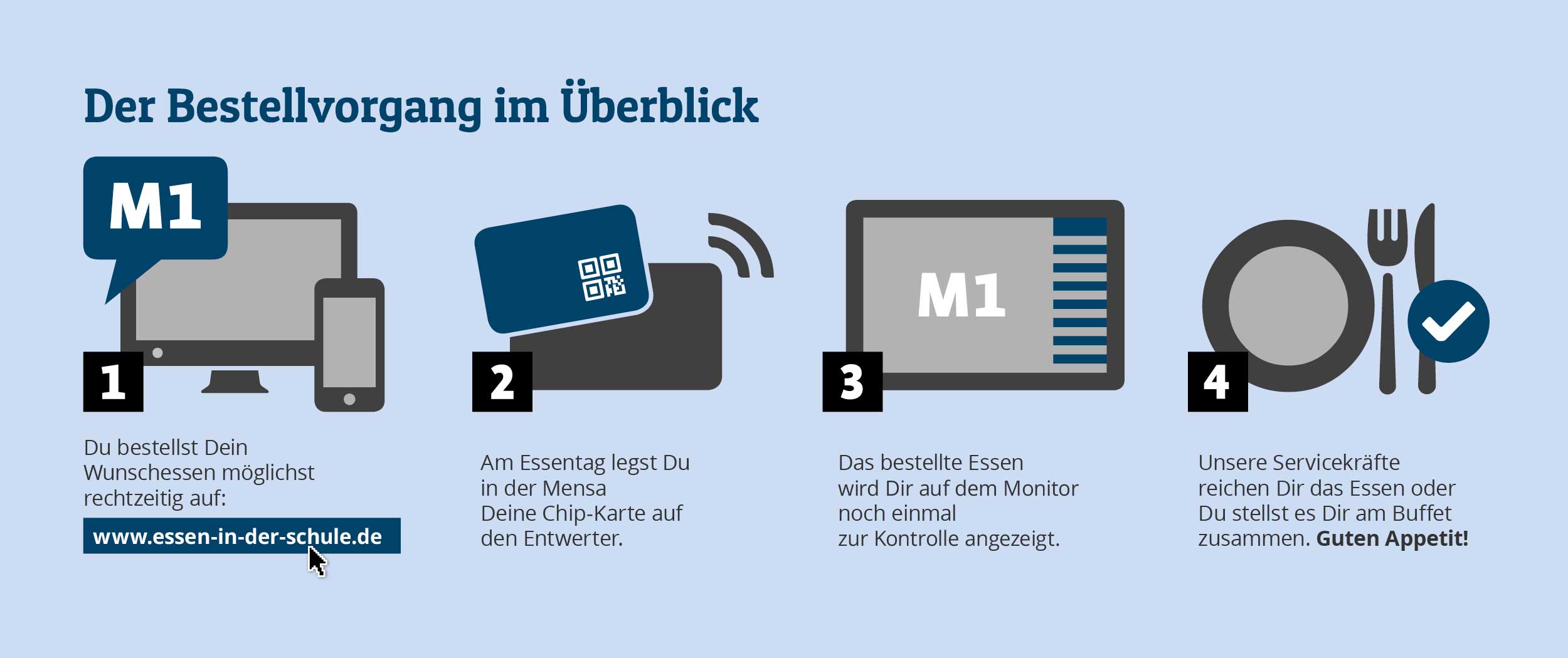
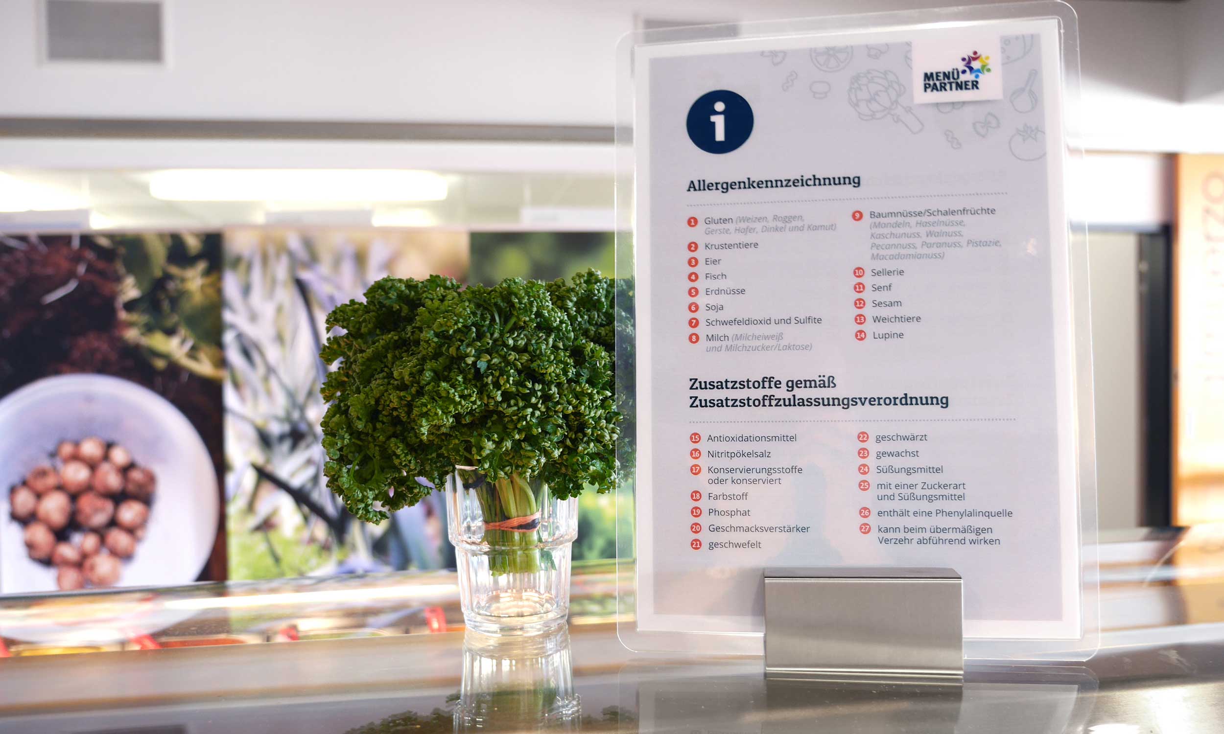
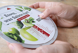
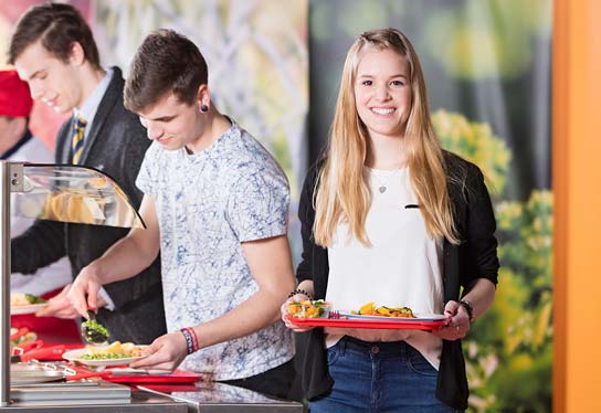
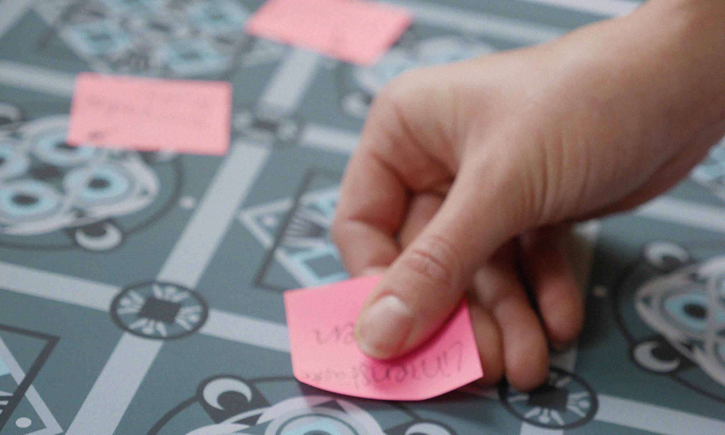
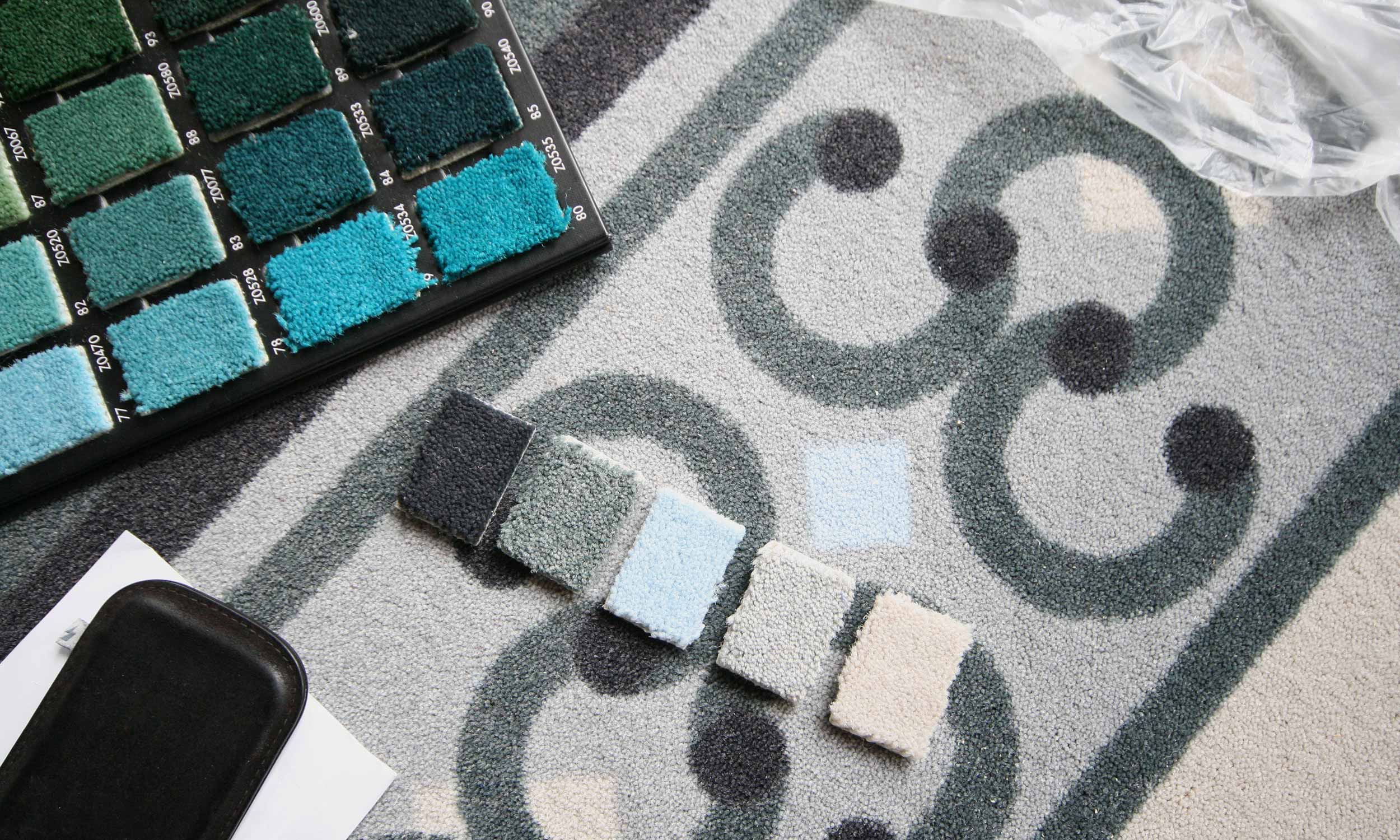
Since Menüpartner is running canteens all over Germany the requirements can be totally different in various locations. Our solutions for a fresh labelling around food had to consider all possible options.

Flexible and expandable, design for all possibilities: from the appealing menu in different styles to clear labelling and numeration at the counter. The respective canteen can choose the needed labelling. It’s always a perfect fit.

From the trolley to the dish return, trash can and comment box, to lunch bags, napkins, tray mats and lanyards, inkl. gave Menüpartner a new face.

Menüpartner can now offer a visual feast digitally as well. We held photoshoots, wrote texts and spiced up existing content for three completely new designed websites for „Essen in Kitas“ and „Essen in Schulen“ as well as the Menüpartner corporation.

And now everybody: Rub-a-dub-dub. Enjoy your grab!

Graphic Concept

Photo of a designed menu partner ring binder with illustrative food items and the company logo.
Illustration of three signets for signalling the menu lines crèche, day nursery and after-school care centre
Photo with information material on eating at school and the seasonal range of fruit and vegetables, published by Menüpartner
Illustration of pictograms for labelling food components (fish, pork, beef, poultry, organic, vegetables, without pork, certified fishing methods).
Illustration of the pictograms in different colours for the menu lines IdealMenu, DailyMenu, Buffet, MyMenu, PurMenu.
Illustration of the ordering and serving process in the canteen for new customers

Design for Canteens

Two photos with students in front of the week's meal plan and validating their meal chip card
Illustration of an instruction for attaching replaceable foils to mark the menu lines at the serving points
Overview of the interchangeable foils for labelling the menu lines as well as drinks and desserts at the serving points
Photo of a modern menu partner food counter with children queuing and two servers behind the counter
Photo motif of a display for the legally required labelling of allergens and additives on a self-service counter
Photo of a paper food bag with healthy contents for field trips by day-care and school children

Visual Language

Photo of a boy with lunch on a tray that he has just put together at a self-service counter
Photo with three pupils happily assembling their lunch at the self-service counter
Photo of a menu partner chef at the cooker tasting the food
Photo of a menu partner service worker at the serving counter
Photo of a happy nursery child at the table covering one eye with a slice of cucumber
Photo of two laughing day-care children at the Vesper table

Digital Presence

Display of the website navigation of www.essen-in-der-kita.
Display of the website navigation of www.essen-in-der-schule.de on the computer screen, tablet and smartphone

 Project Details

Project Scope: Consulting, positioning, continuous brand development, visual language, extensive icon family – among others for the labelling of menu lines and food constituents, modular equipment catalogue for the labelling in school canteens, equipment catalogue for Kindergardens, layout and graphic design, look-and-feel, web design, photo shoots, illustrations, production management
Flat display of the green colour tone defined for promotional applications of the day care centre offers
Photo of a display showing a bowl of freshly harvested potatoes in a potato furrow
Detail photo with dimensions for the shelter around the menu partner logo
Photo of a pupil holding a food tray with fruit and lunch dish with both hands
Photo with three cooks, one woman and two men, preparing fresh vegetables.
Figurative mark for the preparation kitchen, where cooking takes place directly in the establishment, consisting of a stylised cooking pot (white on a dark grey square), supplemented by a stylised chef's hat (white on a green circle) in the upper right corner of the square and a white plus sign on a smaller black circle.
Detail photo of a serving counter with a transparent protective cover on which a removable foil is applied to mark a menu line.
Cover illustration of a menu partner folder for schools with stylised cooking utensils and the slogan "It's easier to learn when it tastes good".
Figurative mark for the hot delivery, in which the already prepared food is delivered to the day care centre, consisting of a stylised cooking pot (white on a dark grey square), supplemented by a stylised clock (white on a green circle) in the upper right corner of the square.
Photo of a two-part turntable. A month is selected by turning it, and information on the seasonal range of fruit and vegetables appears in the lower window.
Flat display of the red colour tone defined for promotional applications of the day care centre offers
Detail photo for handling exchangeable adhesive foils for changing menu sequences
Representation of the colour orange, which was defined for advertising purposes for the offers of the day care centre
Photo of a note box for praise, criticism and suggestions from the food participants
Photo of a display of fresh red vegetable onions with leeks in the hands of one person.
Creation of the menu for display in a day care centre with the help of magnetic foils developed by inkl. design.
Detail photo of the corporate design manual by Menüpartner
Photo of three pupils helping themselves to the lunch menu at a serving counter
Representation of the blue colour tone defined for promotional applications of the school offers
Figurative mark for the chilled food system, in which the finished food is delivered chilled to the day care centre, consisting of a stylised cooking pot (white on a dark grey square), supplemented by a stylised temperature display (white on a green circle) in the upper right corner of the square.

Granitz Hunting Lodge

Design of Carpets

What happens when a castle’s 160-year-old wooden floors have become unsightly and their once magnificent carpets threadbare and moth-infested? Should they be restored or rewoven using original materials and historical patterns? Unaffordable. Put down any old carpet? Absolutely not.

So how about something entirely new? Something contemporary, custom-made, and printed with patterns tailored to Granitz Hunting Lodge’s historical tradition and environment? And something which would come in on budget. That’s exactly what we did!

This project called for some meticulous detective work. So we set about finding historical evidence on Granitz’s original decorative scheme in a decidedly Holmesian manner, and discovered an art historian who steered us in the right direction. The original lords of Putbus had their hunting lodge on the island of Rügen equipped with the finest French Aubusson carpets. It was these historic patterns which became the template for our contemporary versions.

In close cooperation with the Department for the Preservation of Historical Monuments and a specialist manufacturer we managed to create new carpets, which respect the historic brief in terms of scale and ambience, without looking like tired replicas.

The graphic patterns and subtle colours leave ample scope for imagination while seamlessly tying in with the atmosphere of each room.

All well and good, but what has this got to do with inclusivity you may ask? This project is not about inclusion but provides the opportunity to demonstrate that whatever the task in hand, inclusive or not, inkl.Design is always ready to get involved, wherever a contemporary design project requires skill and passion.

Photo with a dizzying view of the cantilevered spiral staircase of the observation tower running along the walls. It is made of cast iron. The openwork steps reveal the view into the depths.
Today's image of a drawing room with a wood-panelled ceiling and honey-coloured double doors. The eye-catcher is the ornamental carpet in shades of grey that covers the floor of the room. In the centre of the picture, three dark red stools are placed in a row. On the wall in the background of the picture hangs a large rectangular painting of a nobleman in a gold frame, with a modern white table below. On the wall to the right of the picture hangs a portrait of a lady, in a pompous oval gold frame.
Photo with exterior view of the Granitz hunting lodge, built in 1846 by the Putbus family. It is built in the style of northern Italian Renaissance castels with four corner towers and an imposing central tower.
A dark blue area.
Detail of a carpet design. The pattern shows a two-coloured star in light blue and grey in a dark grey circle framed by blue-grey dots. Further lines and dots extend the pattern. The feet of a person in blue-grey trainers can be seen on the upper edge of the picture.
A shot from the working process sketching templates for the carpet patterns.
Photo of the entrance and trophy hall. The walls of the two-storey high hall are adorned with antlers of various game species. The mammoth floor, structured in grey and white rectangles, is covered by a plain grey runner.
Historical photo of a drawing room.
Detail photo of knitted carpet element patterns. The colour gradations include grey, green, blue and ochre.
Photo with a dizzying view of the cantilevered spiral staircase of the observation tower running along the walls. It is made of cast iron. The openwork steps reveal the view into the depths.
A dark red color patch.
View into a wood-panelled salon. The only furniture in the corner is a white marble fireplace. The eye-catcher is the room-filling ornamental carpet dominated by round graphic shapes.
Historical photograph of a salon with chequerboard-panelled walls and parquet floor. The focal point is an upholstered seating group in rococo style under an impressive chandelier and in front of a fireplace on which a life-size marble figure stands.
Historic photograph of a salon with half-height bookshelves and paintings and sculptures above, and ornate upholstered chairs around a round table. The parquet floor is laid in a chequerboard pattern.
Jagdschloss Granitz: Photo with a view of one of the modern ornamental carpets. You can see the multitude of combined basic geometric figures, which are combined to form impressive design elements.
View into the dining room. In the centre, a modern table with recreated historical contours, which replaces the missing original. On top of it is a reproduction of the contemporary table setting. The floor is covered with an ornamental carpet in shades of grey and blue. A visitor to the exhibition, dressed in a light blue jacket, looks at the table setting.
A light blue area.
A shot from the working process sketching templates for the carpet patterns.

Interpretation

A shot from the working process while sketching templates for the carpet patterns.
Detail shot from the working process. Notes are attached to a test printout of a carpet sample.
Detail photo of knitted carpet element patterns. The colour gradations include grey, green, blue and ochre.

Carpet Samples

Graphic overall view of the carpet from the Ladies' Room, original size: 5.47 x 3.24 m
Graphic overall view of the carpet from the dining room, original size: 5.17 x 3.33 m
Graphic detail of a corner of the carpet from the Red Salon; original size of the carpet: 2.59 x 3.30 m
Graphic overall view of the carpet from the ladies' room in the tower in the shape of a hexagon, original size: 2.40 x 2.08 m

A Glance at the Room

Today's image of a drawing room with a wood-panelled ceiling and honey-coloured double doors. The eye-catcher is the ornamental carpet in shades of grey that covers the floor of the room. In the centre of the picture, three dark red stools are placed in a row. On the wall in the background of the picture hangs a large rectangular painting of a nobleman in a gold frame, with a modern white table below. On the wall to the right of the picture hangs a portrait of a lady in a pompous oval gold frame.
Two pictures with a view into the dining room. You can see a long modern table with recreated historical contours, which replaces the missing original. On top of it is the contemporary table setting. The floor is covered with an ornamental carpet in grey tones. A historical original chair stands between modern dark red stools at the table. The first picture shows a chandelier above the table and a historical fireplace in the corner. The second picture shows a detailed view of the table.
Detail of a round ornamental carpet in the wood-panelled tower room. The carpet design is a kind of mandala in shades of blue and grey framed by a white and blue chequerboard pattern.
Two exhibition rooms of the Granitz Hunting Lodge. The first picture shows a walk-in box with recreated historical ornamental contours. It stands in a room with a wood-panelled ceiling and a light square carpet with a plain border. In the second picture, a table that is also in the style of the recreated historical contours. A large touch screen is embedded in the table. Below it is a modern ornamental carpet. On the walls, paintings of the zu Putbus family.
Detail of a carpet design. The focal point of the pattern is a two-coloured star in light blue and light grey in a grey circle, framed by blue-grey dots. Further lines and dots extend the pattern.
Two wood-panelled rooms. The first picture shows a honey-brown, wooden tower room. The small room is not furnished. It is merely covered with a round, blue-grey ornamental carpet. Large windows provide bright sunlight. A dark grey runner leads out of the room. The second picture shows a bedroom with a divan, wood-panelled inlaid walls and a strikingly structured light ceiling. The floor is covered by a carpet in grey tones with dominant round ornamental shapes.

Project Details

Project Scope: Art-historical research, contact with international textile historians, development of a concept of modern interpretations of historical carpet designs, colour and material concept, coordination with Upper Heritage Authority, elaboration of carpet designs for 9 rooms, production management