Aktion Mensch e.V.

Die Bunte Bande

How about that? All children can read the same book. Visually challenged children, blind children, deaf children, children with learning difficulties, your children. There’s no special treatment, no complicated separate way anymore. One edition for everybody. Easy-Peasy?


That’s exactly the kind of groundbreaking and important book project we inkl.Designers are tackling together with “Aktion Mensch”, for the very first time in Germany.

The children’s book series “Die Bunte Bande” (“The Colourful Gang”) around the five friends Tessa, Tom, Jule, Henry and Leo – each with their individual strengths and weaknesses – introduces topics like diversity and inclusion in a way that’s exciting and suitable for children at the same time.

In earlier editions of “Bunte Bande” only its content was related to inclusion. But quite quickly it became clear: it’s all or nothing. The goal had to be a fully inclusive edition.

Because there were no comparable books on the market for the target group – children between the ages of eight and eleven – we had to become experts ourselves in order to develop a completely new, inclusive book for all new readers. For younger visually challenged and blind children there are a handful of well-designed picture books.

But when the sensitive phase of early support ends with school entry, it looks pretty dark as far as appealing book material is concerned.

But what special needs do challenged children have when they are learning to read? How can large print, Braille and Easy-to-Read Language be elegantly and reader-friendly reconciled? Together with experts from special education, didactics and everyday experts, we have developed suitable theories and found convincing solutions.

Not only in terms of design, but also in the large-scale production of a circulation of 2,000 books, we have broken new ground with the “Bunte Bande”.
The fifth volume “The Stolen Bike” is pioneering. We are proud of our first inkl.Design children’s book. And we can be, because the edition of the children’s book series realised by inkl.Design with partners is winner of the German Design Award 2020 in the category Universal Design, won the Silver Award 2019 from the International Association for Universal Design (IAUD), received the prize “Outstanding Books for Young People With Disabilities 2019” and was awarded the Kimi seal for diversity 2018.

And by the way: to make sure young readers can enjoy the earlier adventures of the „Bunte Bande“ as well, we subsequently realized also them as inclusive books in the combination of Easy-to-Read Language, large print and Braille.

A Glance at the Book

Cover of the book "Die Bunte Bande, Das gestohlene Fahrrad". In the upper left corner of the picture a black circular sticker. In it, 5 colourful hands are visible. On it is written in large white letters: \"Inclusion in Germany\". In the lower left corner the seals of the prizes for the Bunte Bande
Close-up of an inside page of the book with all members of the Coloured Gang and Braille
Close-up of an inside page of the book. At the top left of the picture, an illustration is visible in which an educator is applying make-up to a child. Below this is a text in both black and braille. At the upper right edge of the picture, a pictogram with Braille is arranged. An arrow points to the braille of the book page.
An open double page of the book. Across the entire format is an illustration of the colourful gang with educator Ben. Again, blackletter and braille are combined. The next easy-language page is already peeking out from the right edge of the book.
Close-up of a blue easy language page, which always follows a double page with everyday language and Braille. In the upper left corner of the picture is a pictogram for easy language. An arrow points to the book page.
Excerpt from the presentation of the inclusive children's book ”Die Bunte Bande” with marking of visually impaired-friendly design elements
In a row, the issue of the Bunte Bande \"Das gestohlene Fahrrad\" (The Stolen Bicycle) lies next to other subsequently inclusive issues of the Bunte Bande.

Inclusion in Use

Graphic of a double page with explanations of the individual elements of the page
Graphic explaining the structure of the book
Photo of a blind woman reading from The Colourful Gang to three interested sighted children
Photo of a blind woman with two girls sitting next to her, feeling the Braille dots in the coloured ribbon
Photo of a blind woman reading from an inclusive children's book to three sighted children. Everyone is visibly enjoying themselves and laughing merrily.
Six incl-designers celebrate the children's book award with confetti and streamers. They hold a banner that reads: 2019 Selection of Outstanding Books for Young People with Disabilities.

Project Details

Project Scope: Development of a publication concept for the first inclusive children’s book in Germany, Consulting of illustrators, Advice on technical production issues (Braille, book binding, logistics), Consulting (typography, fonts, contrasts), Realisation of the braille text, Proofreading of the Braille texts, Checking the design for accessibility

Earlier Bunte Band issues lying side by side.
A boy looks over the top of the book with wide eyes.
a red coloured area
A hand feels the Braille letters in the Bunte Bande book
A grass green coloured surface
A girl and two boys are sitting side by side on the floor with their backs against a wall. The girl reads the stories of the colourful gang to the two boys.
Cover of a proof copy of the book "Die Bunte Bande, Das gestohlene Fahrrad" (The Colourful Gang, The Stolen Bicycle) with many yellow correction slips in it
Close-up of a hand sticking a correction note into the boo
Close-up of the book cover "Die Bunte Bande, Der neue Bandentreff".
A dark blue coloured area
A cosy listening room can be seen. The book "Die Bunte Bande" (The Colourful Gang) is being read aloud on the stage. On the floor in front of it, children sit and lie on colourful cushions and listen intently.
A bright yellow coloured surface
Close-up of an illustration of a girl with a correction slip on it
A child reads a Bunte Bande book and feels over the braille letters.
Close-up of an illustration from the book. A magnifying glass enlarging a text

Kunstsammlungen Chemnitz

Big city, planned city, city of the future

Hardly any other city in Germany has faced such constant and far-reaching change over the past centuries and decades as Chemnitz. Today, Saxony’s third-largest city has a museum, the Schlossberg Museum, which brings the city’s eventful history to life.

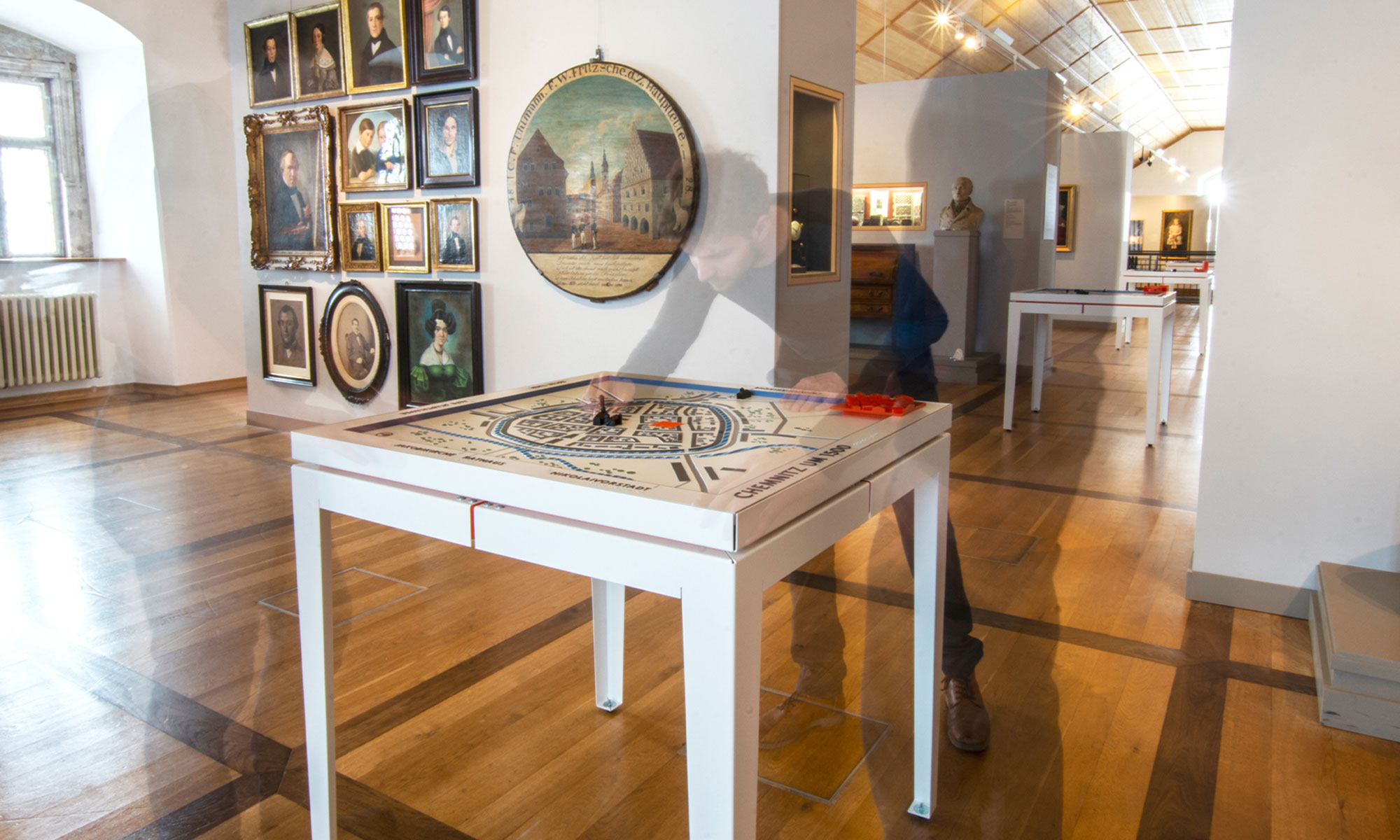
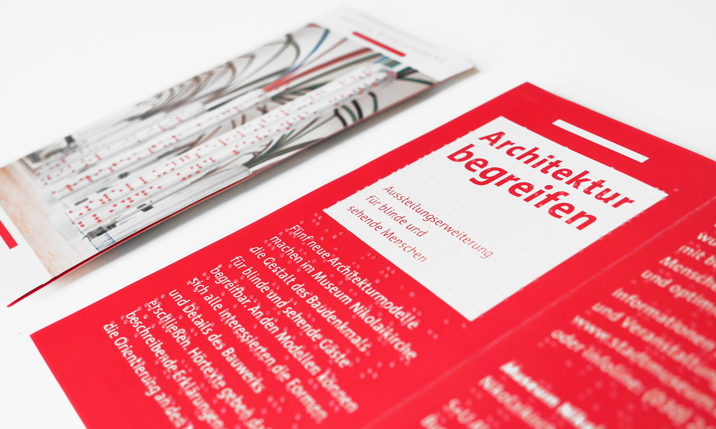
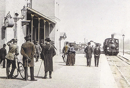
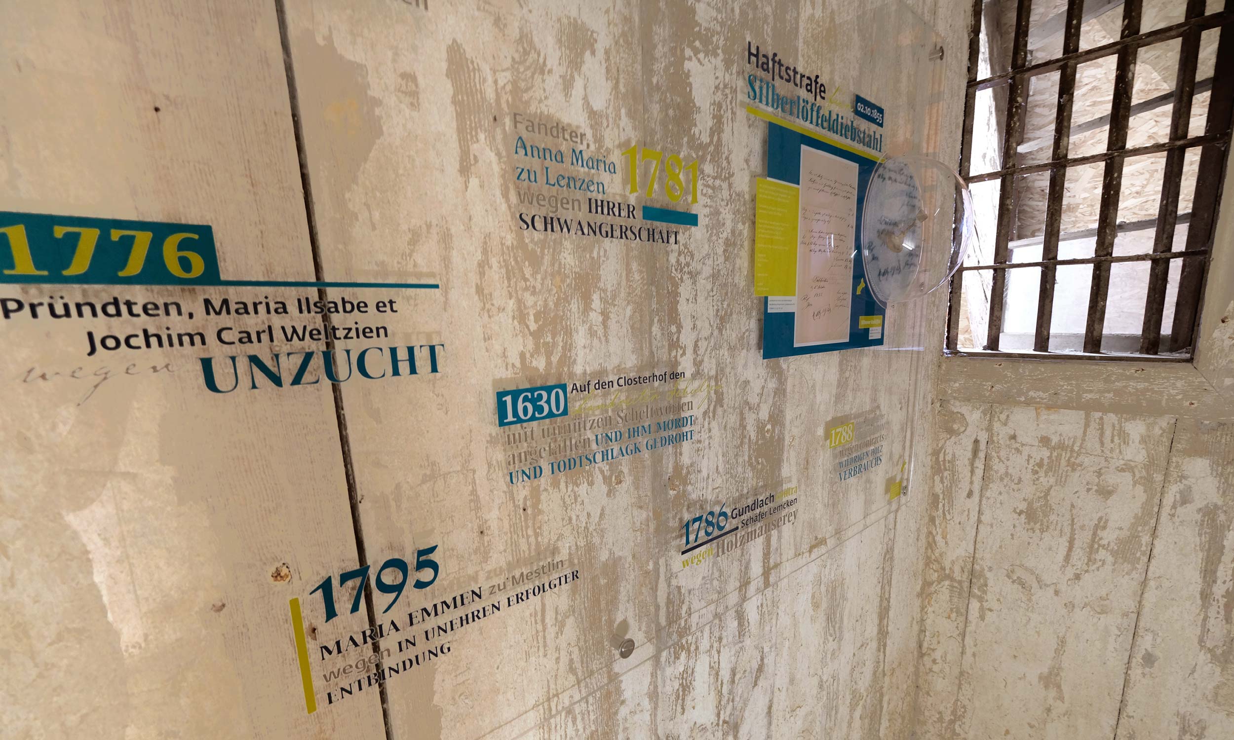
From a populous metropolis during the industrialization, to heavy destruction in World War II and reconstruction as the socialist planned city of Karl-Marx-Stadt, Chemnitz has experienced many facets. The Museum of Urban History now shows them with the help of four new tactile models.

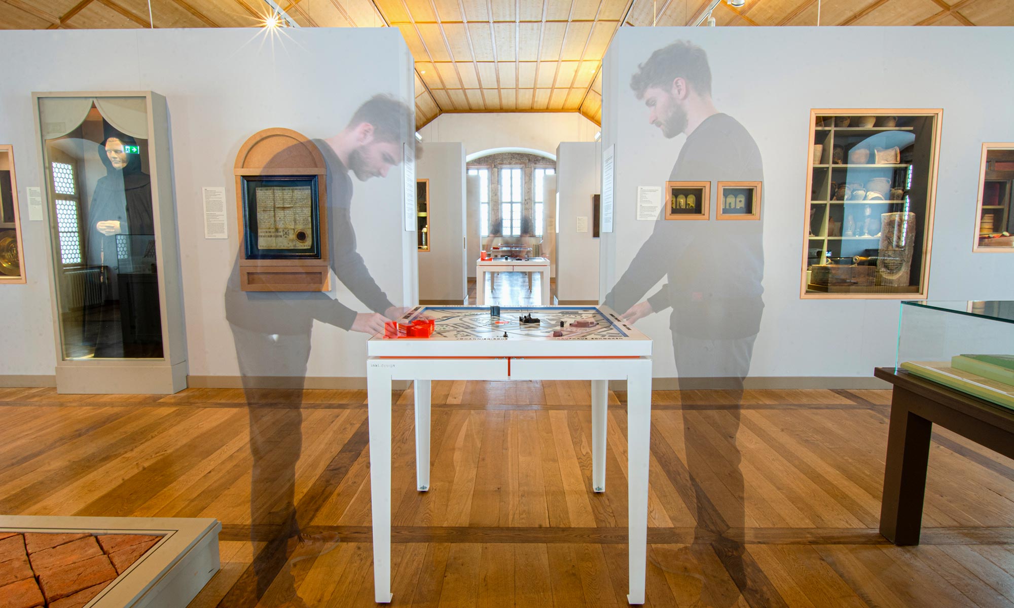
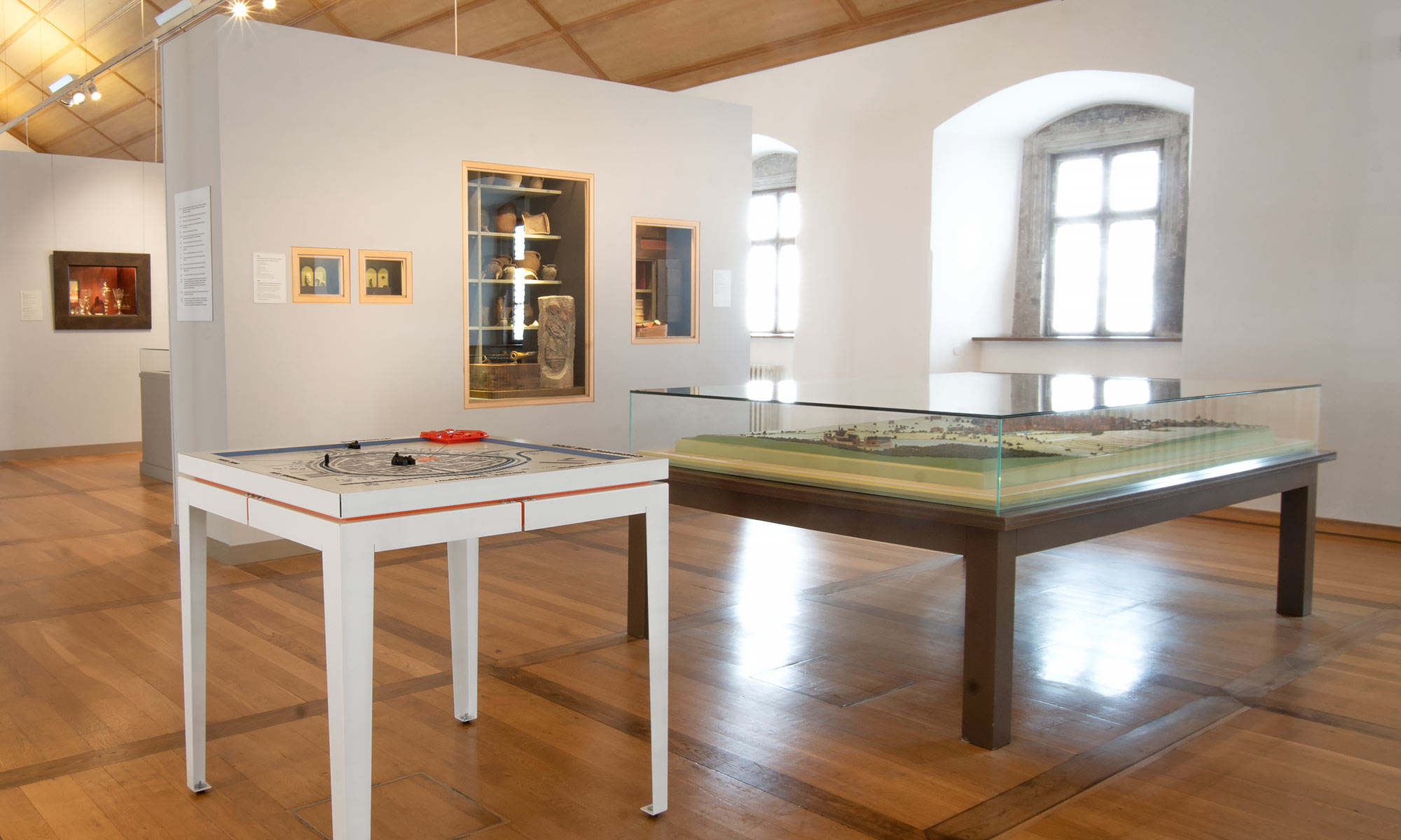
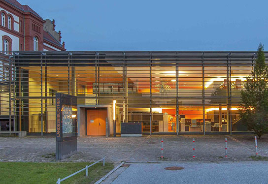
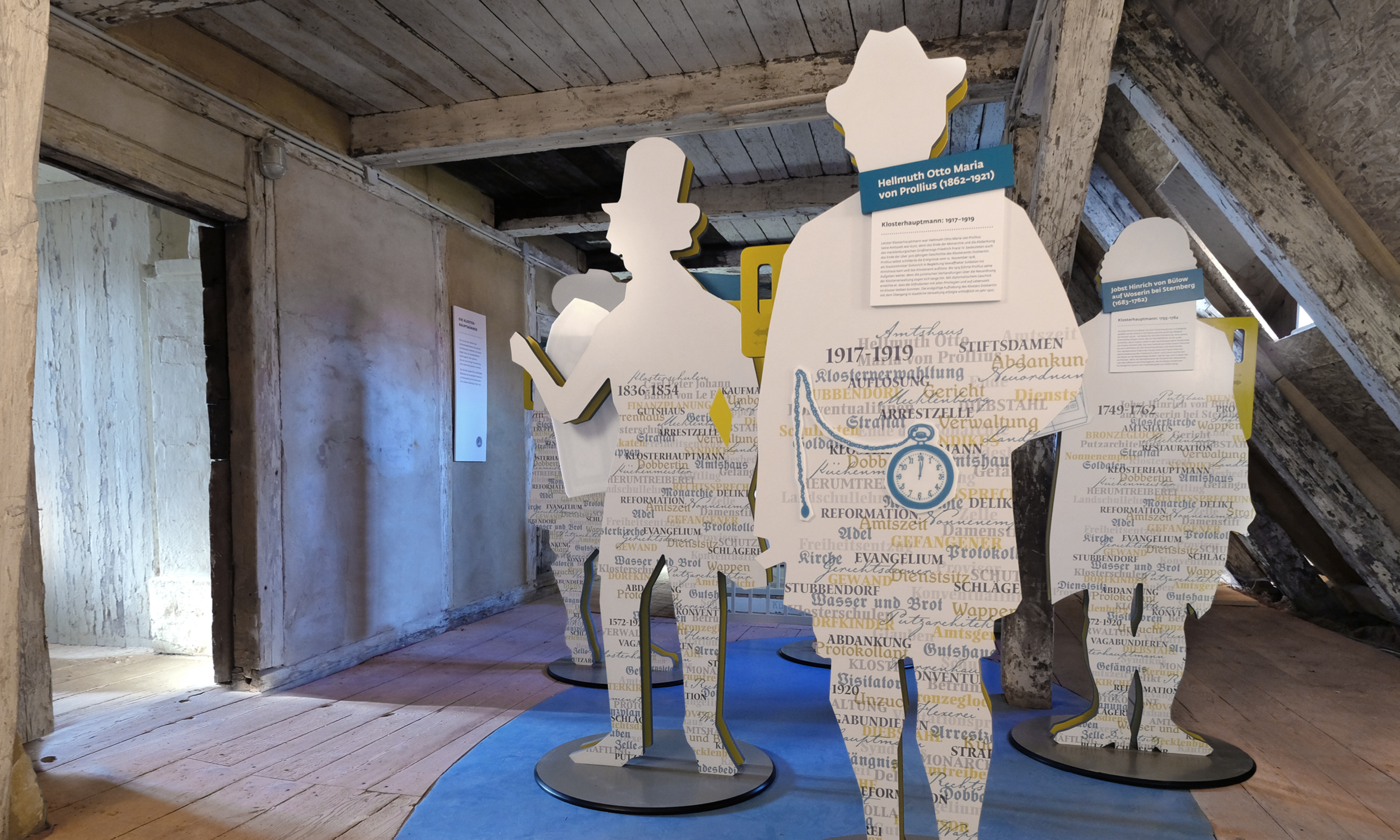
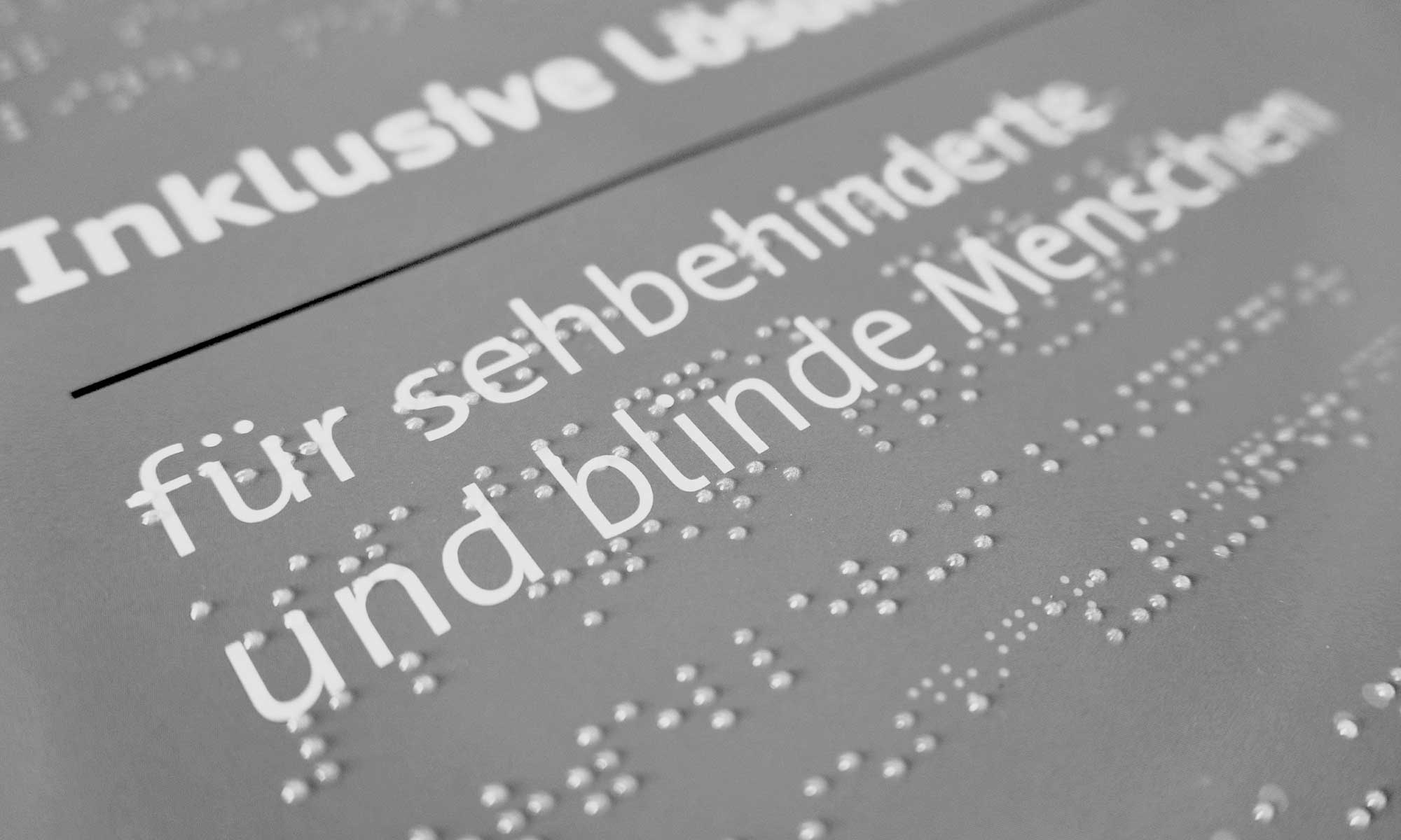
In the rooms of the monastery and castle complex on the Chemnitz Schlossberg, the ink.Design-models flank existing city models and make the exhibition a good more inclusive.

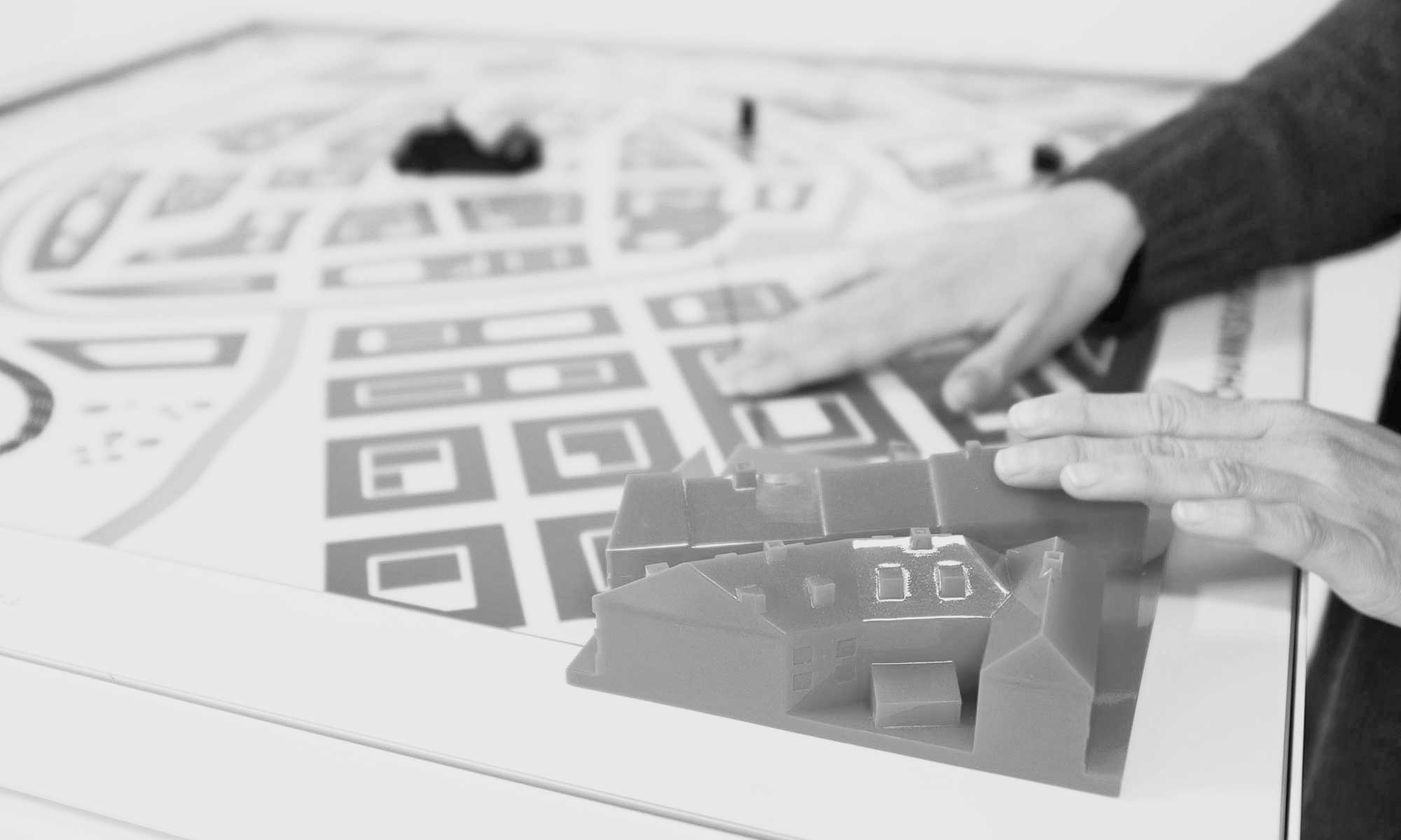
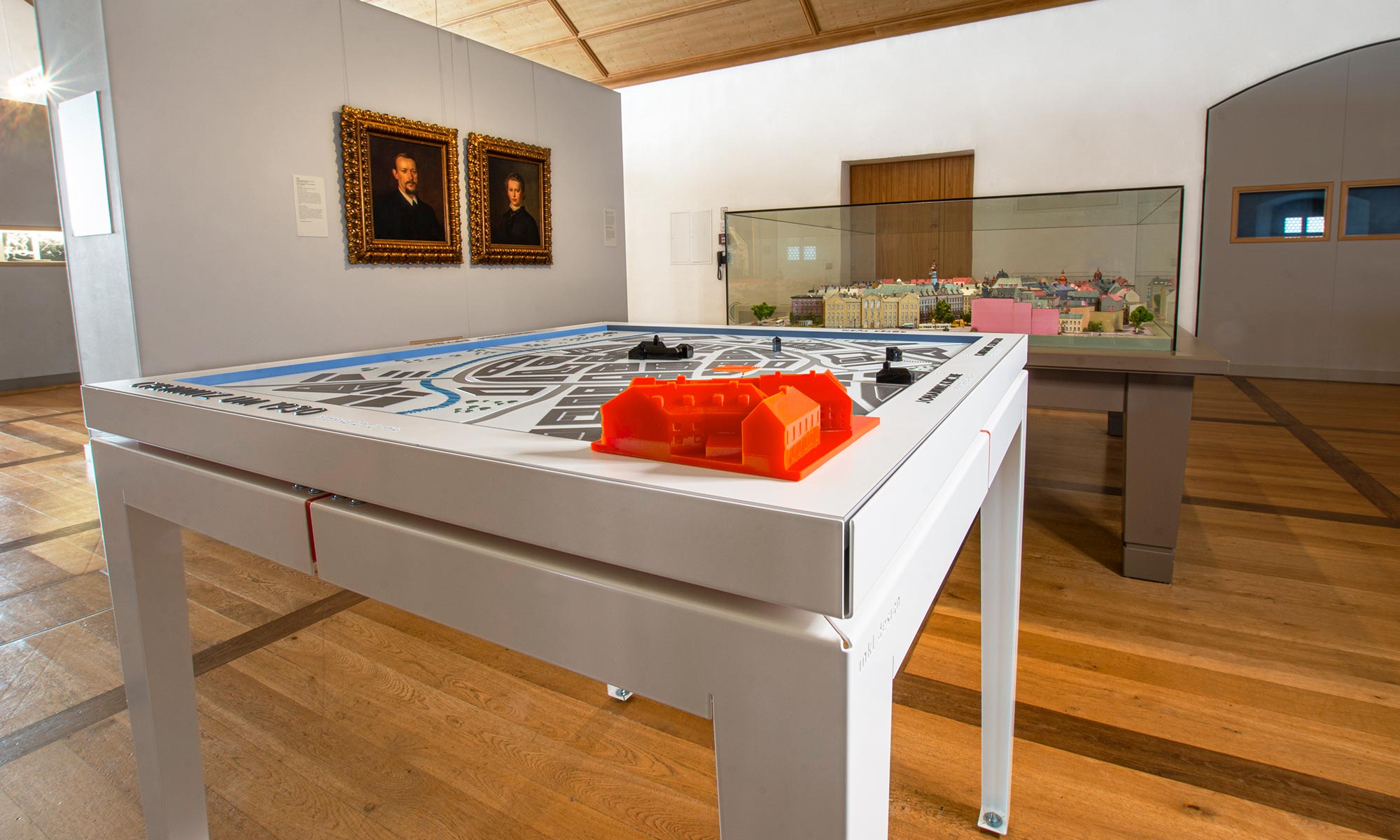
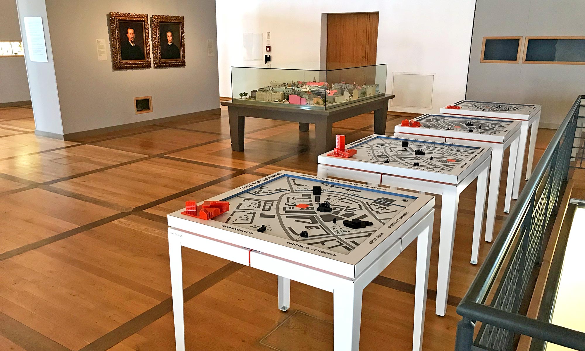
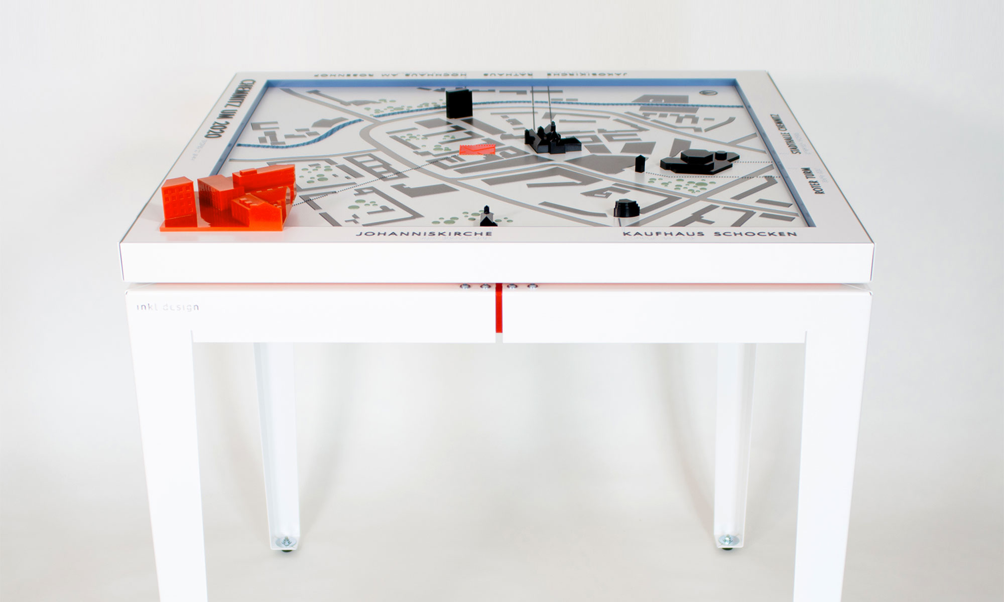
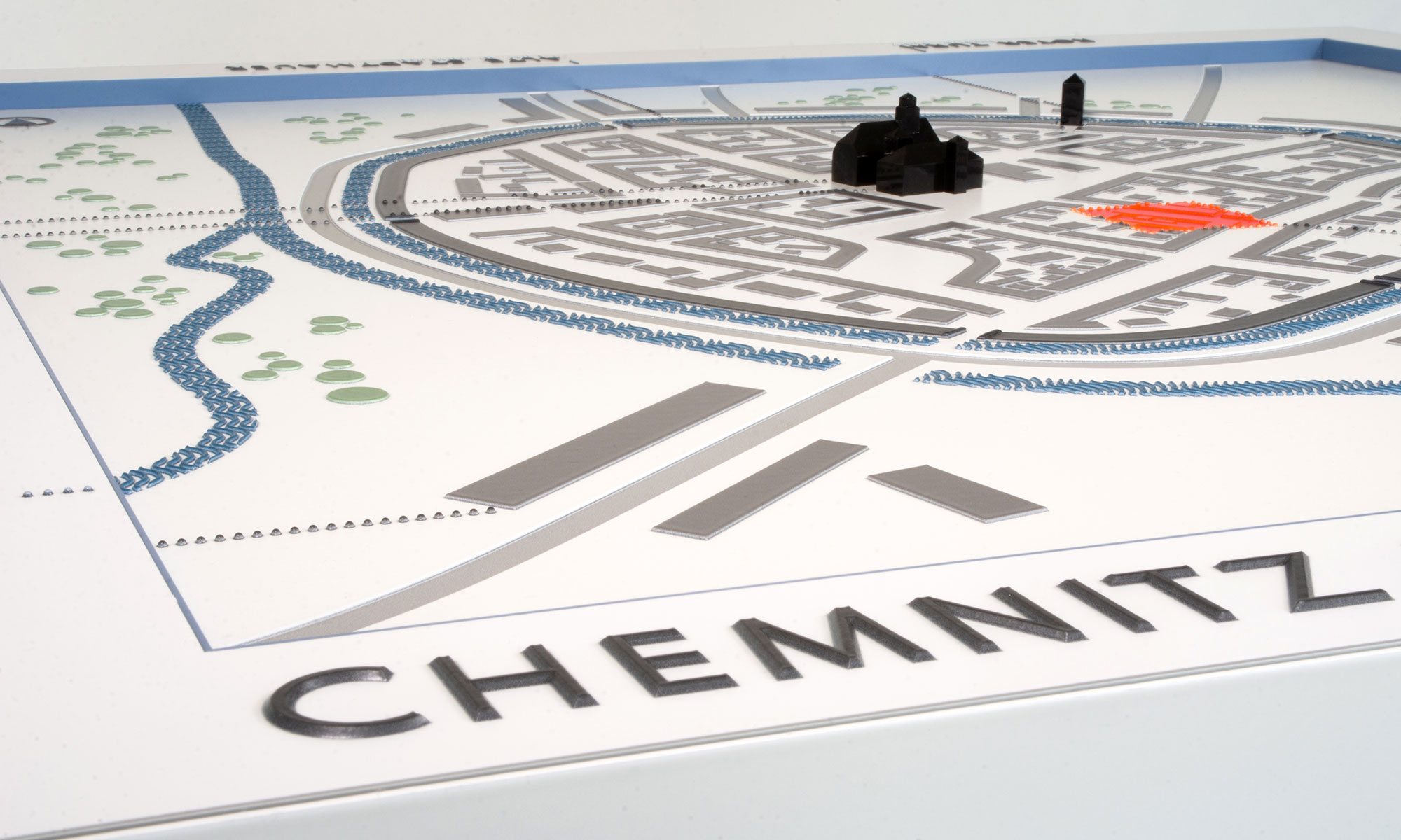
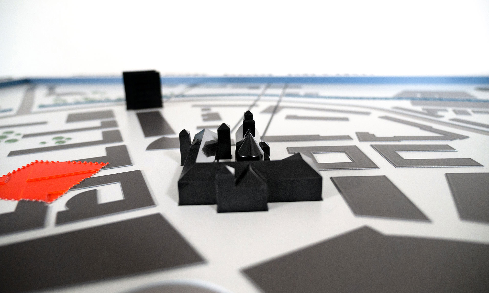
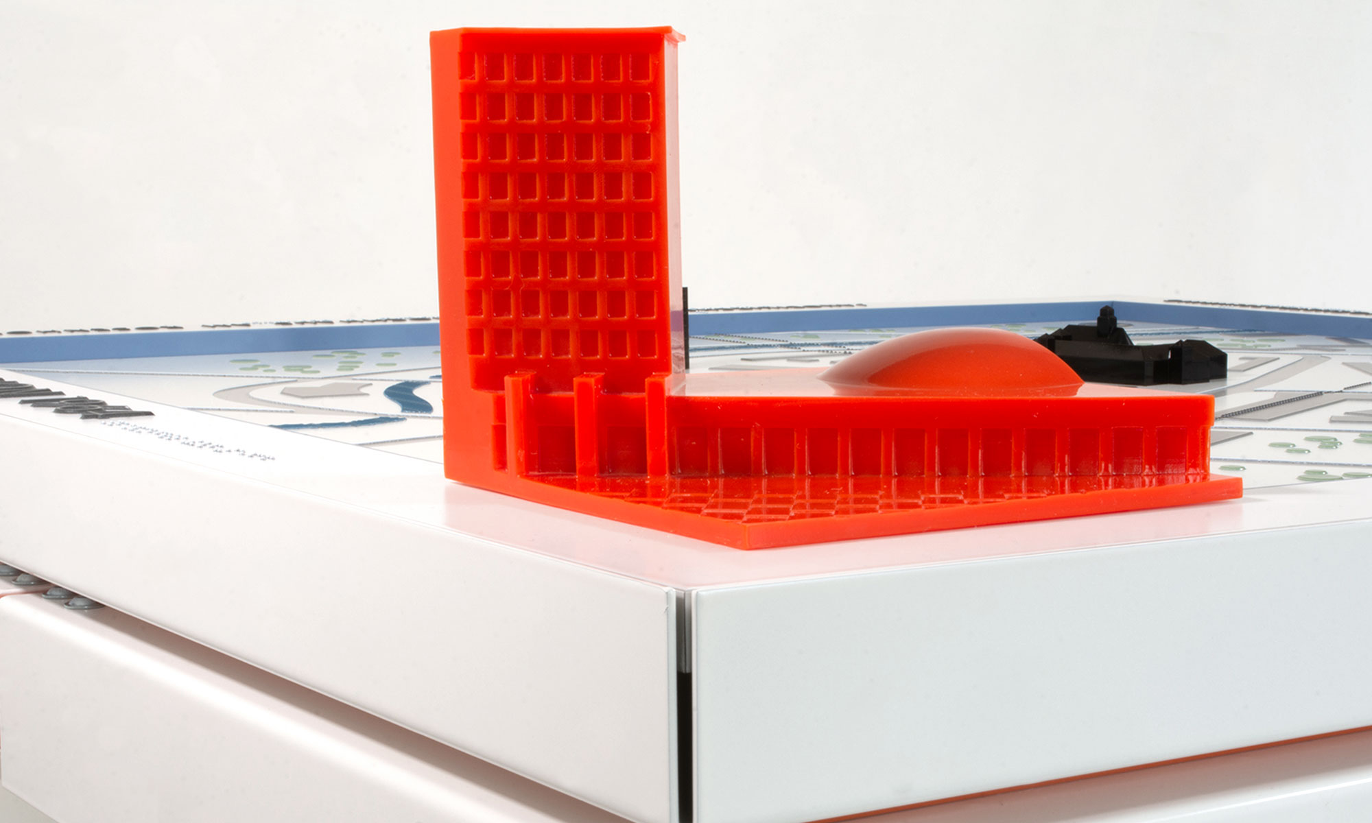
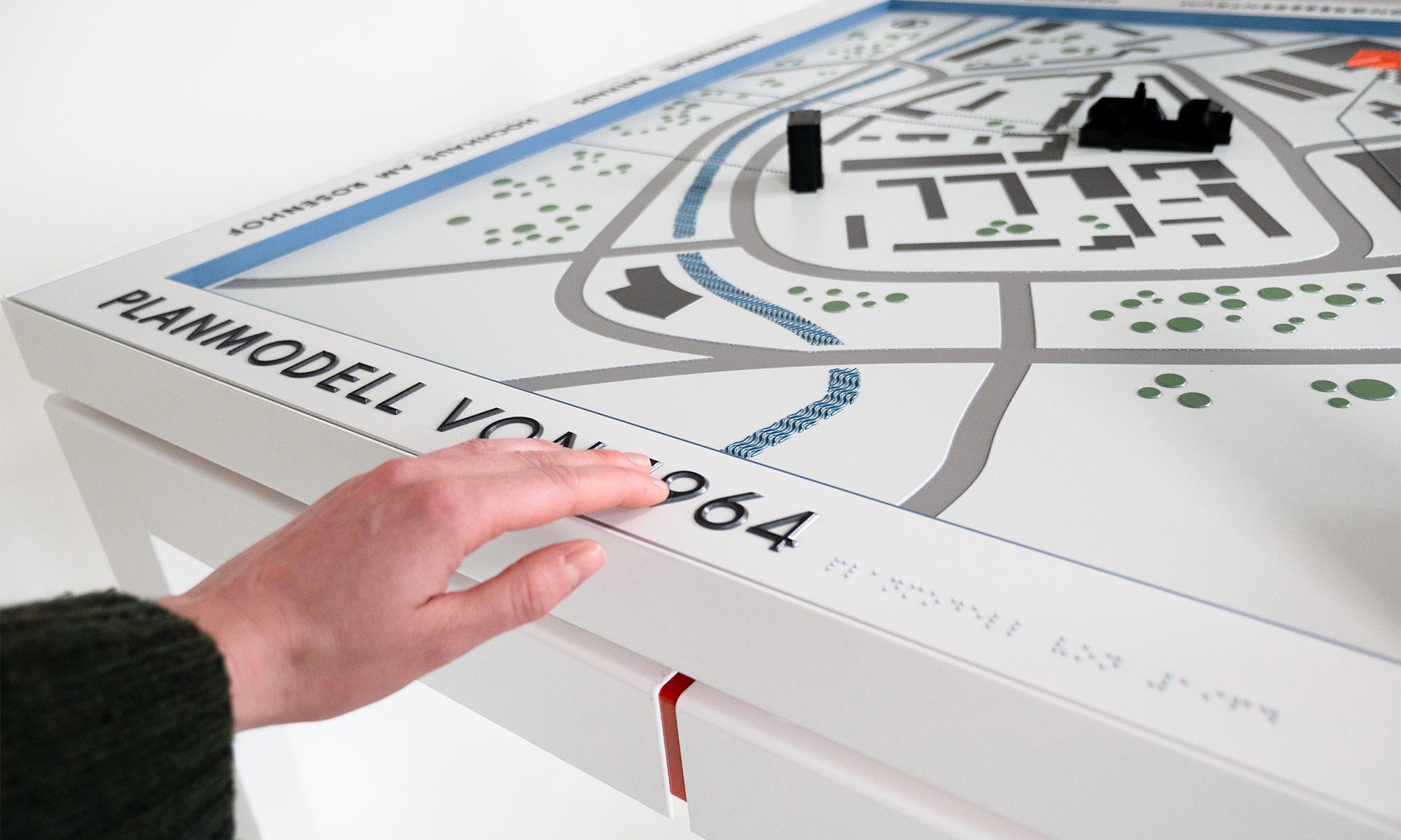
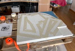
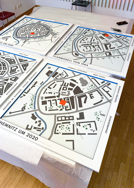
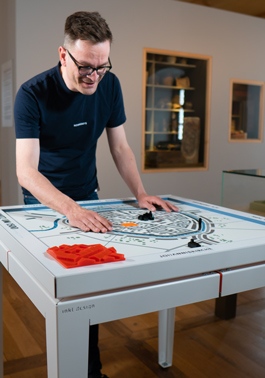
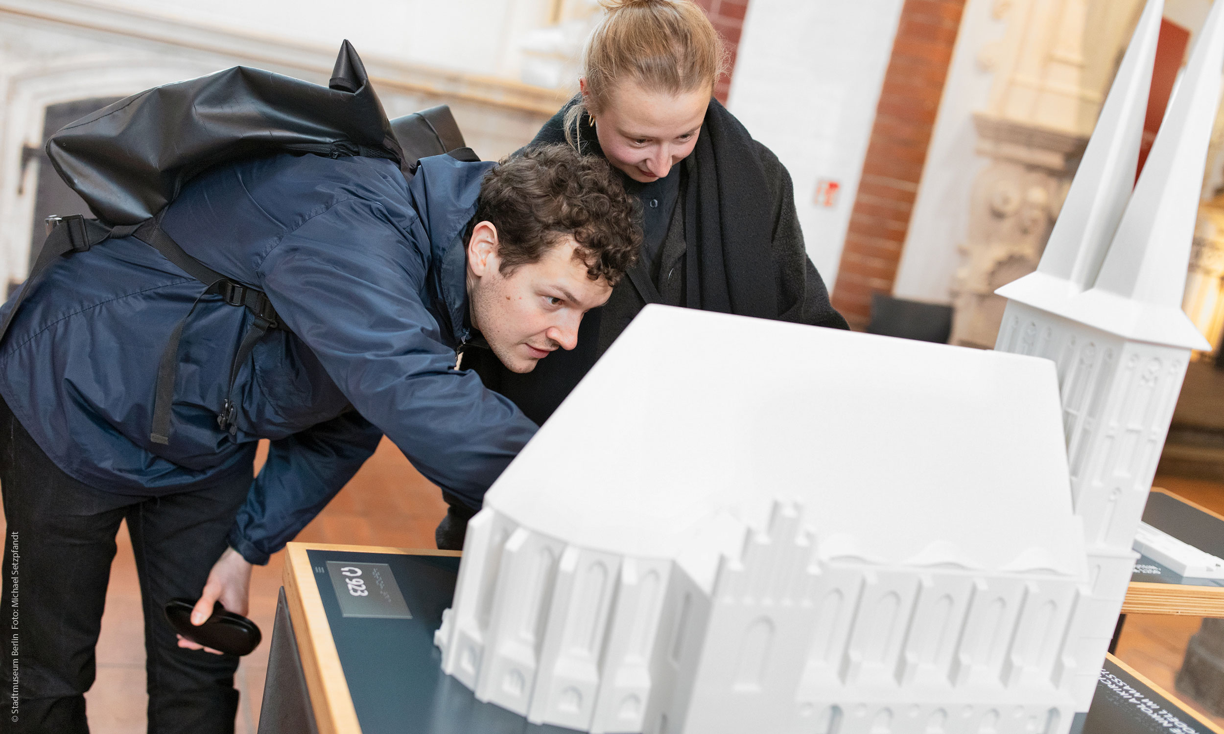
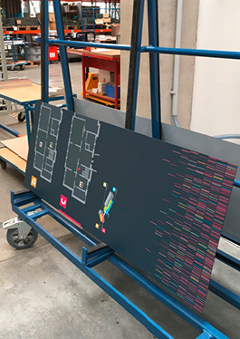
The four tactile city models show the respective development around 1500, around 1930 and 2020. One of the models is a plan model from 1960, documenting the urban planners’ ideas for the construction of an ideal city according to the standards of a socialist society.

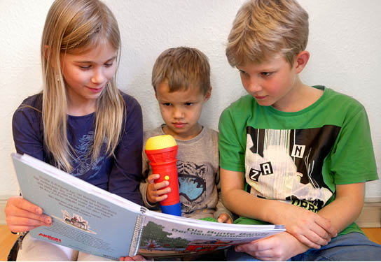
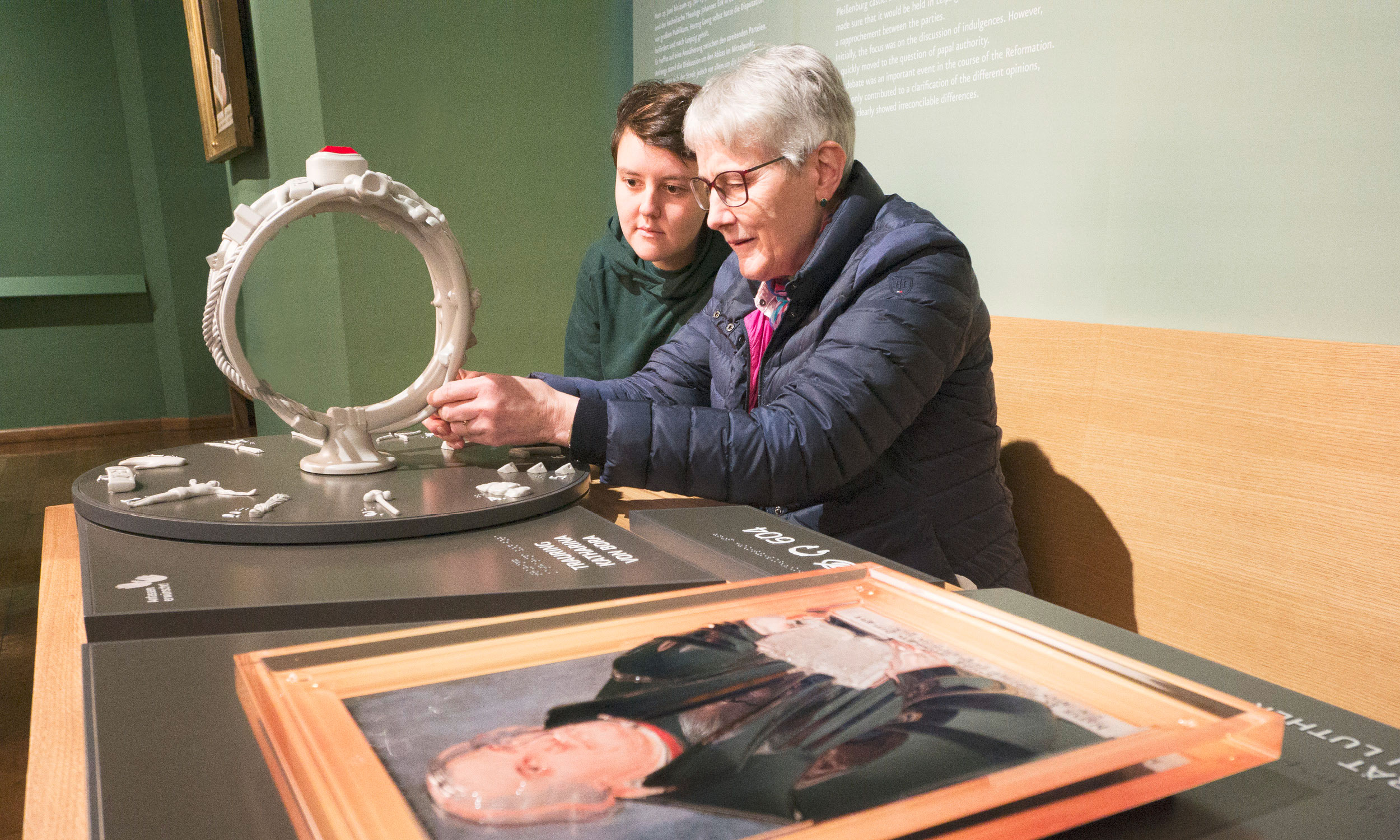
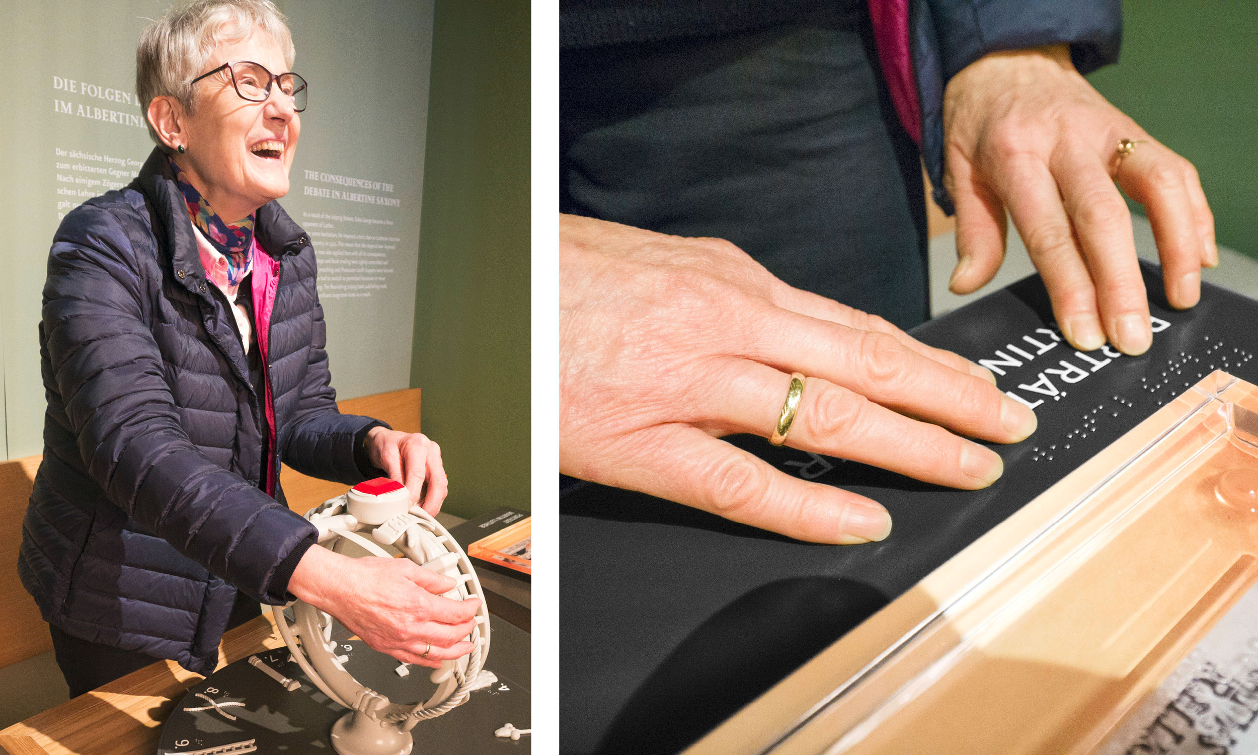
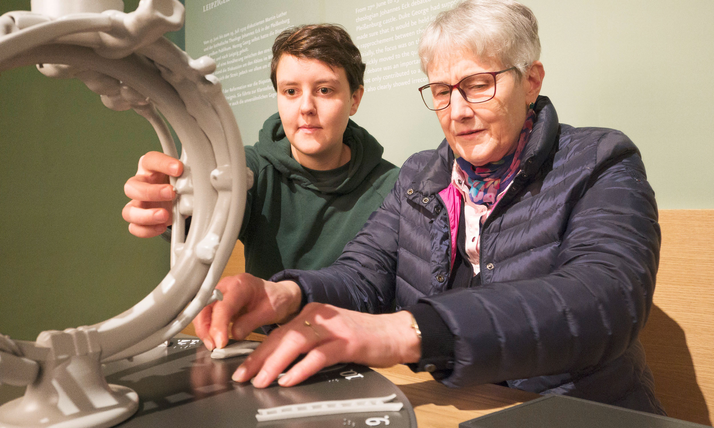
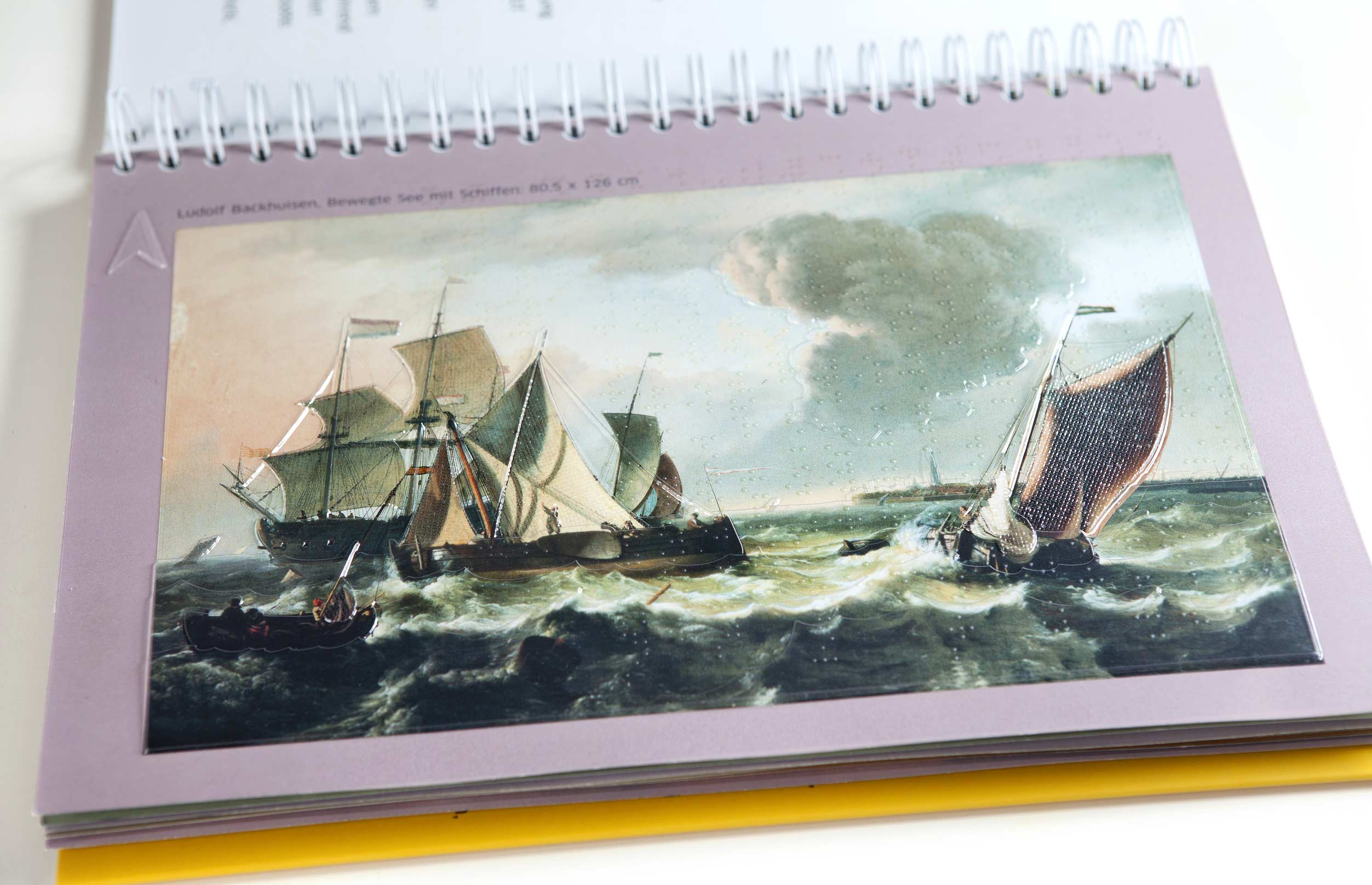
In their parallelism, the models are the ideal extension of the already existing representations and offer blind, visually impaired and sighted people the opportunity to tactilely trace the urban development of Chemnitz from a small trading center to a bustling metropolis.

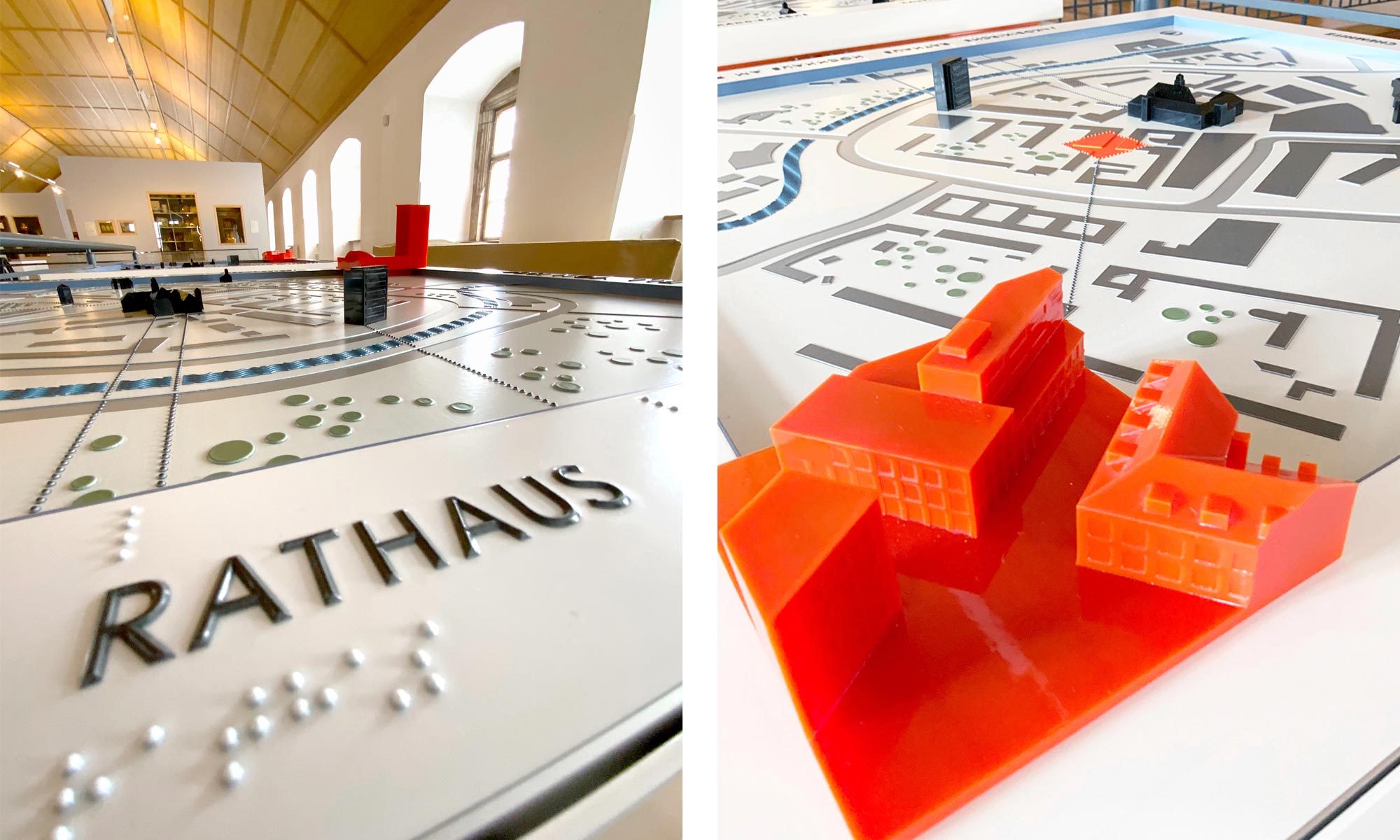
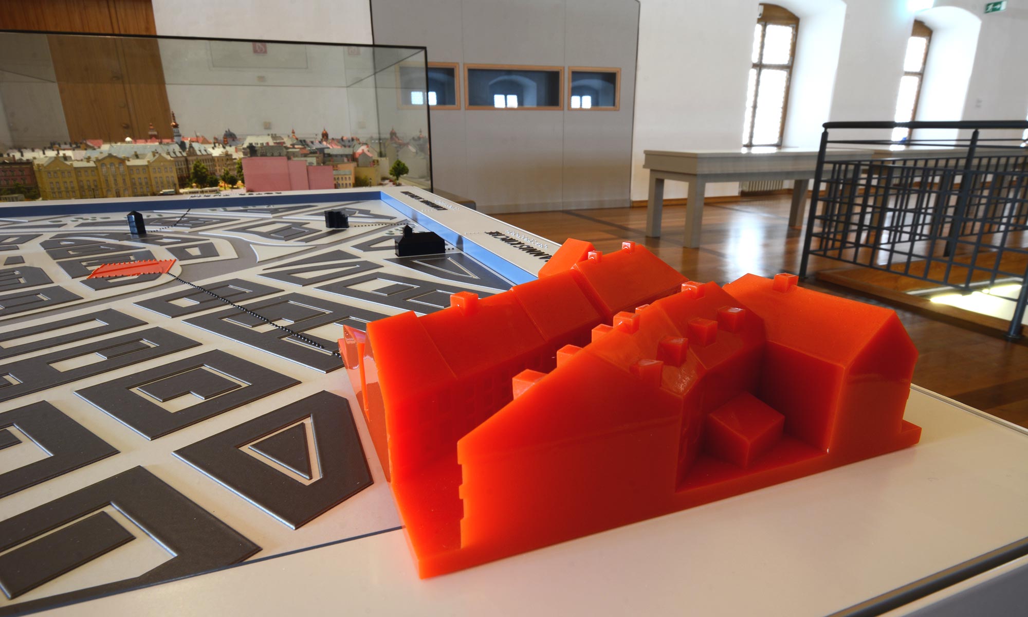
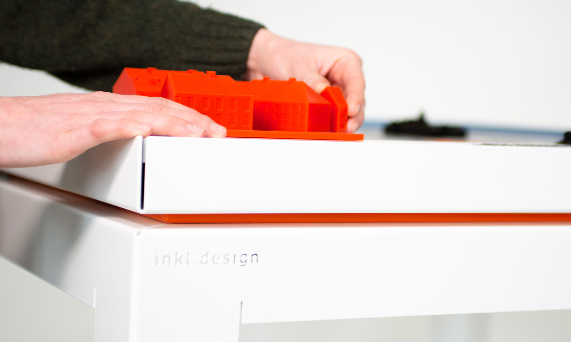
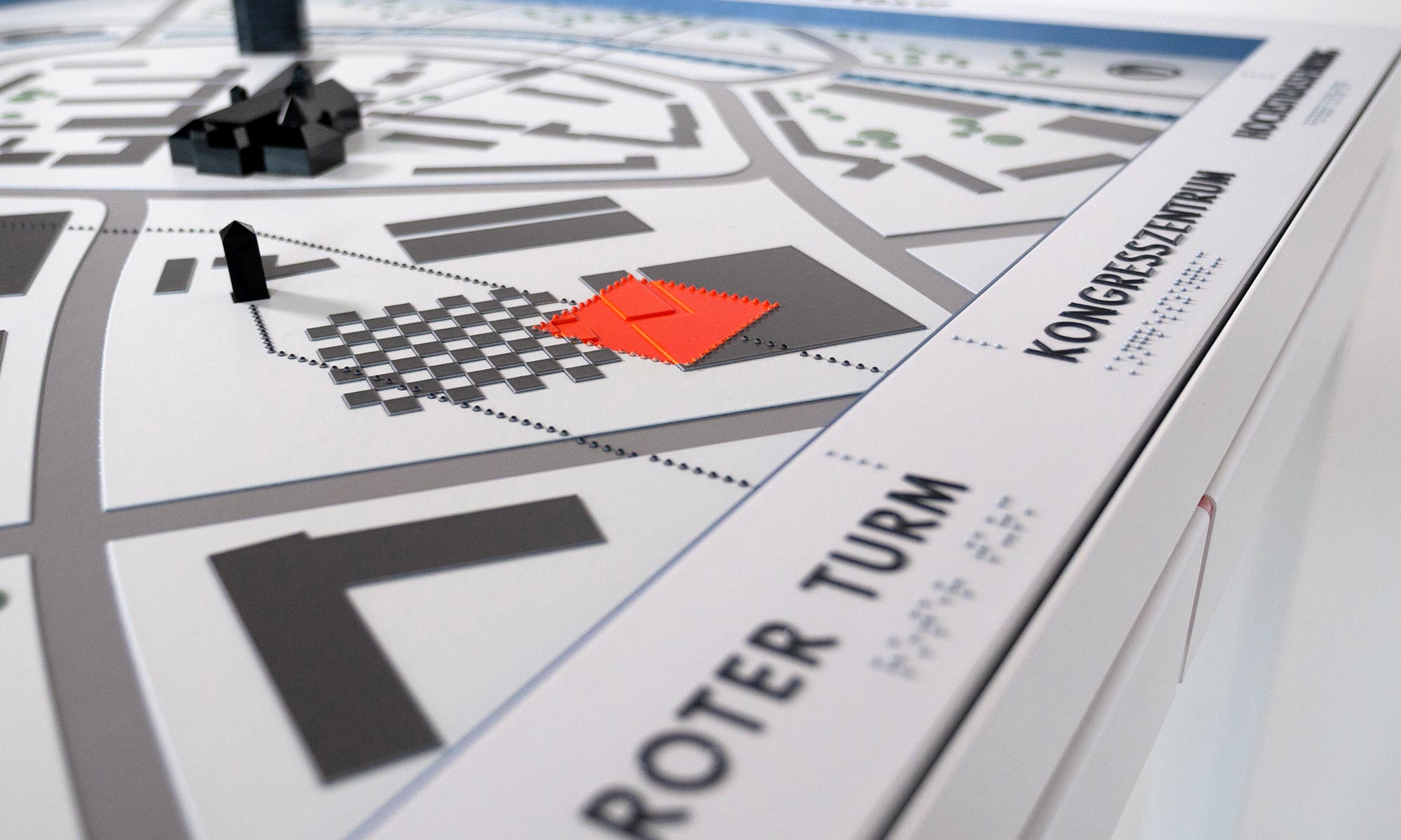
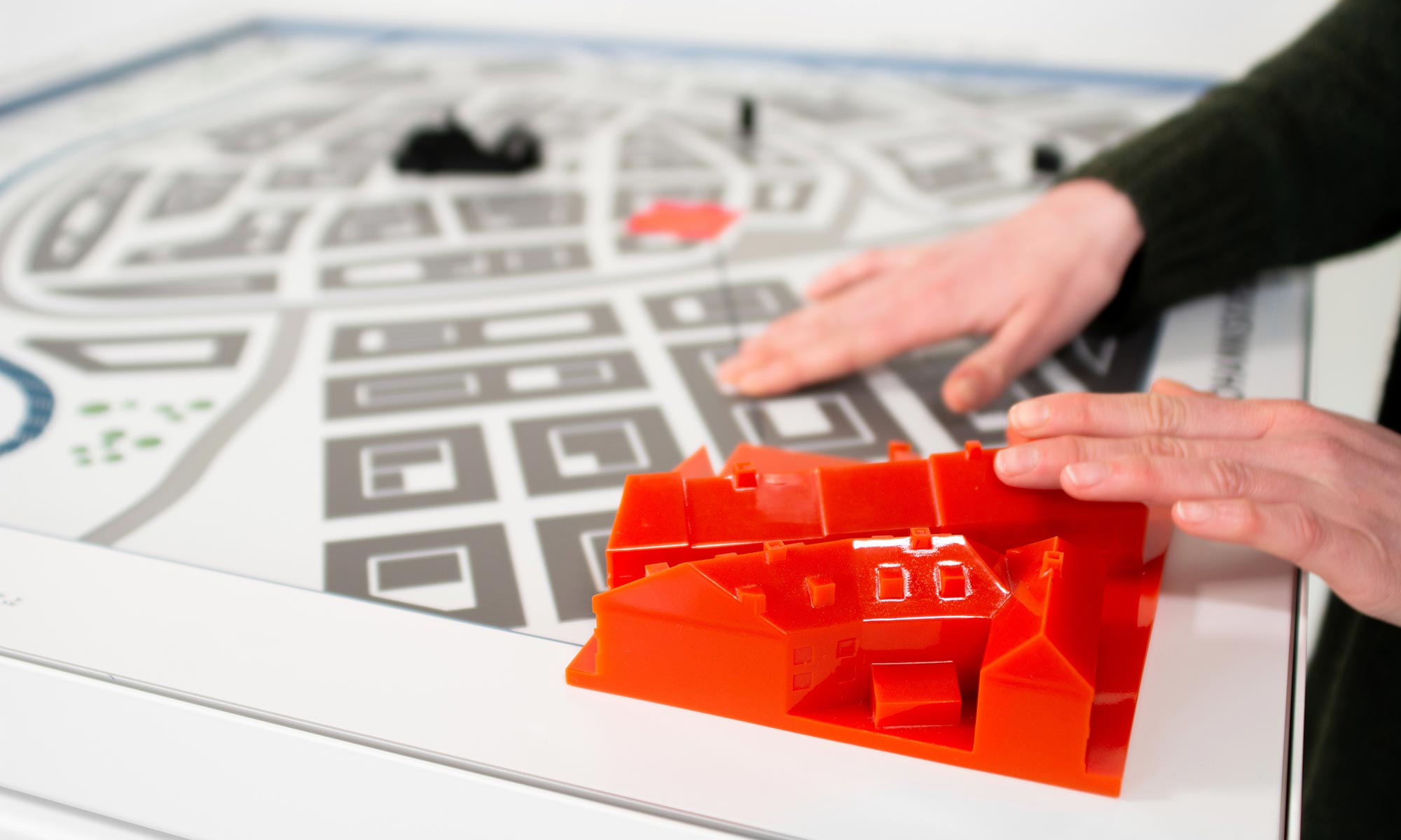
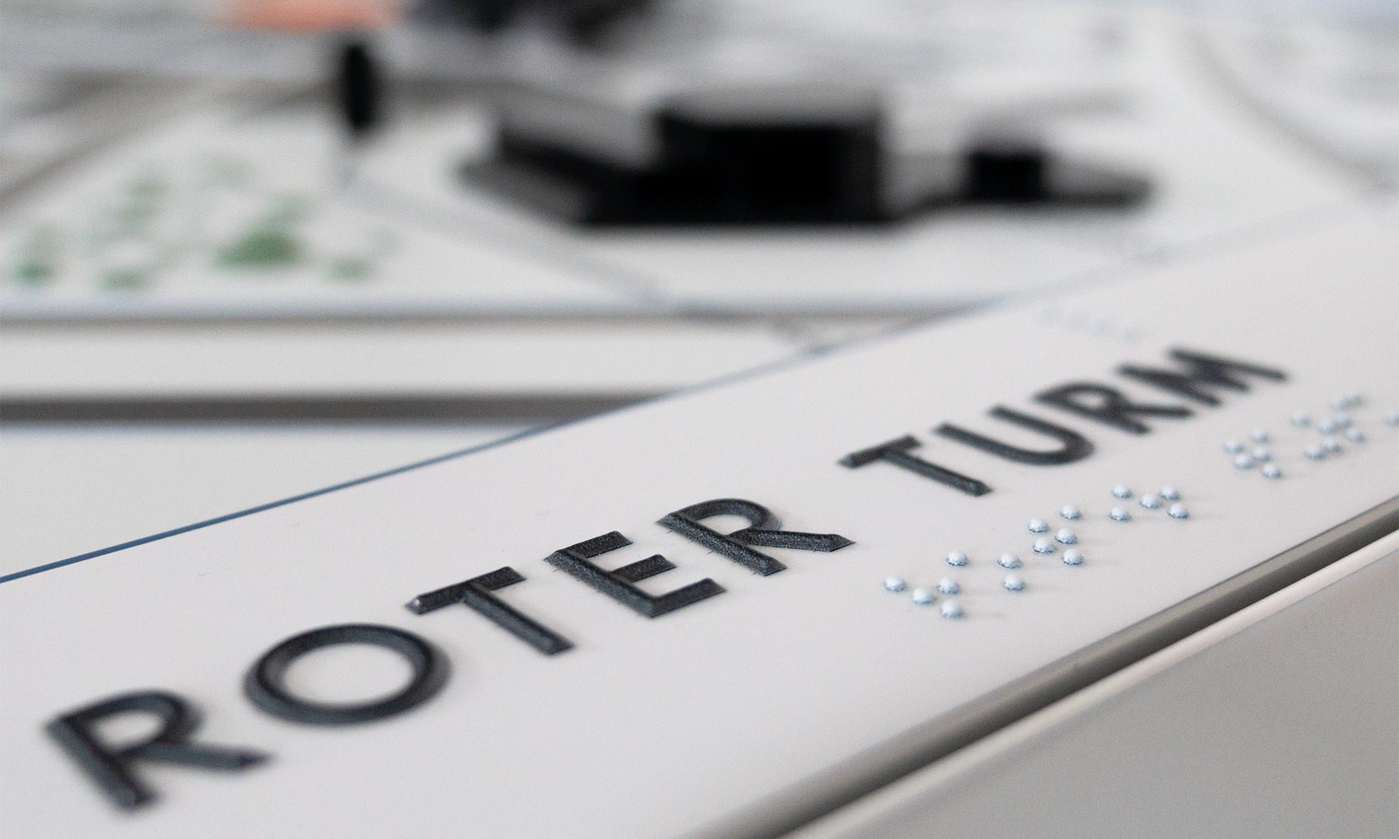
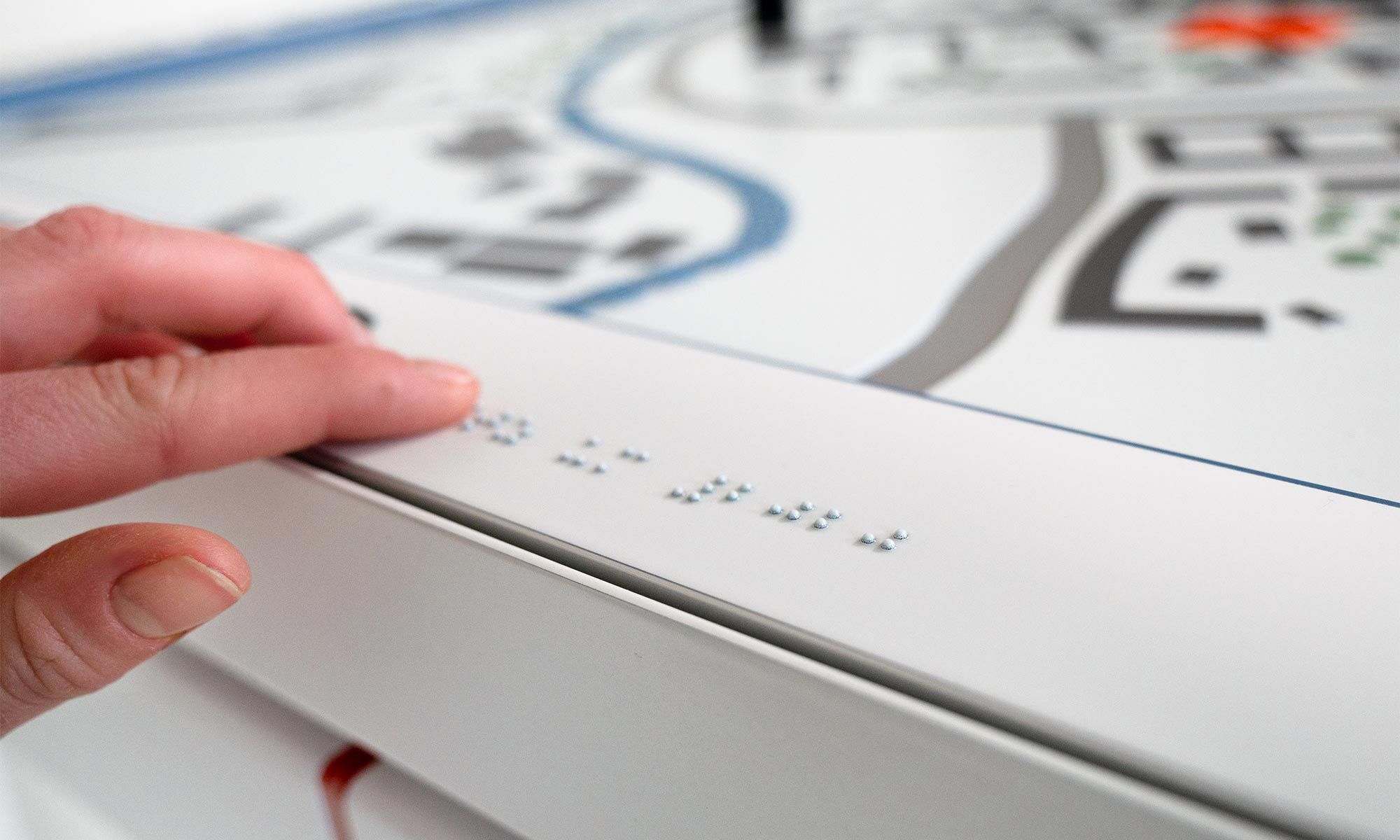
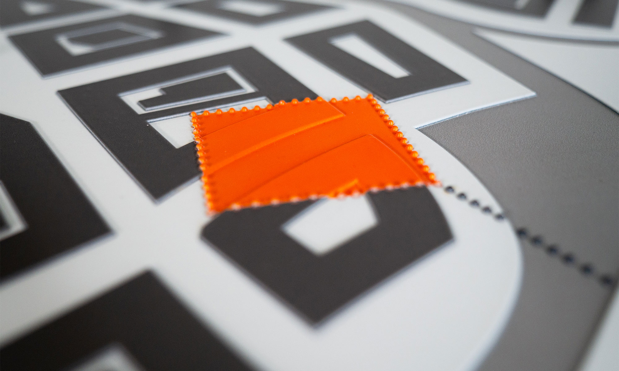
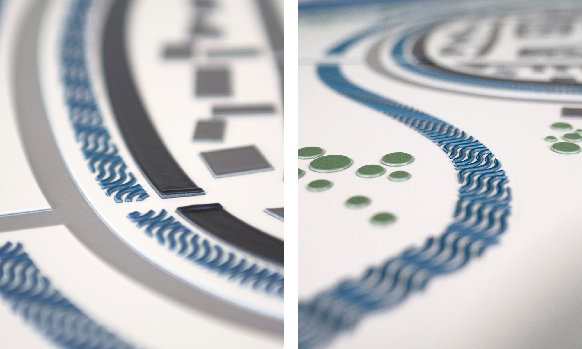
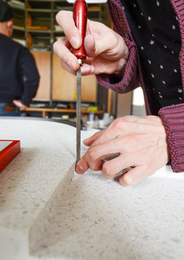
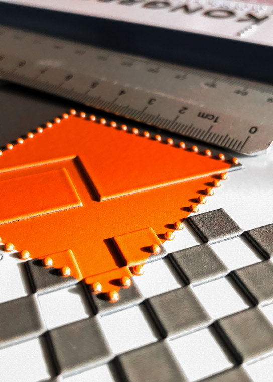
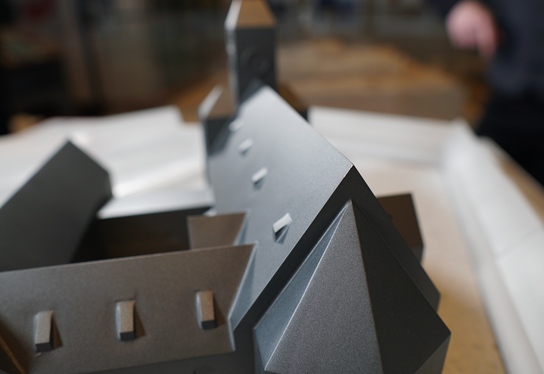
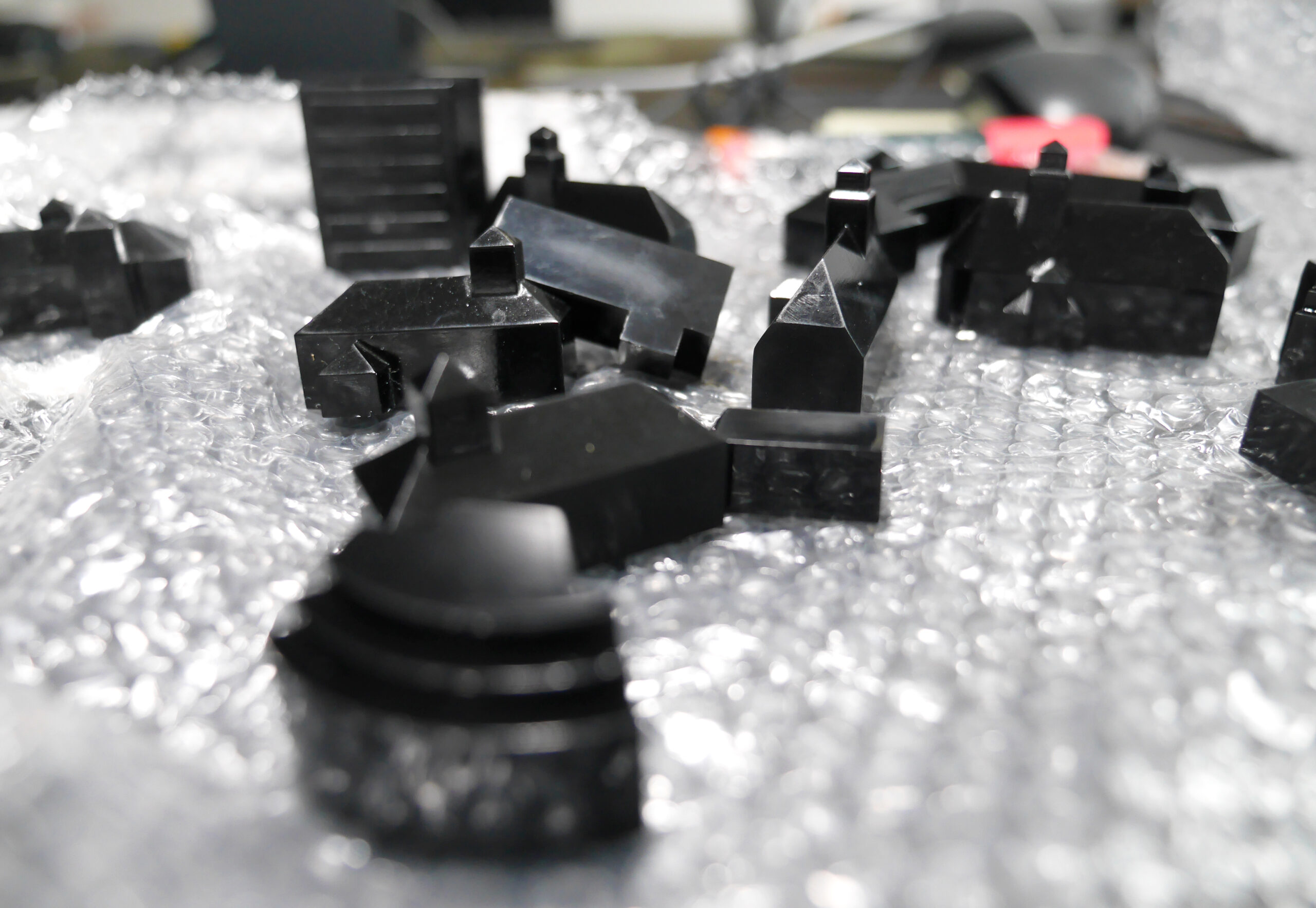
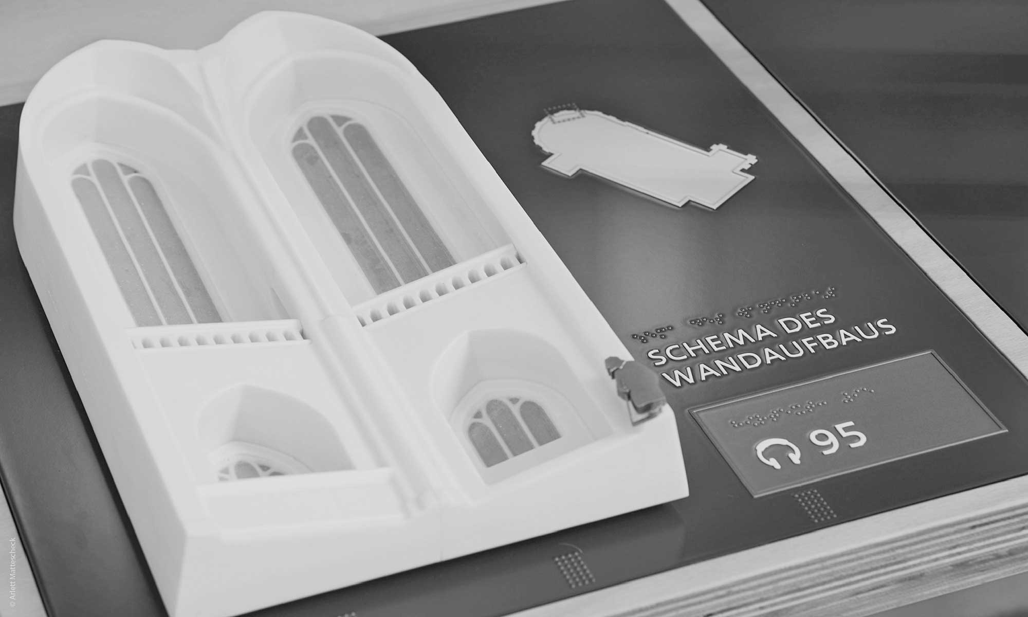
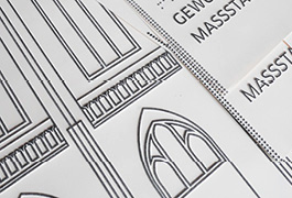
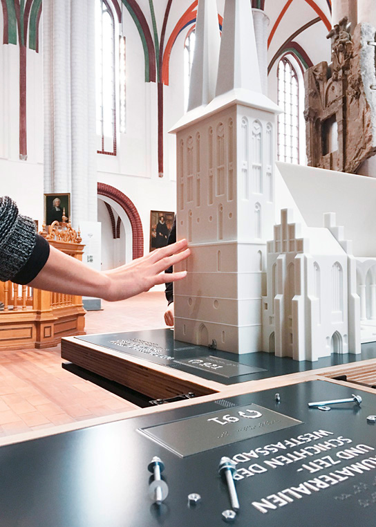
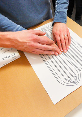
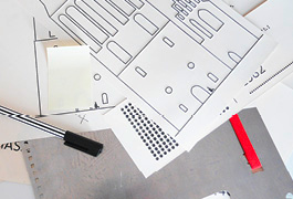
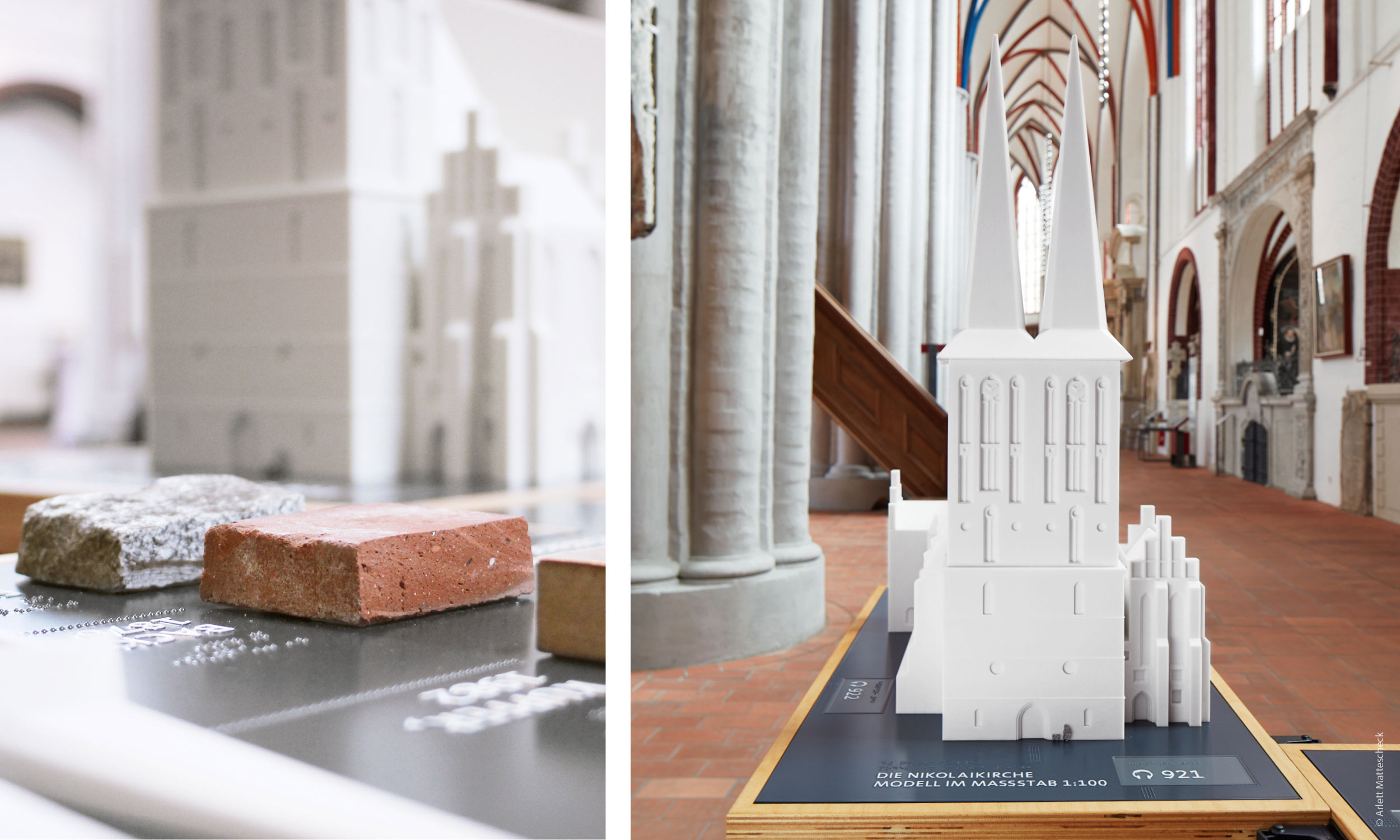
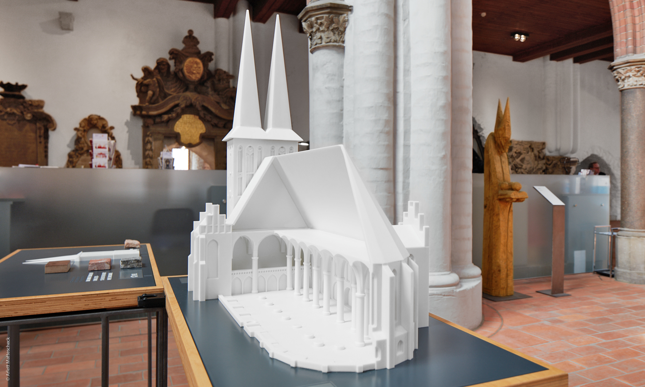
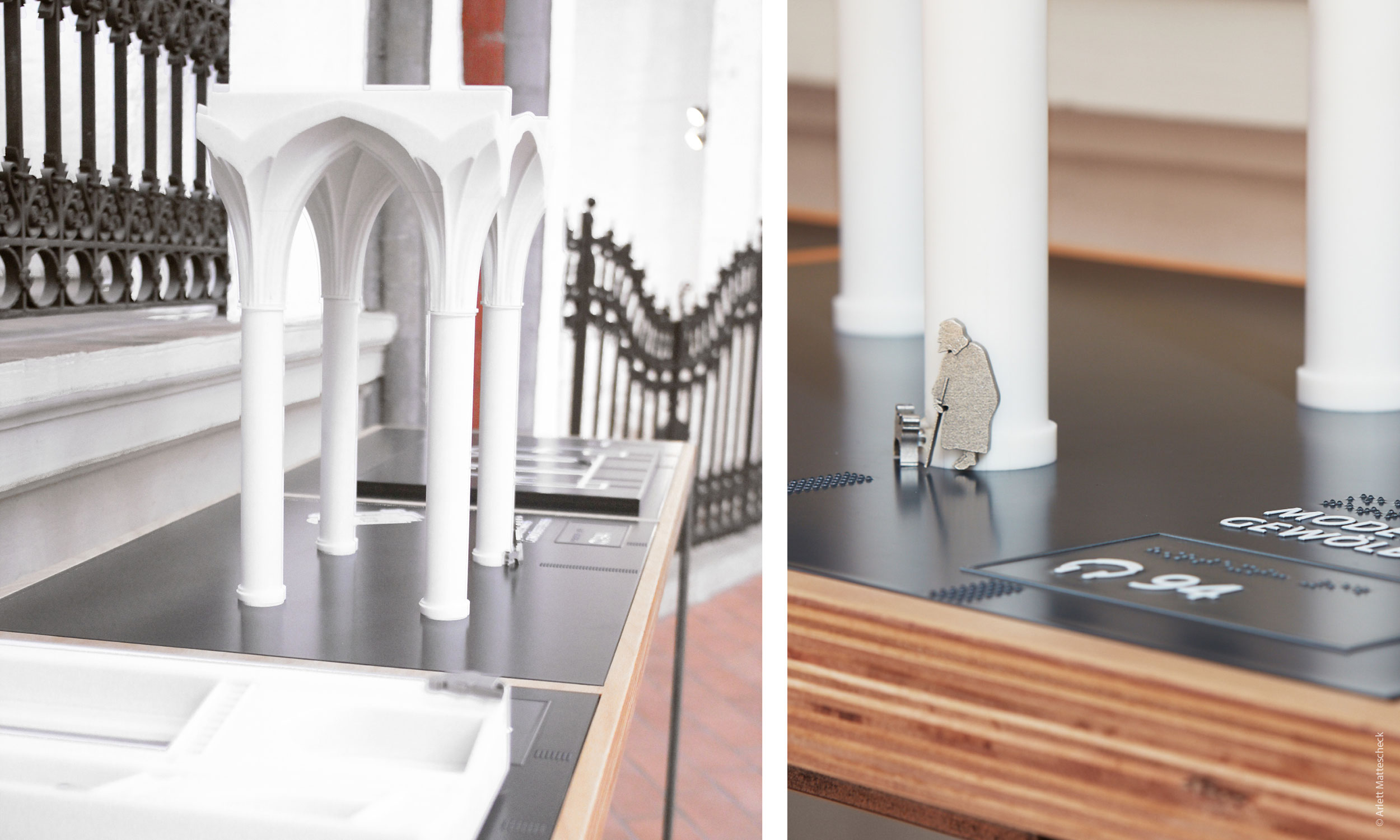
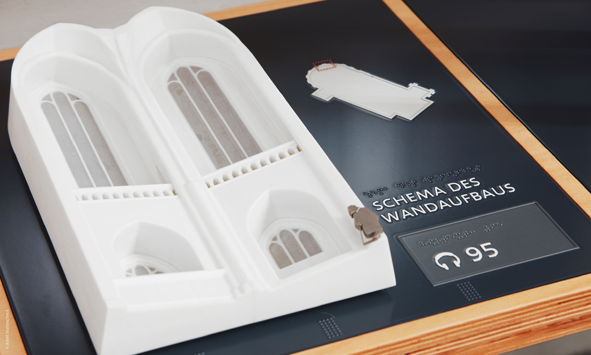
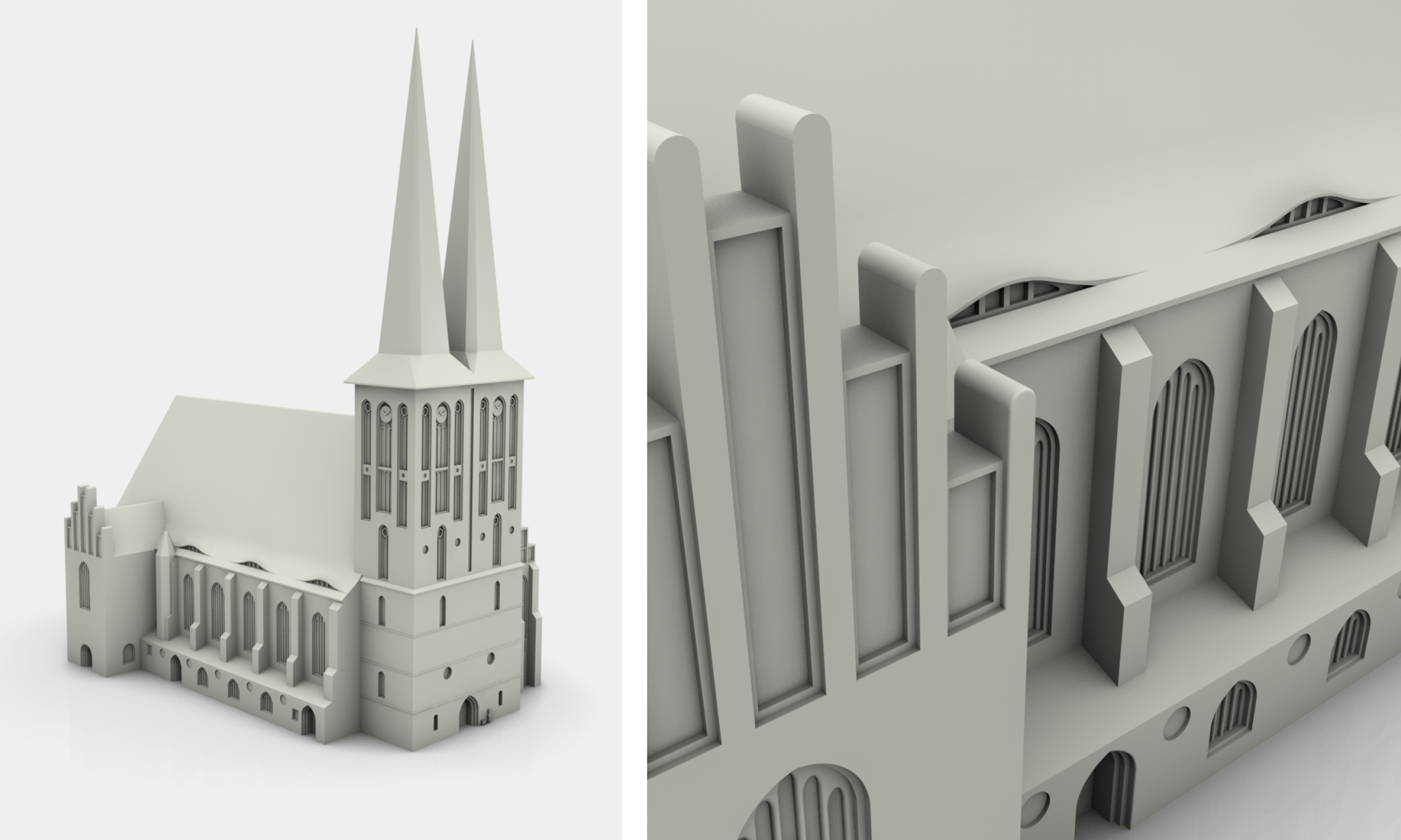
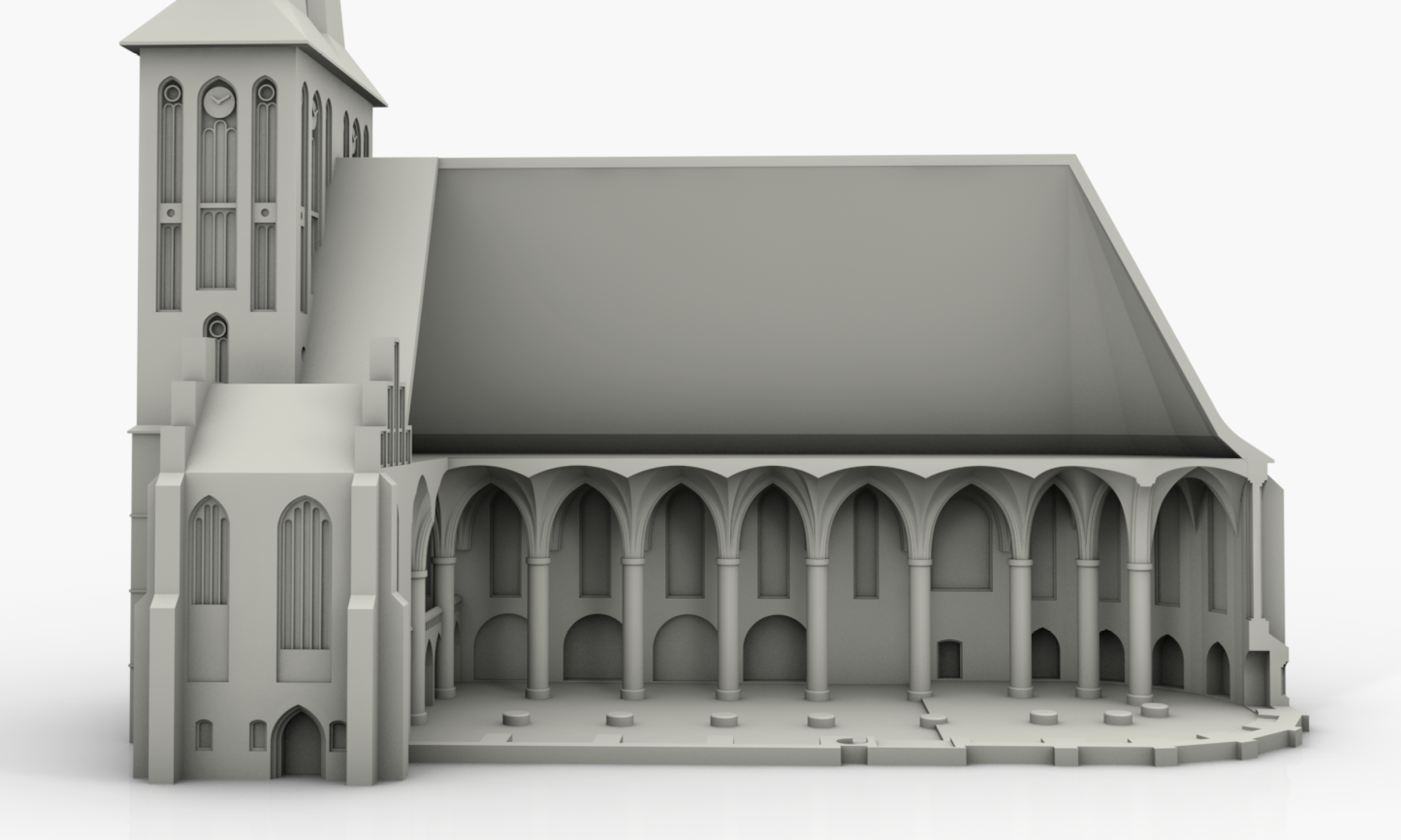
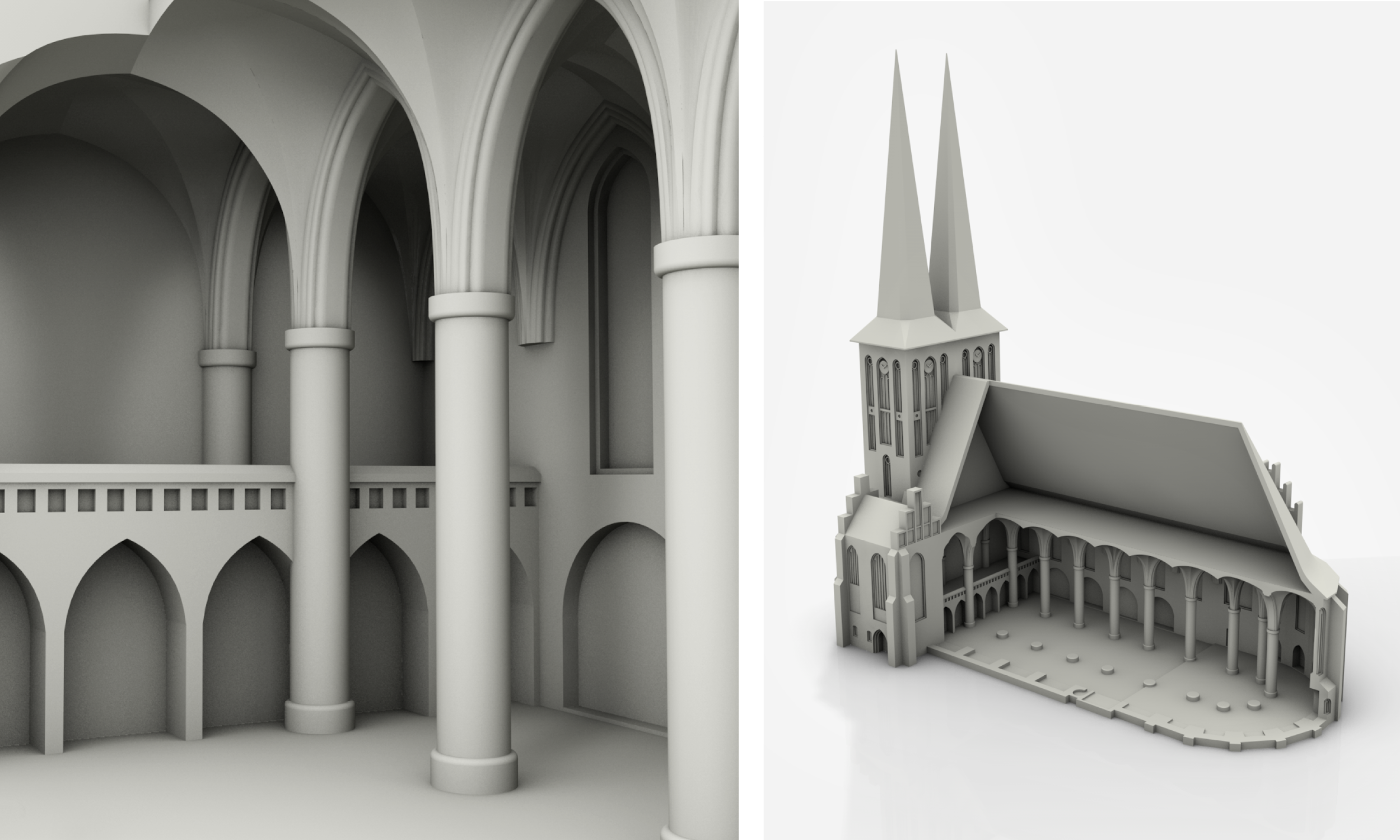
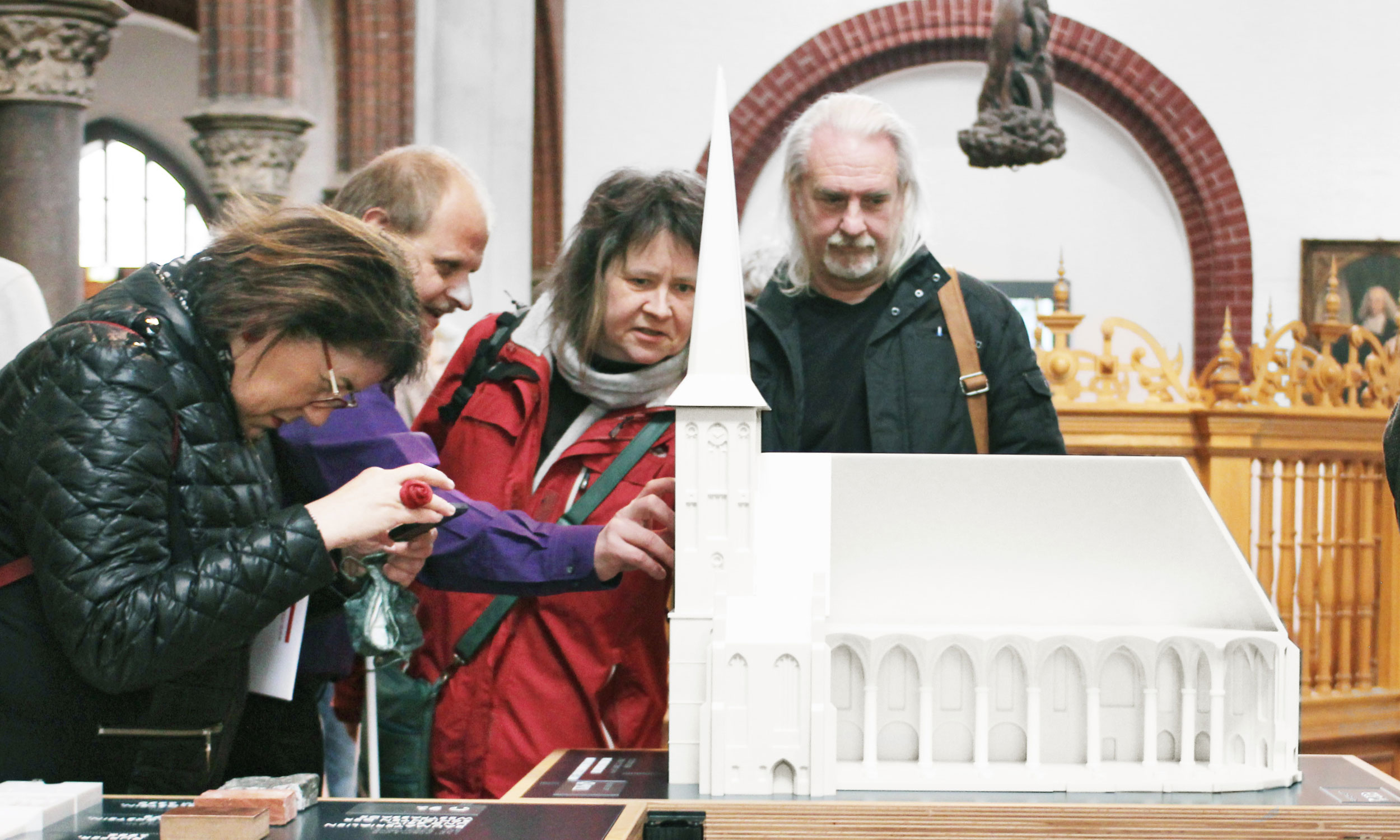
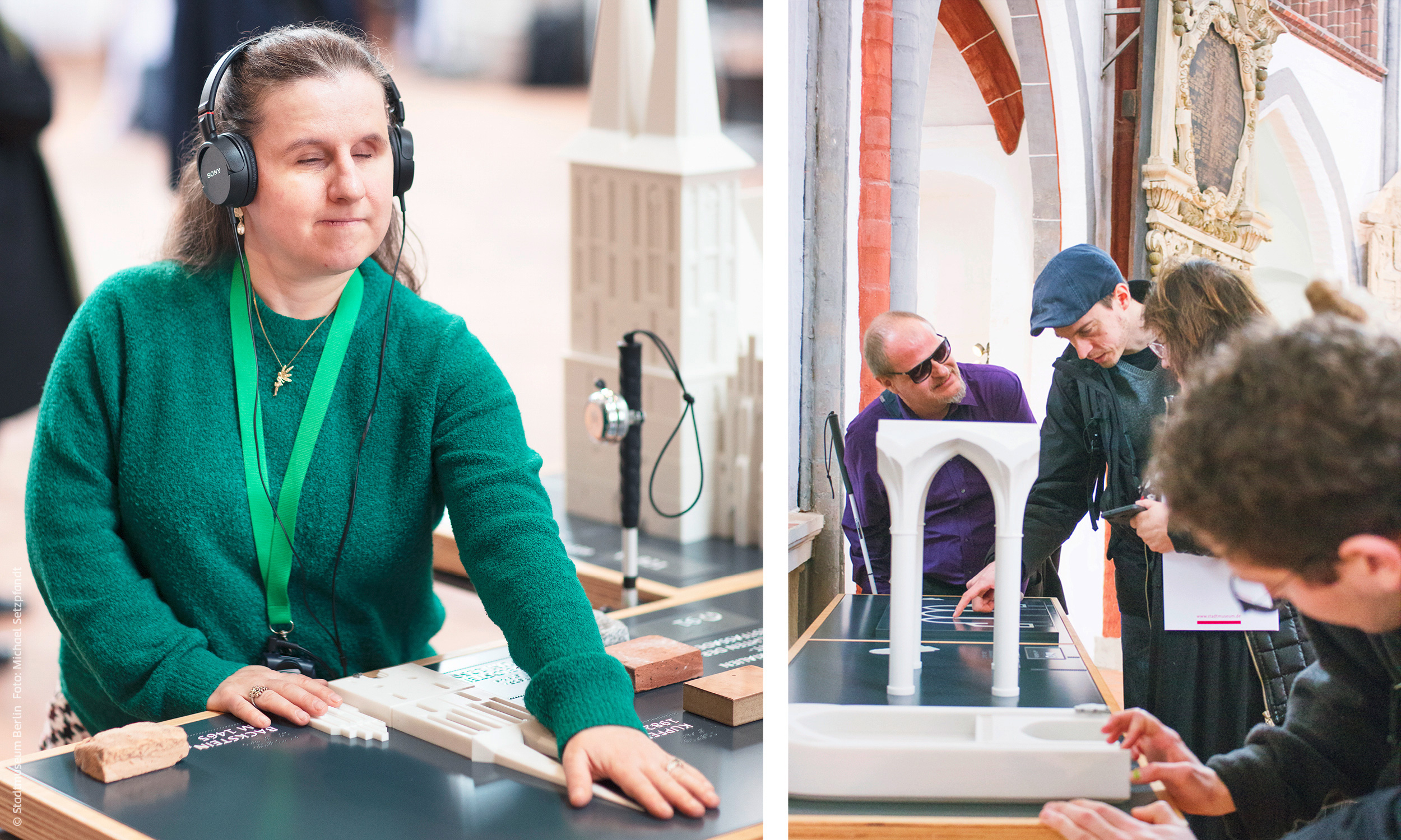
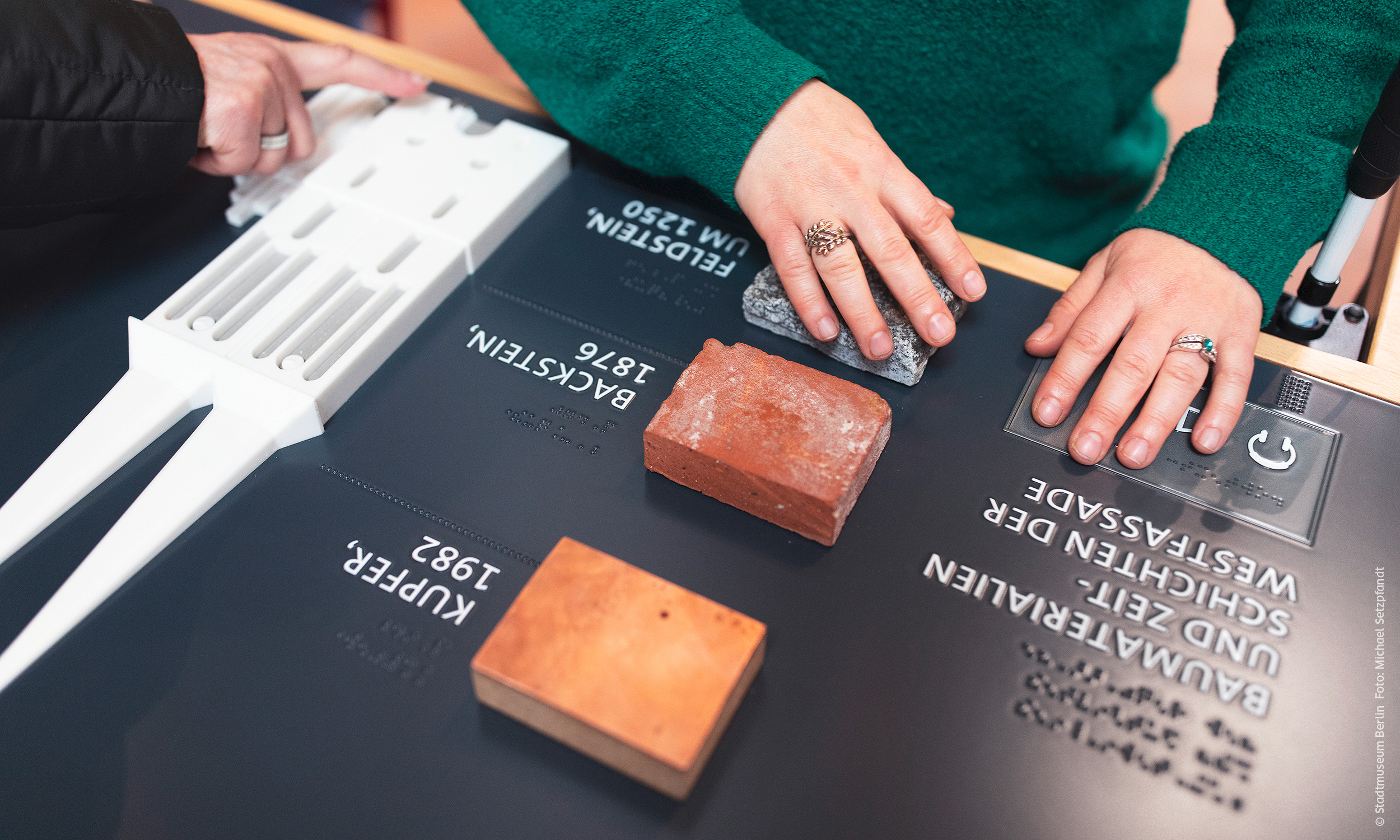
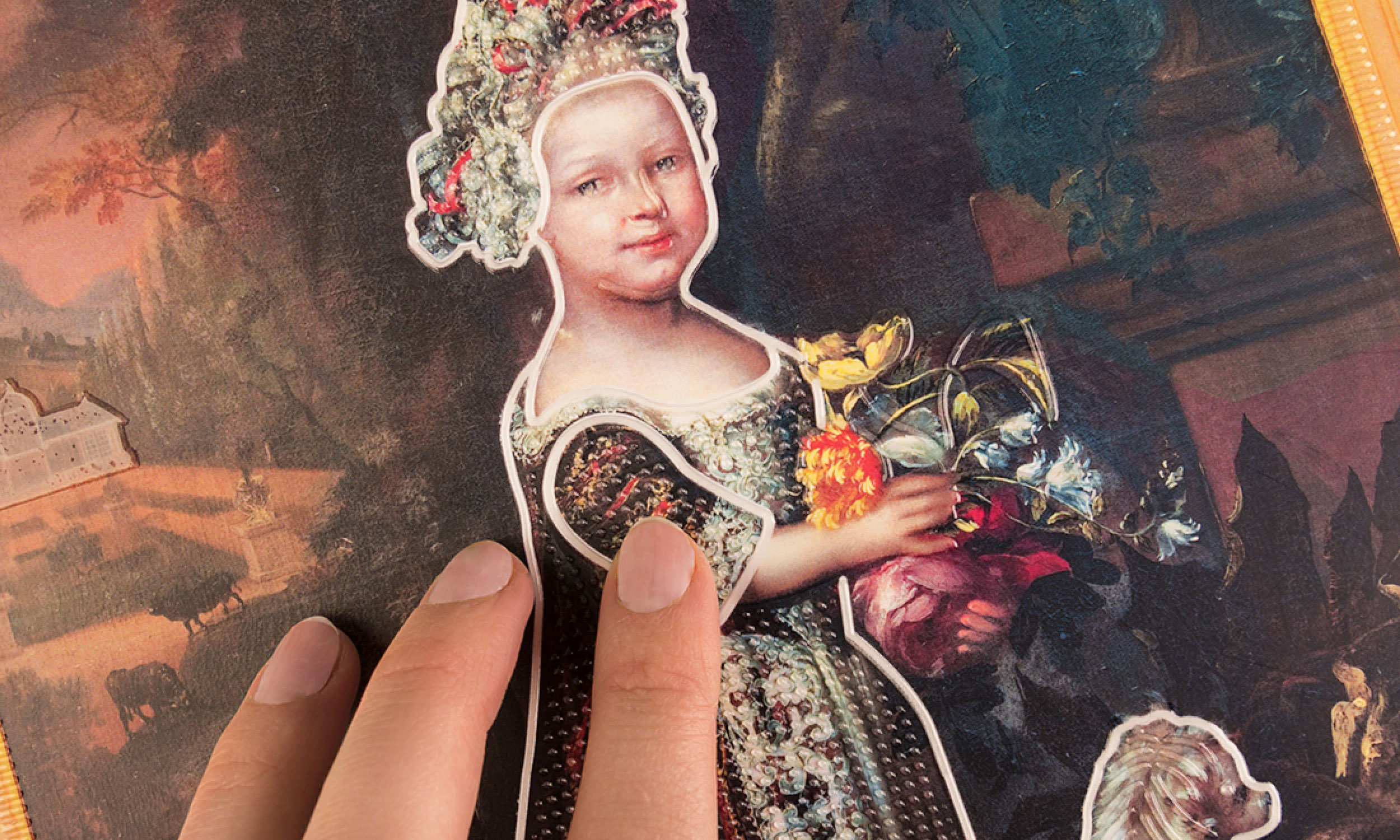
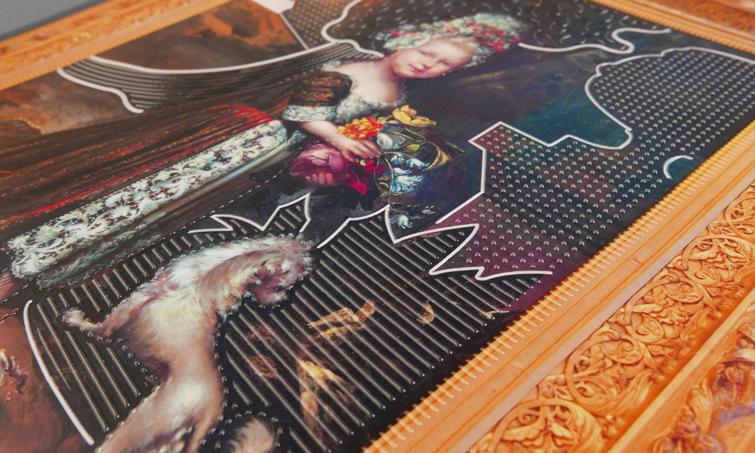
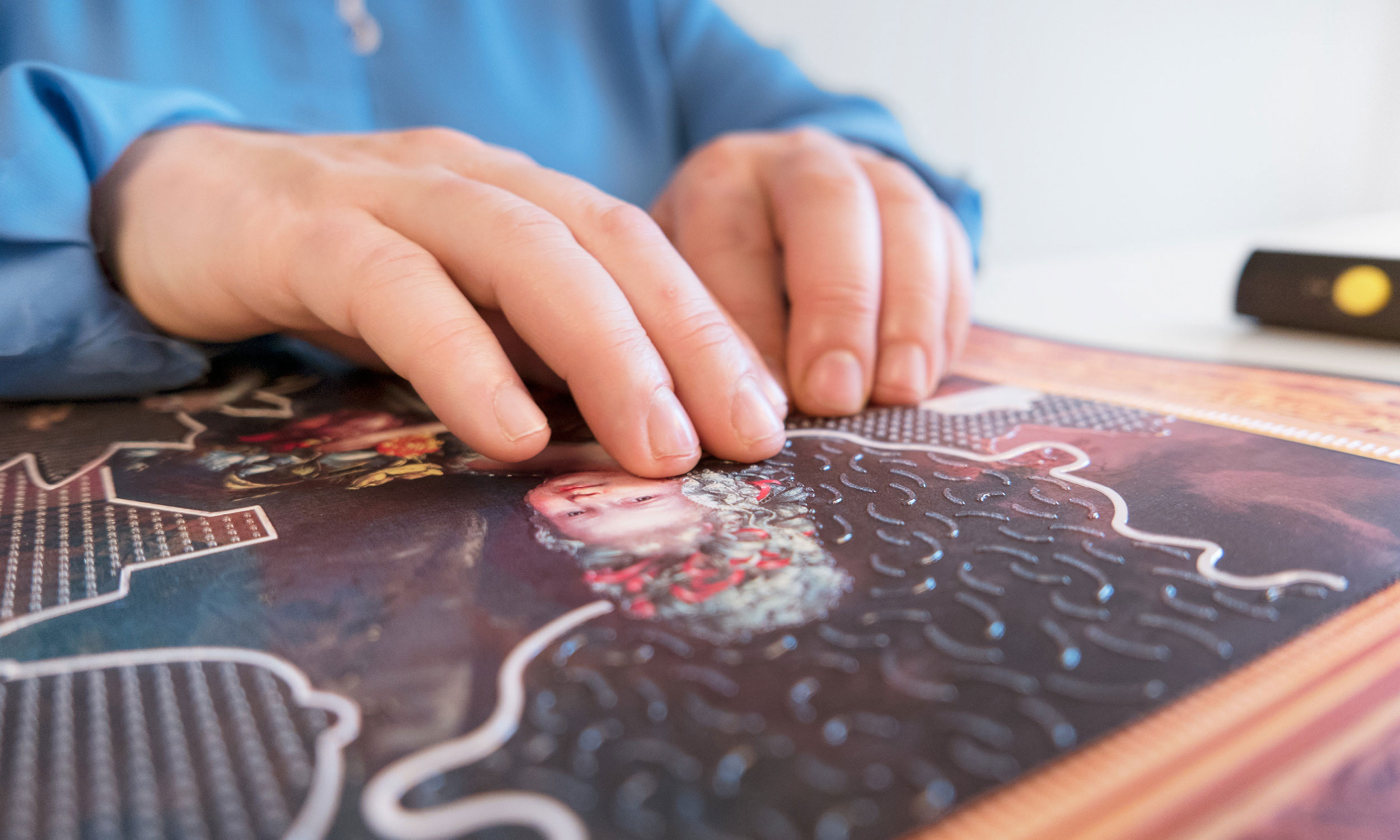
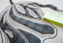
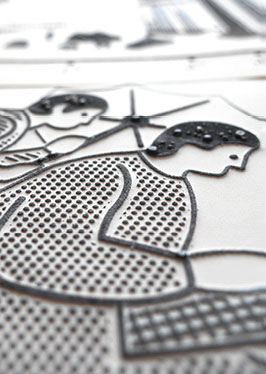
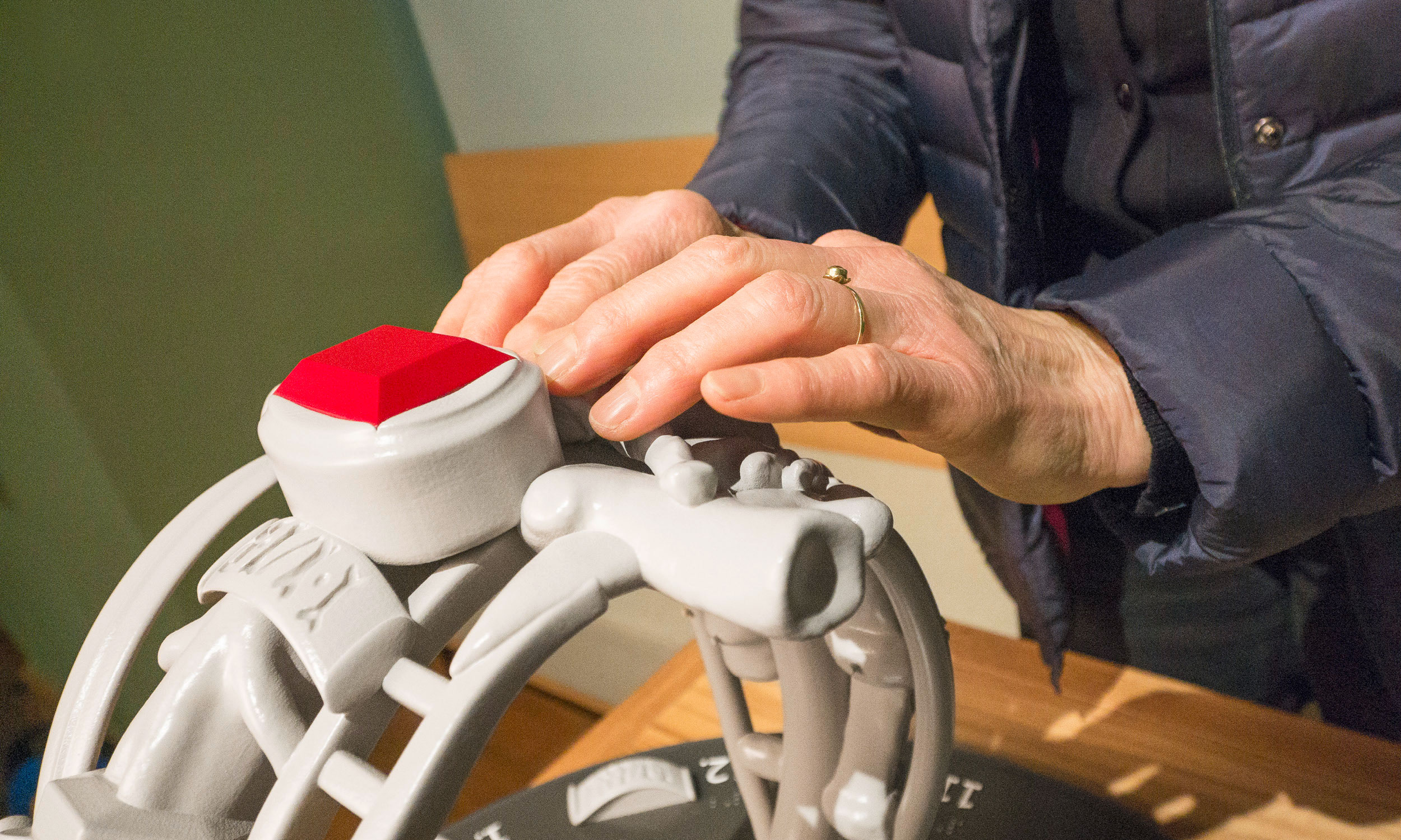
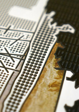
On each tactile model, the planar expansion of the city was tactilely highlighted and structural constants such as the City Hall, St. Jacob’s Church, the Red Tower, St. John’s Church and the Kaufhaus Schocken were set up as 3D models. They serve as fixed points for orientation in the course of the streets.

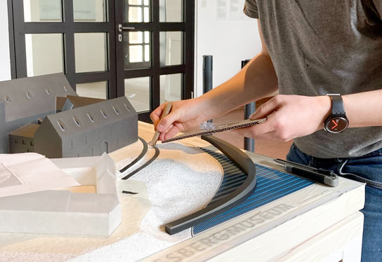
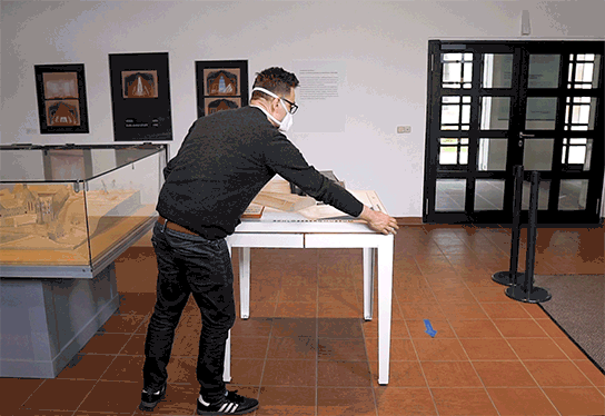
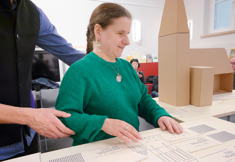
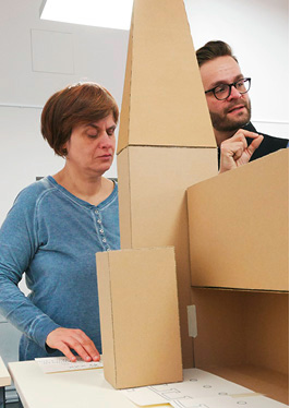
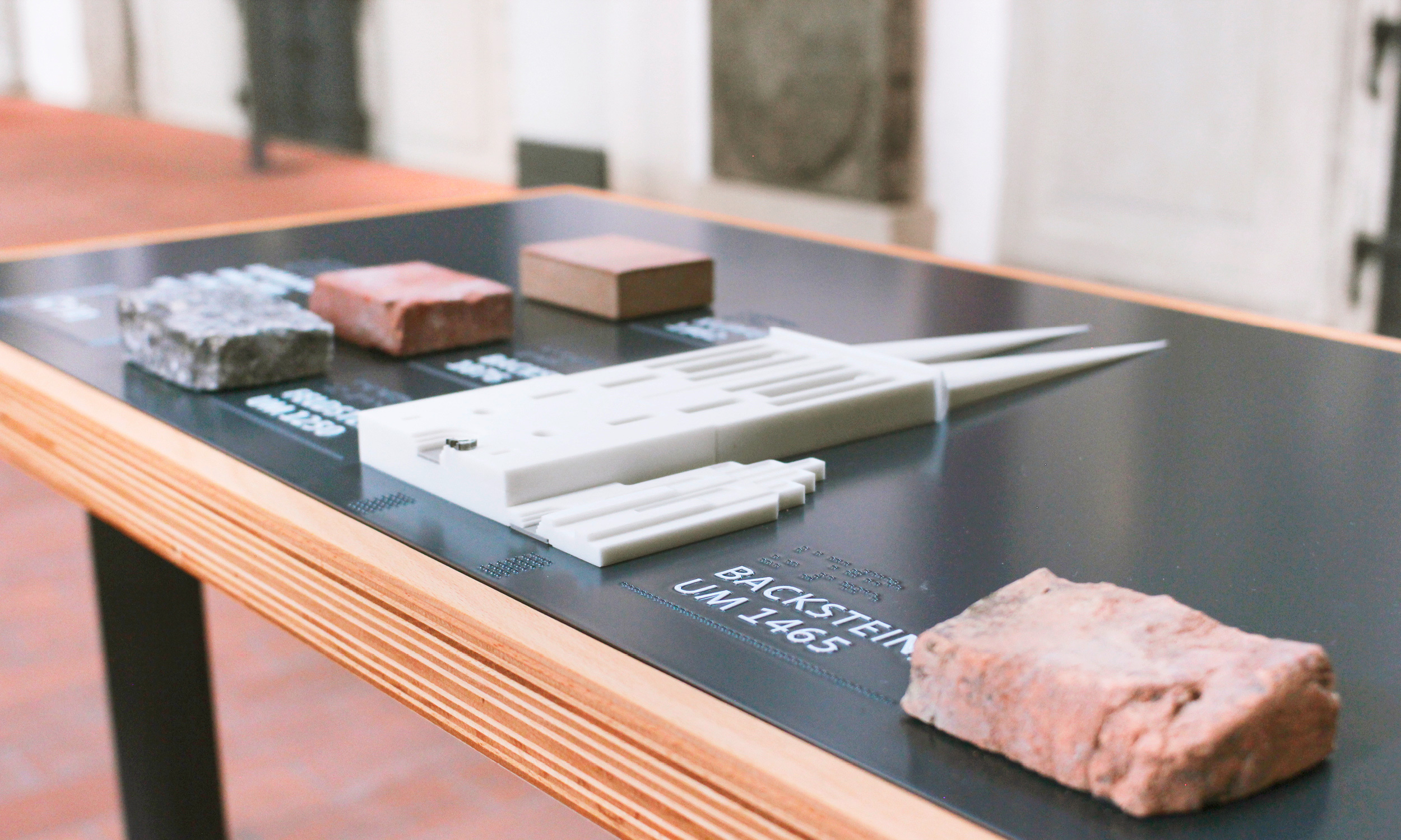
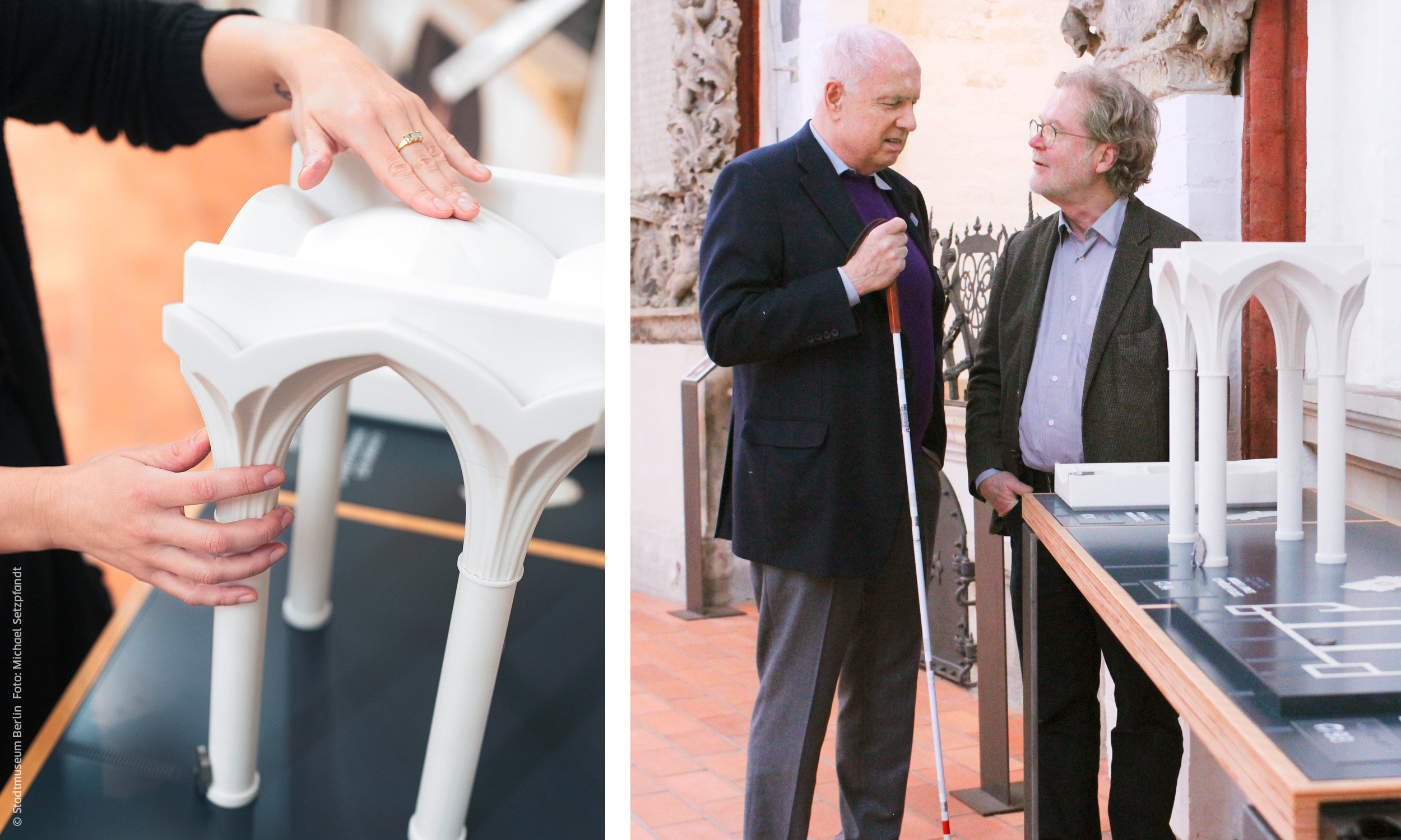
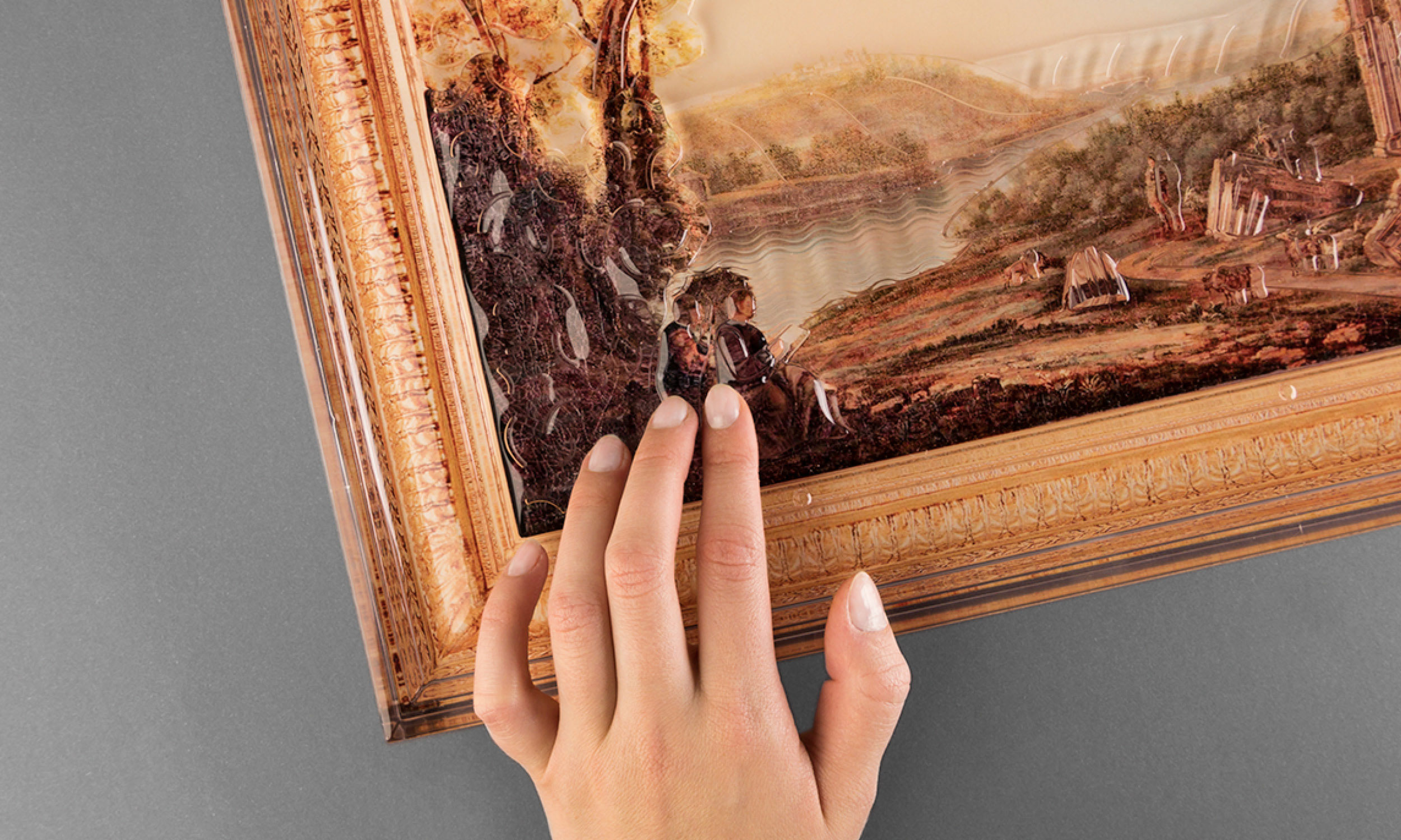
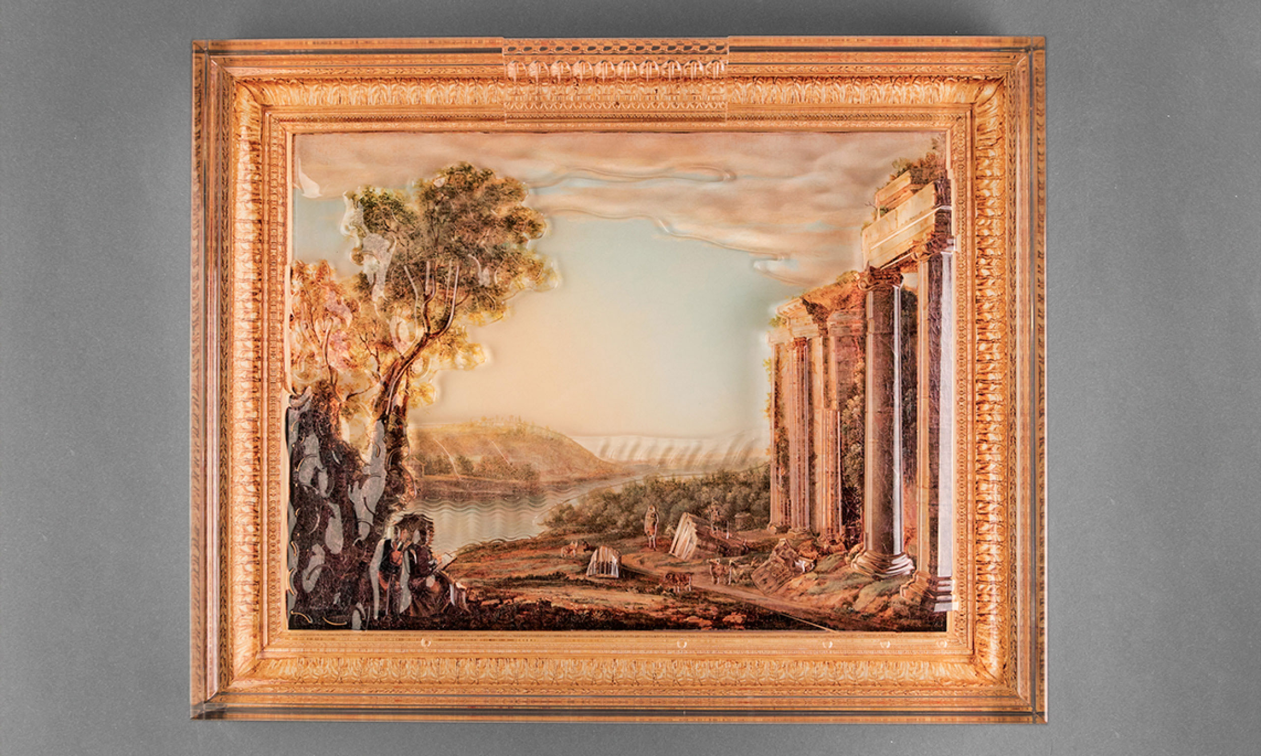
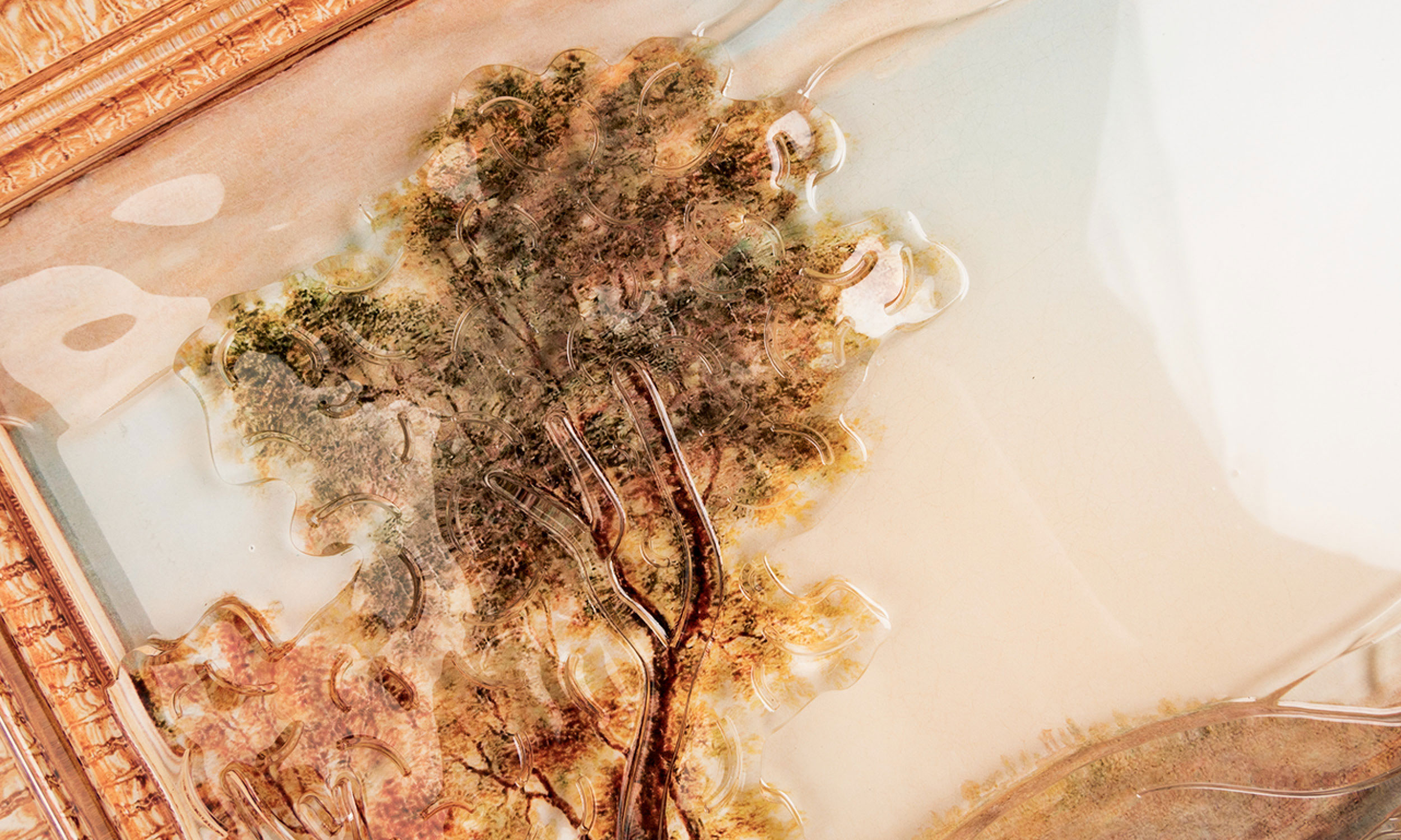
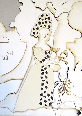
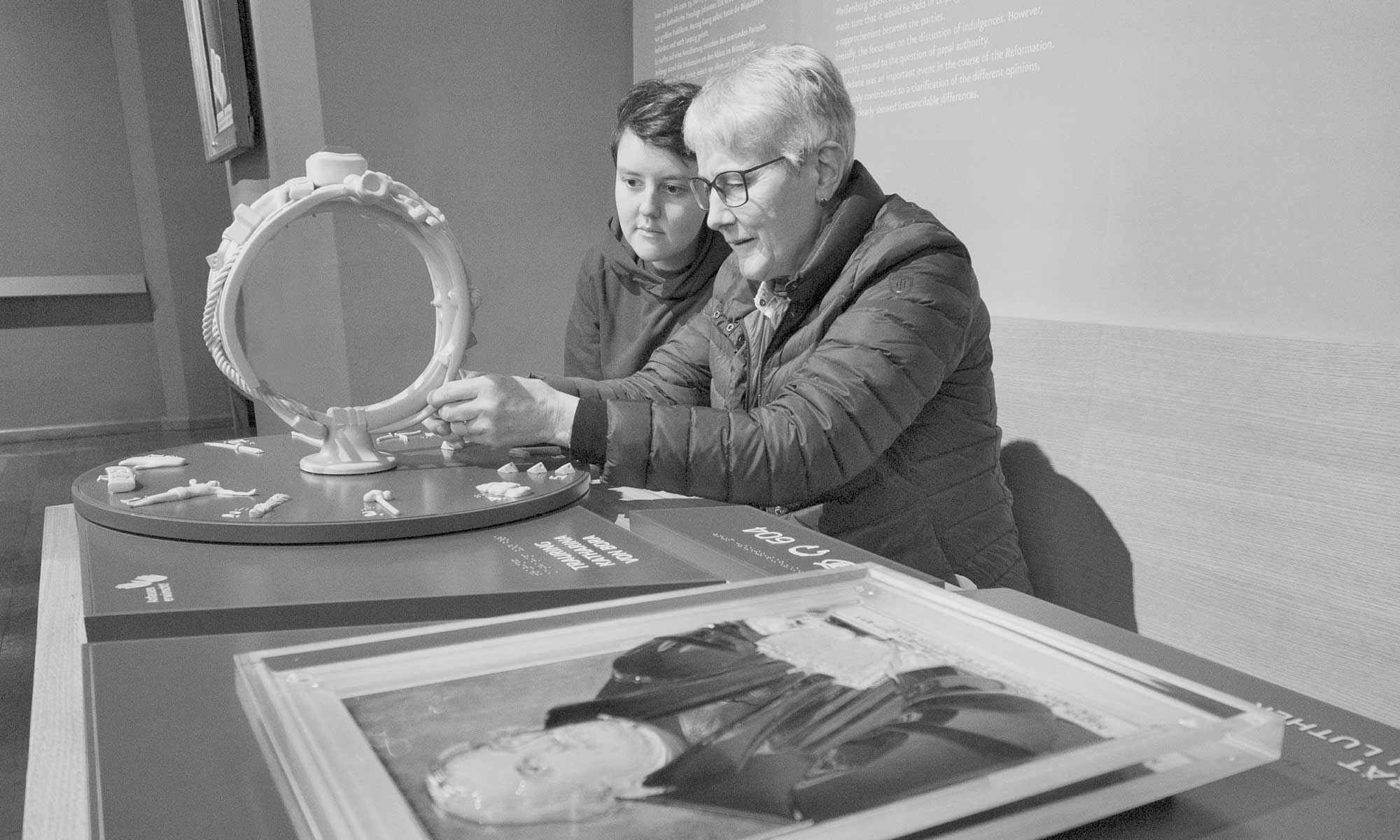
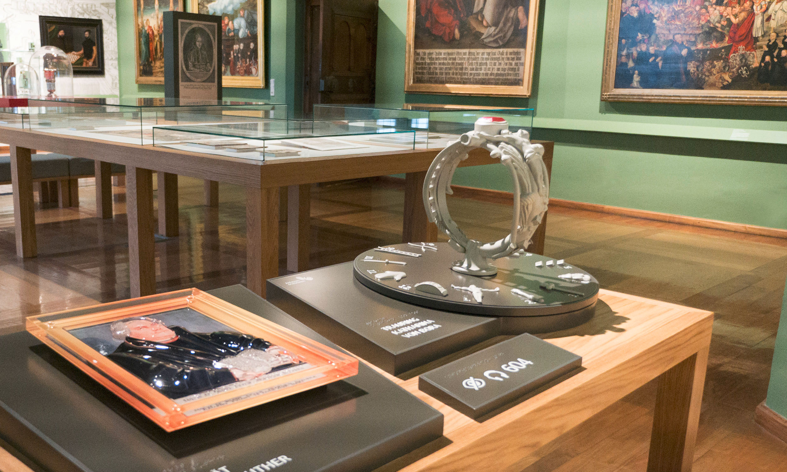
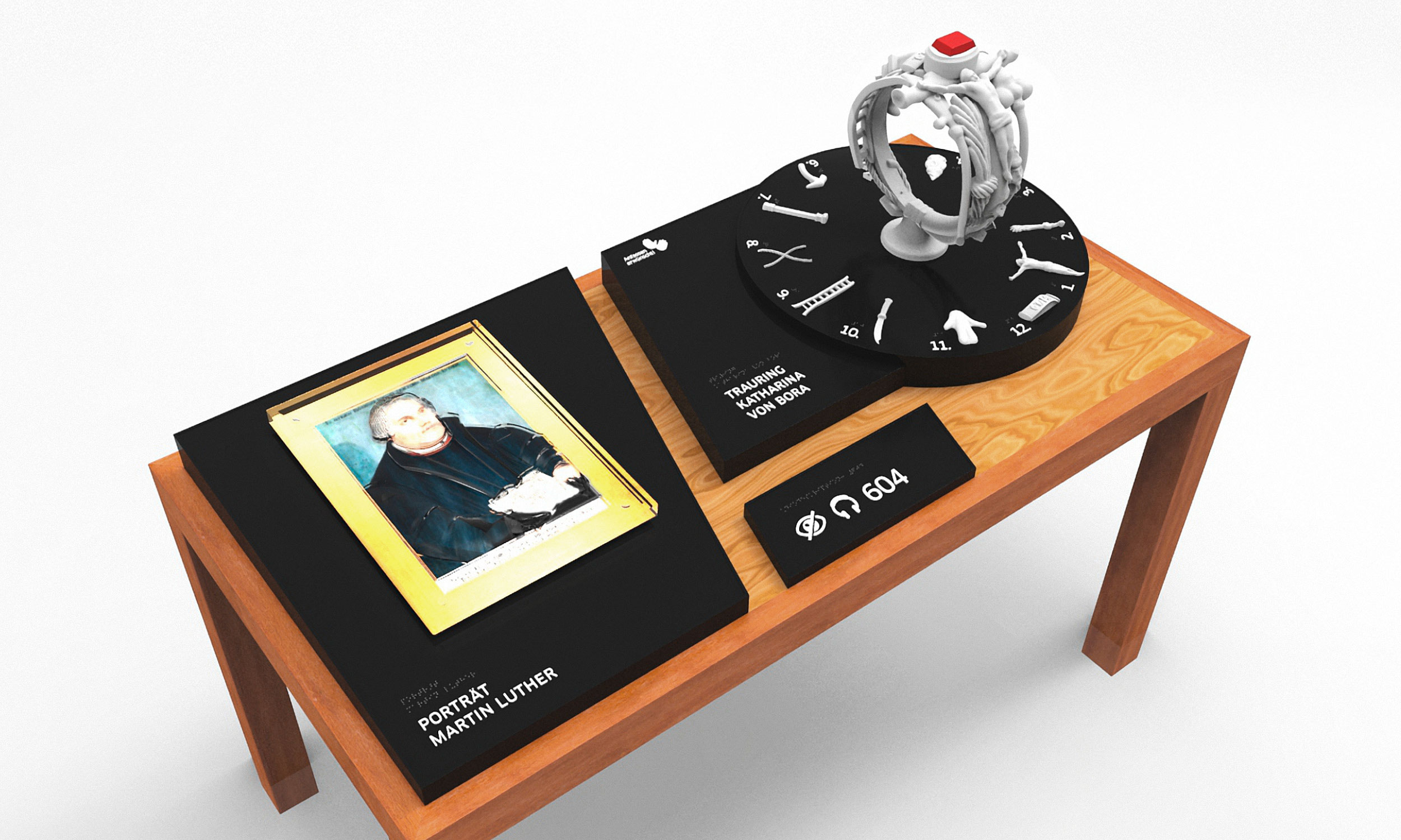
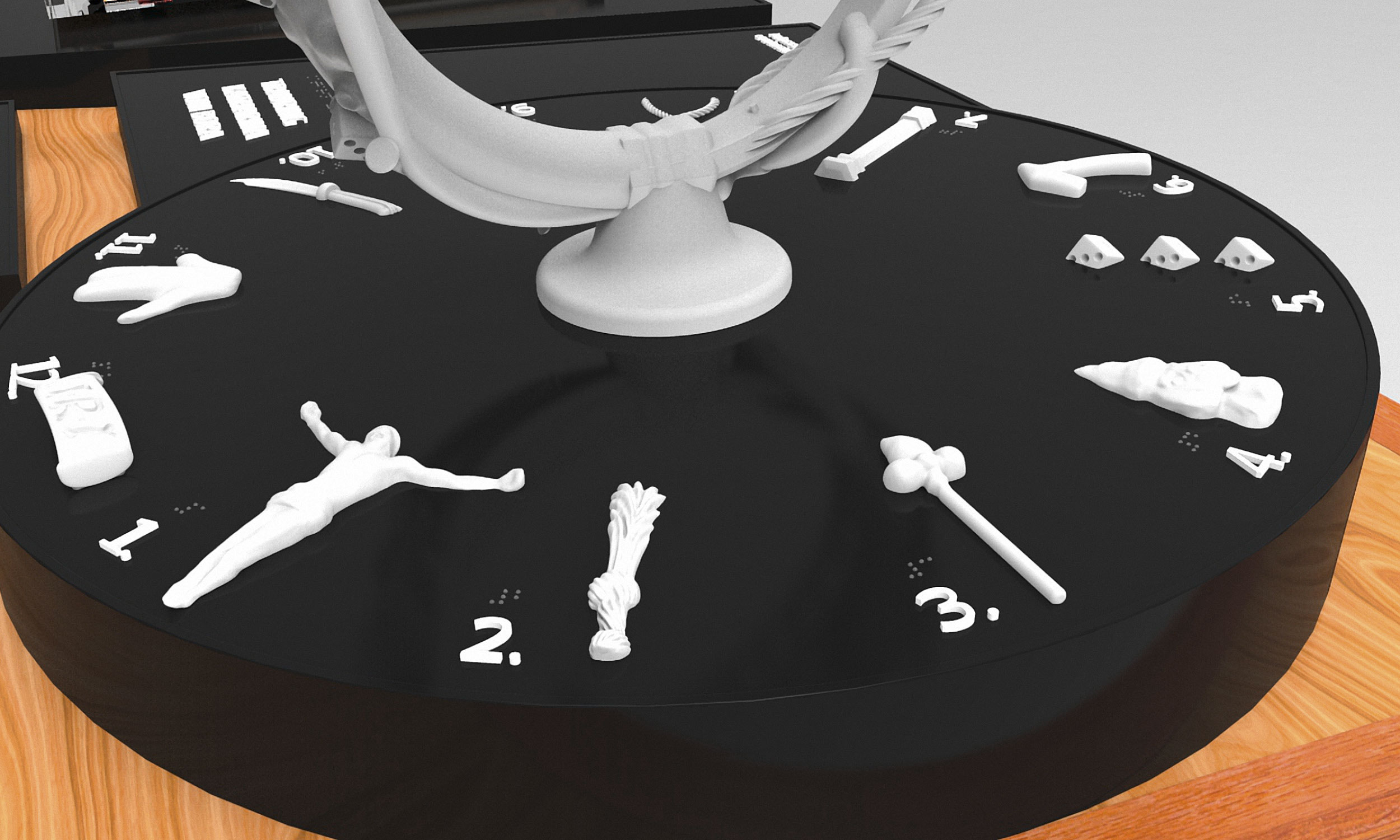
In the entrance area, we also designed and produced a tactile model of the Schlossberg area. On it, the castle and the monastery complex can be experienced tactilely as a fully plastic 3D model. Various materials depict preserved or reconstructed buildings in contrast to destroyed structures.

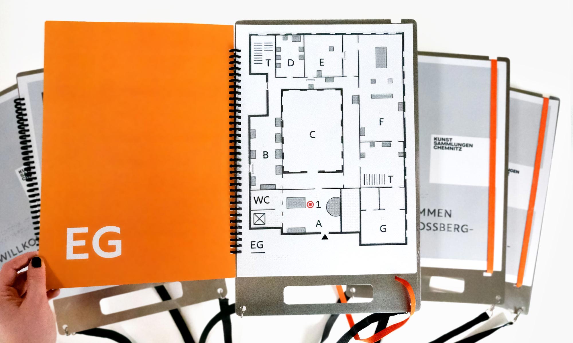
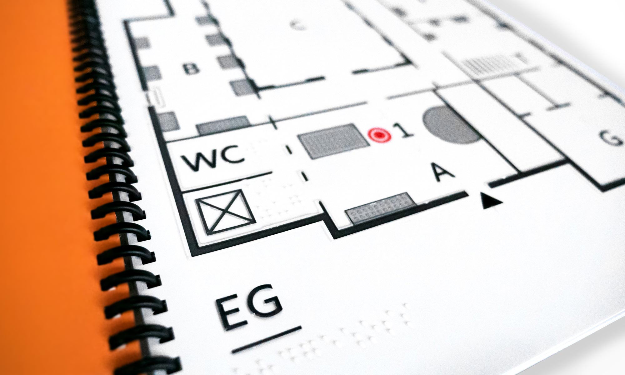
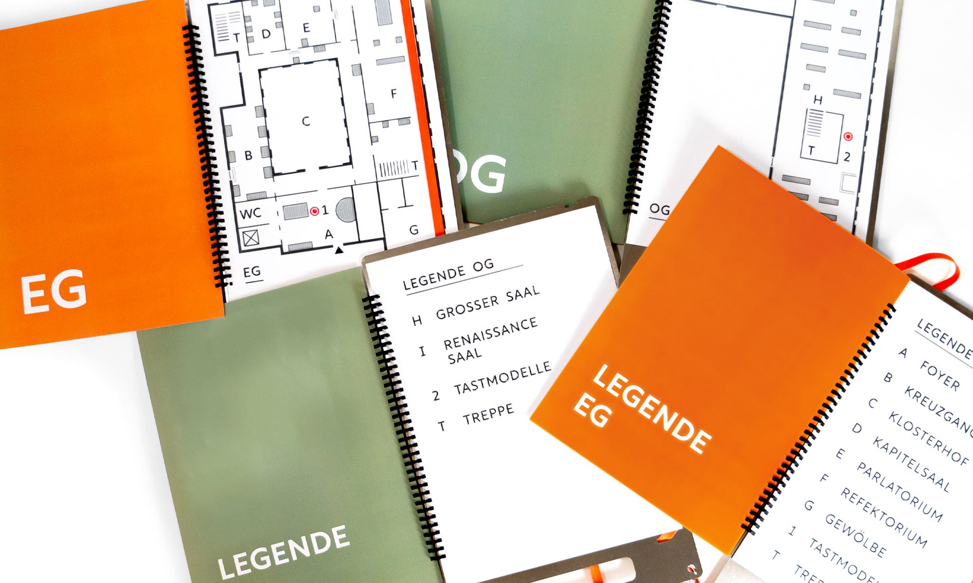
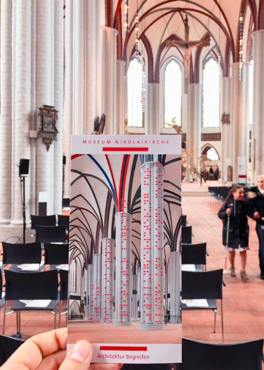
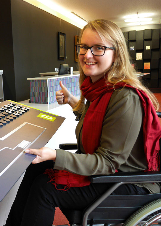
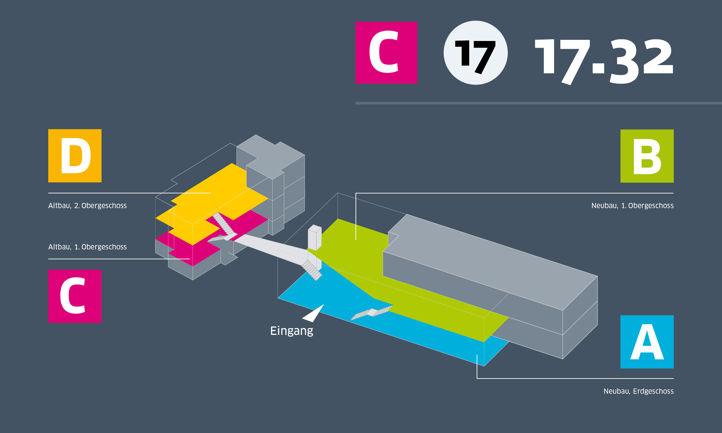
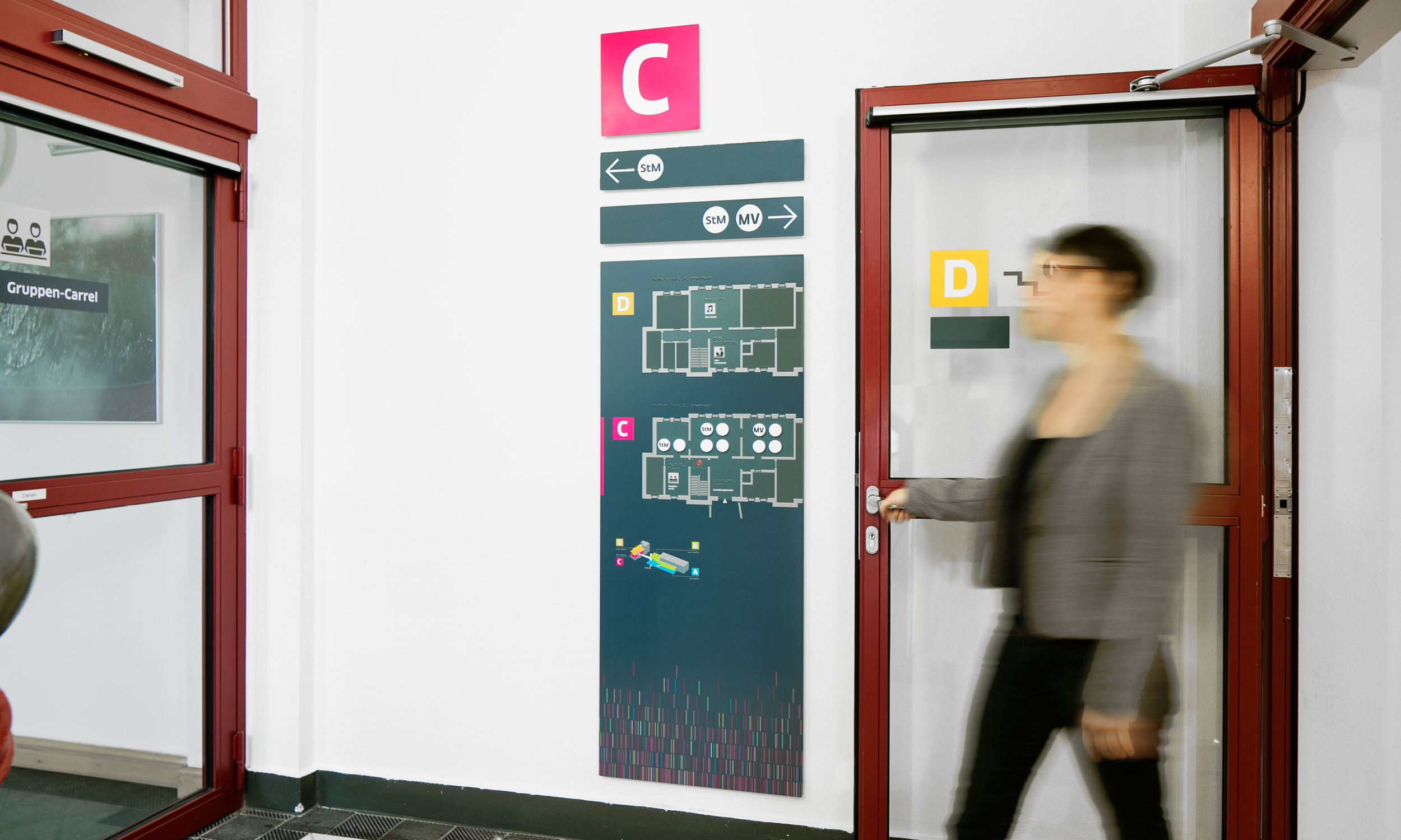
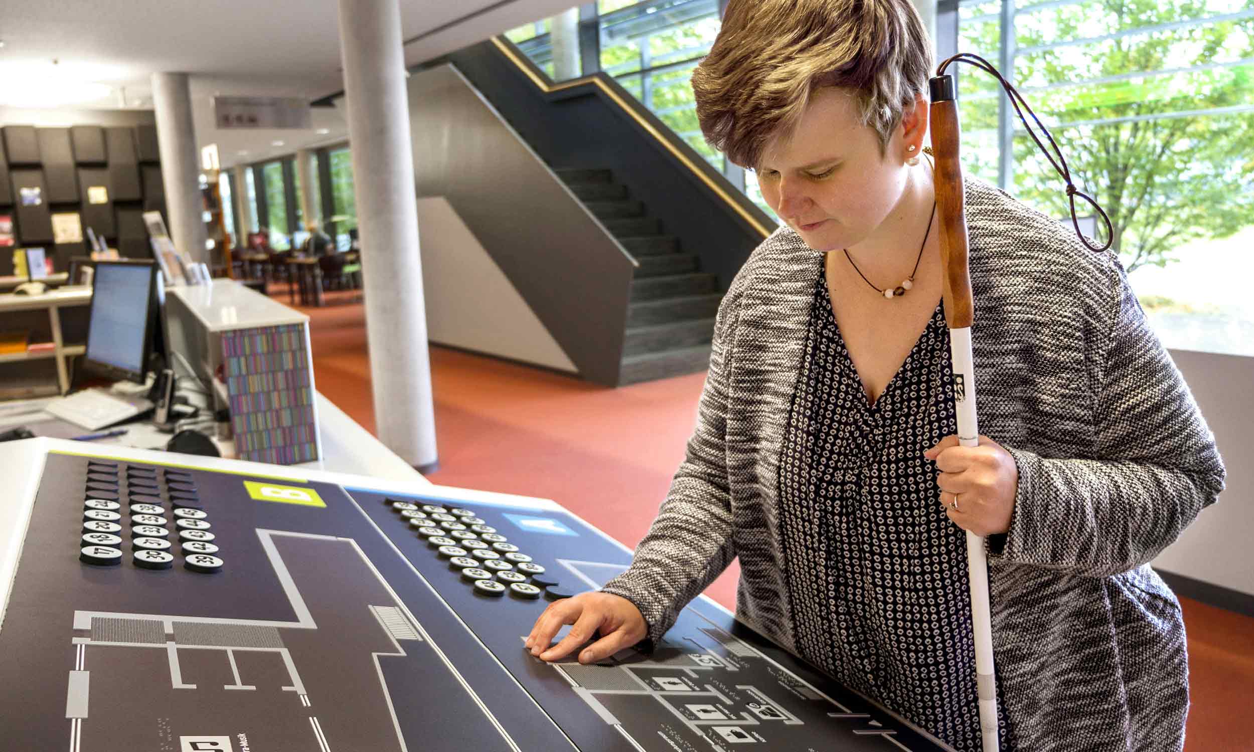
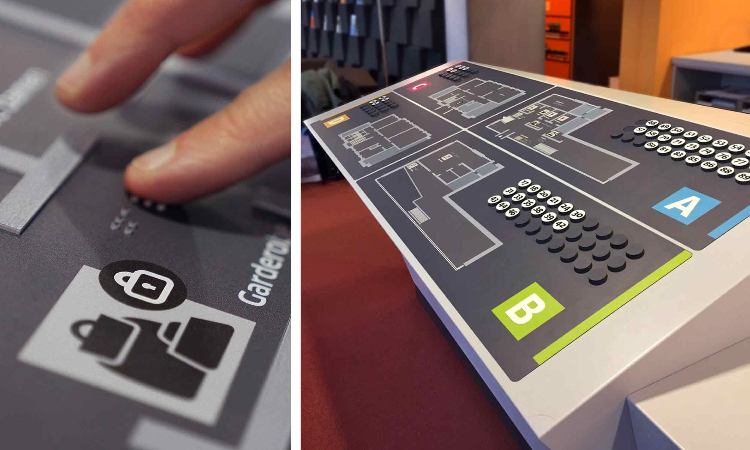
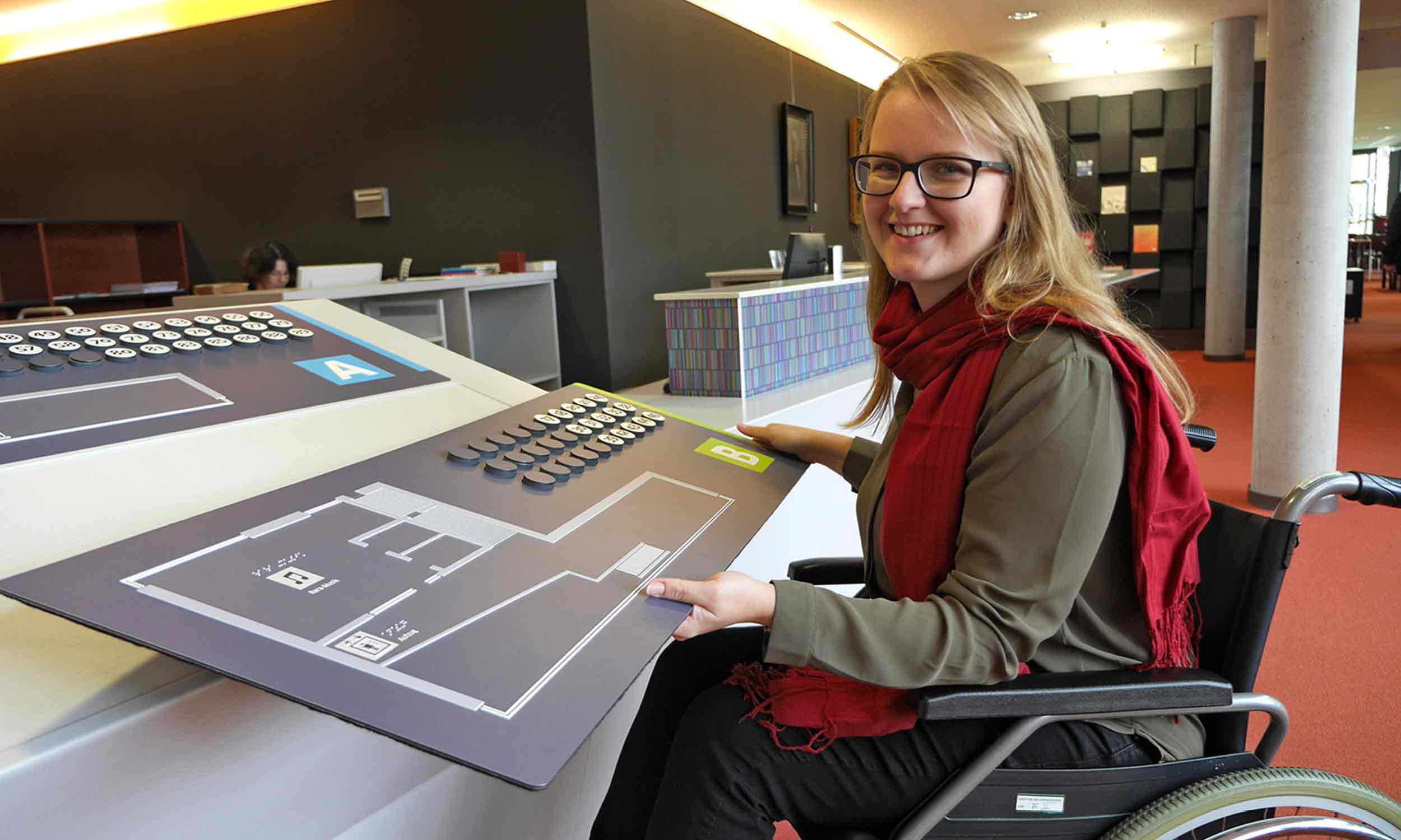
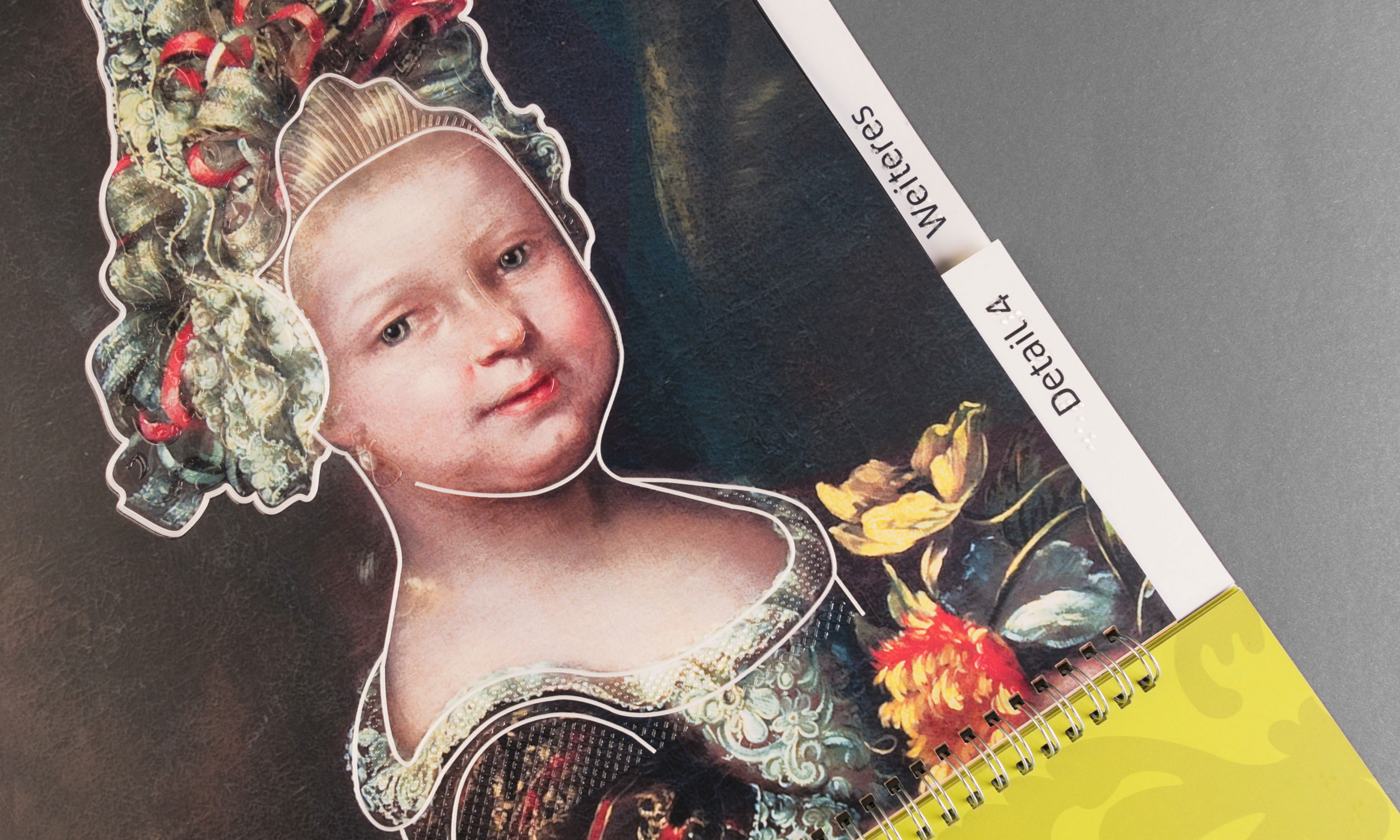
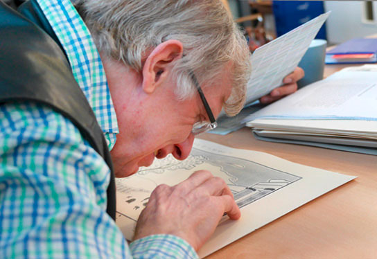
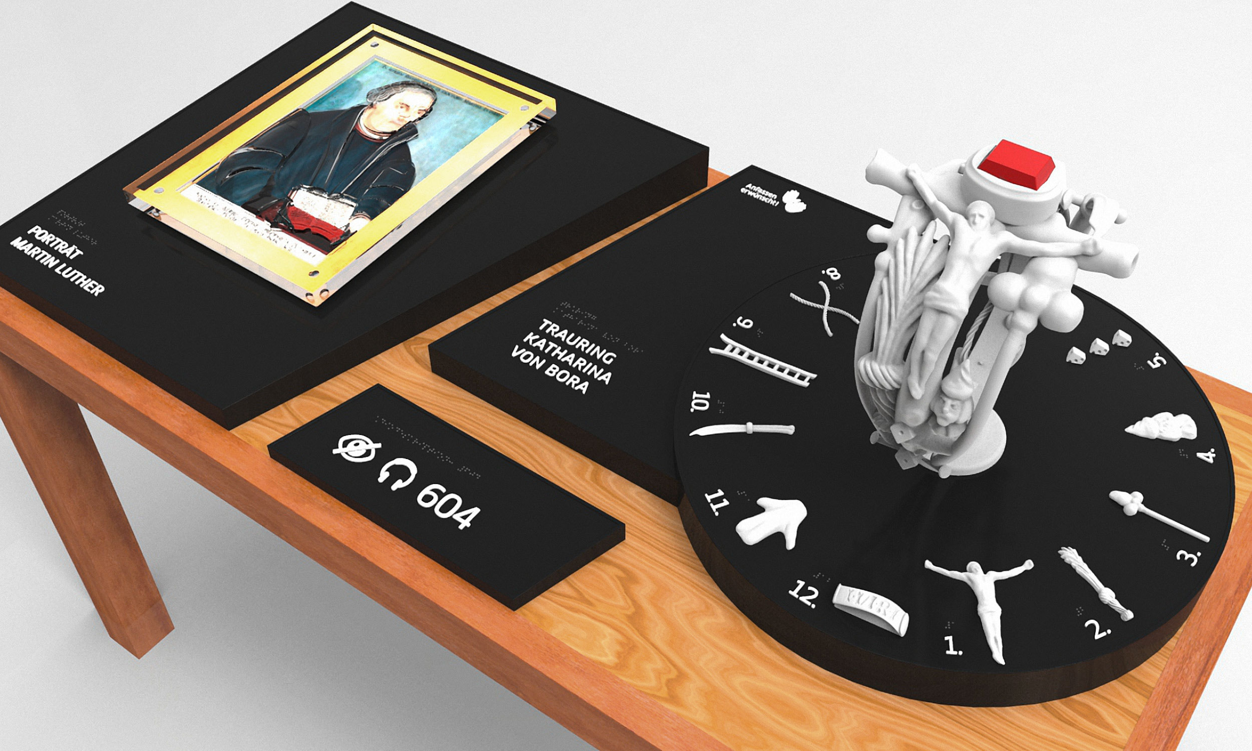
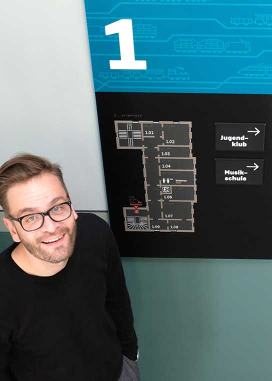
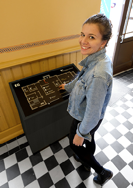
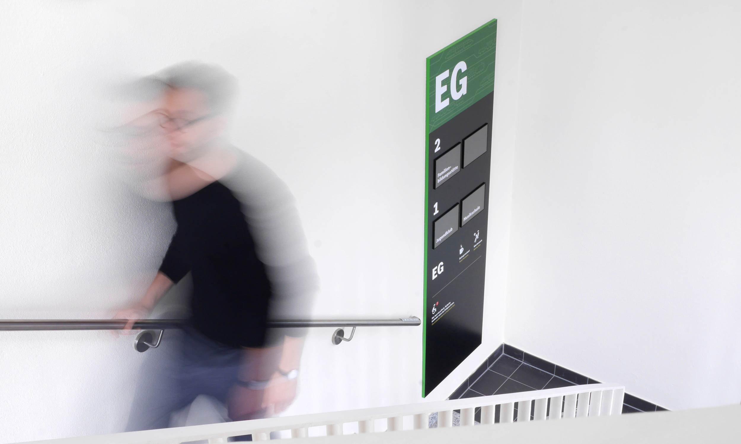
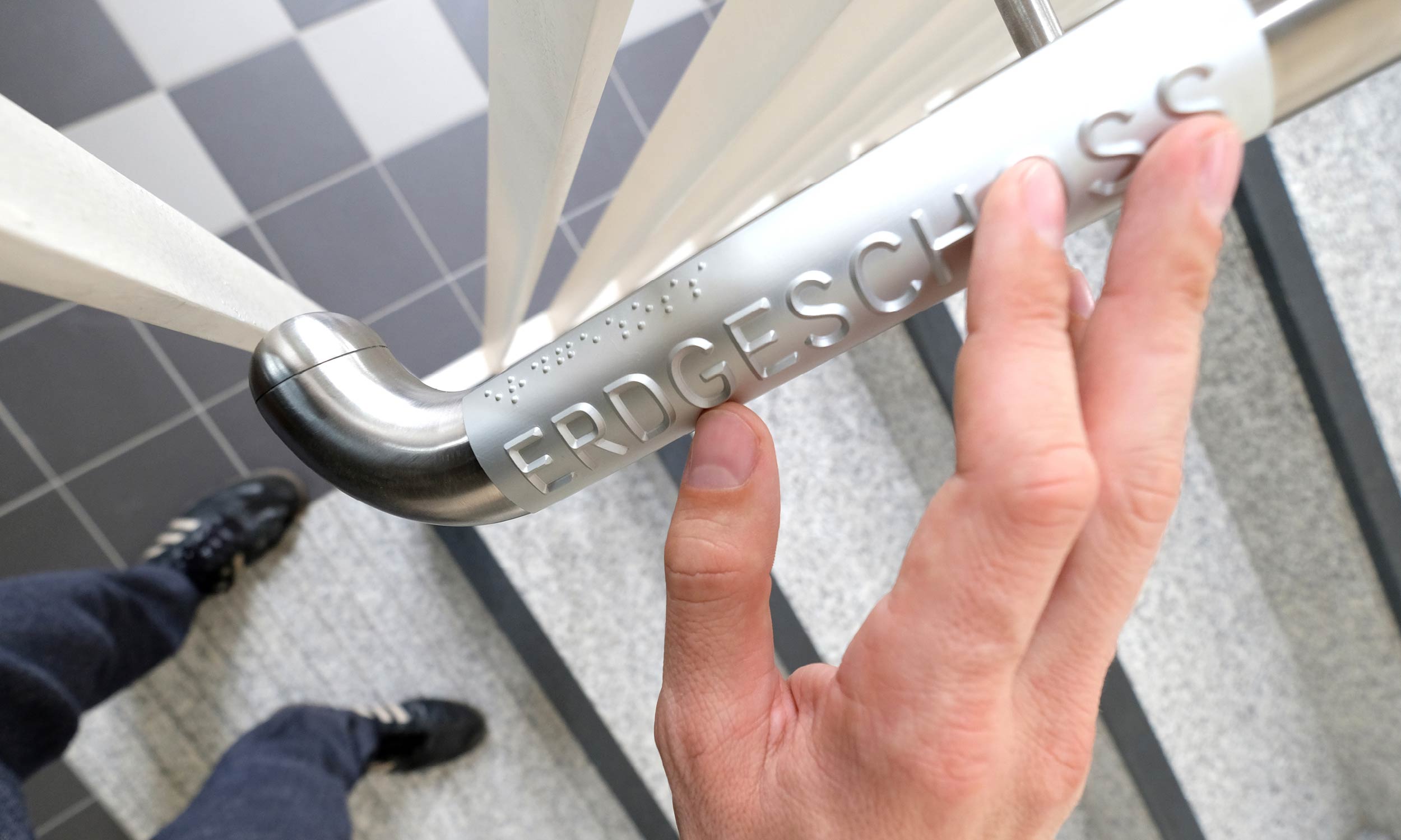
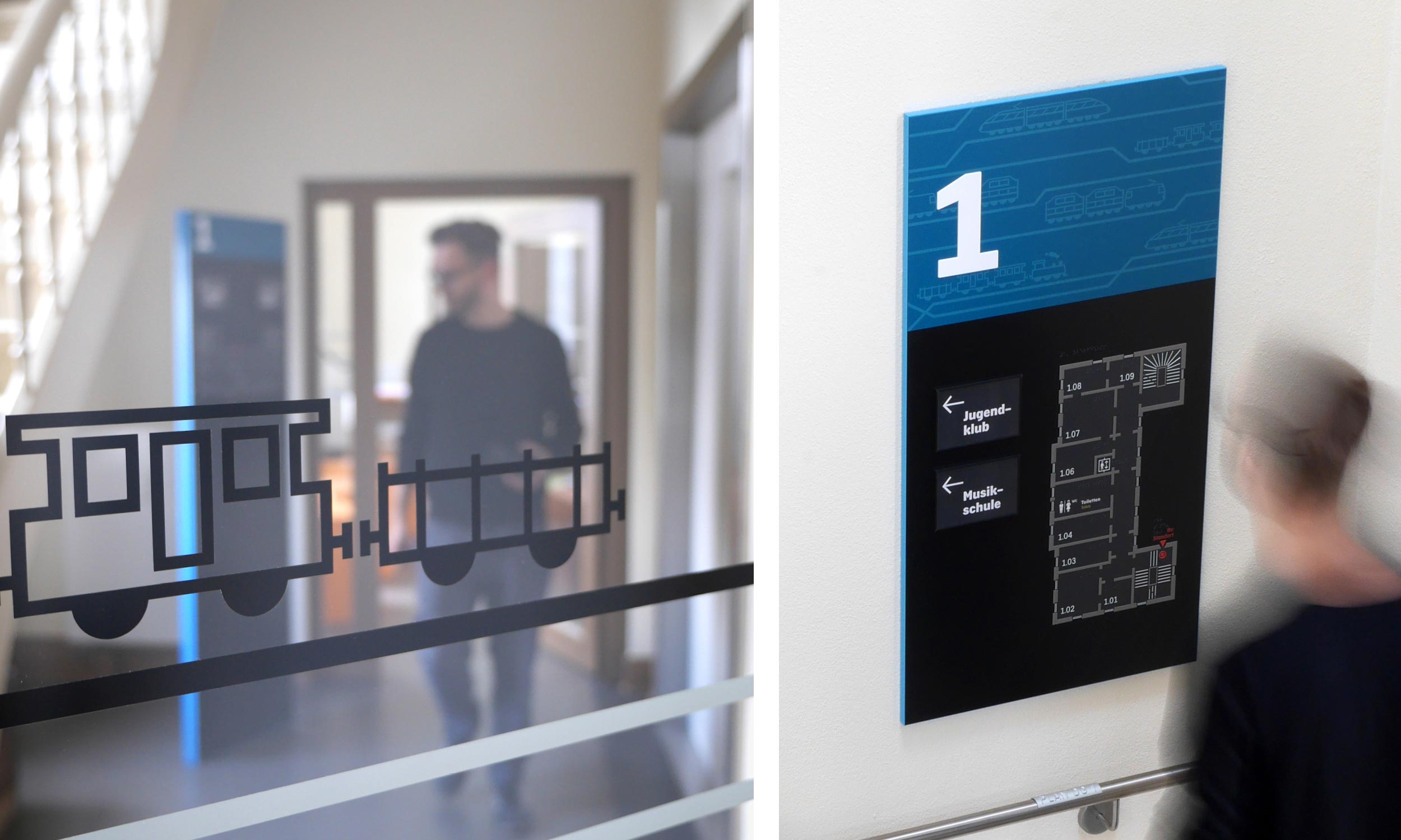
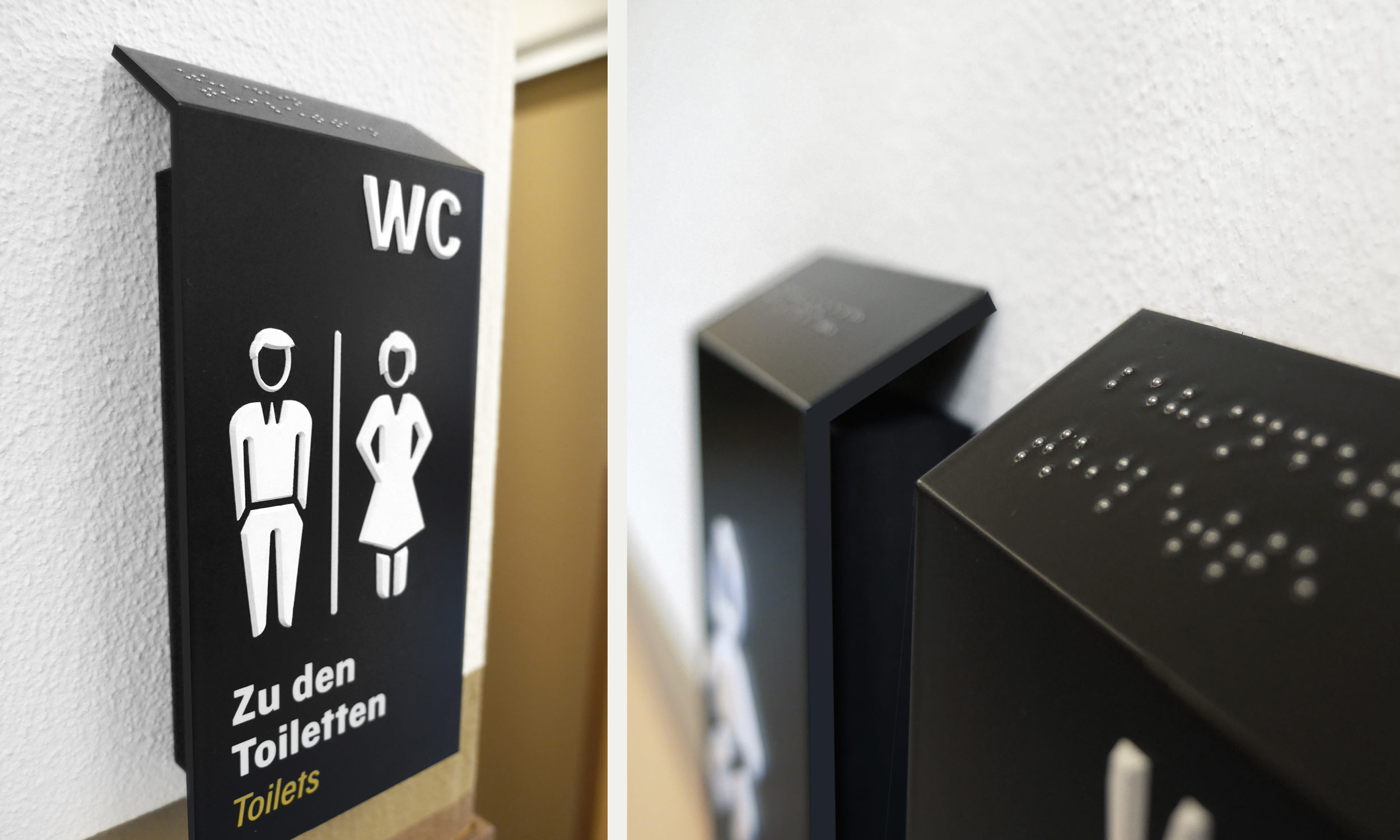
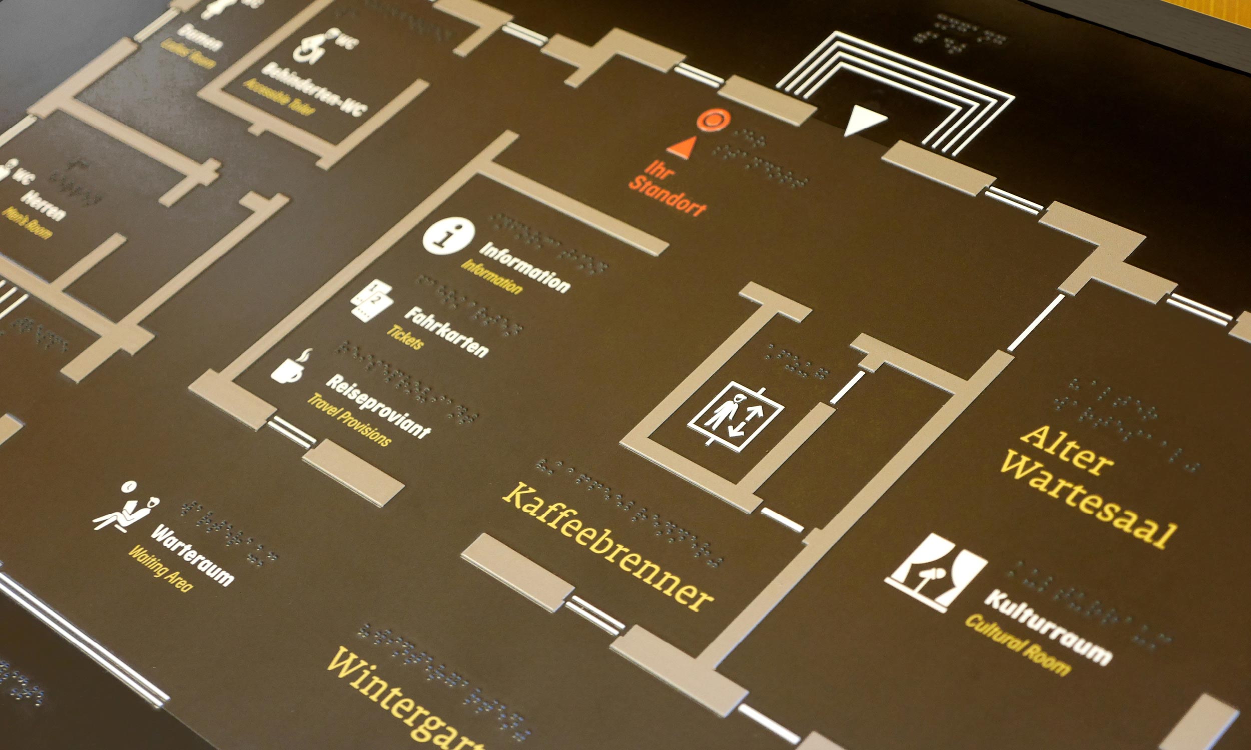
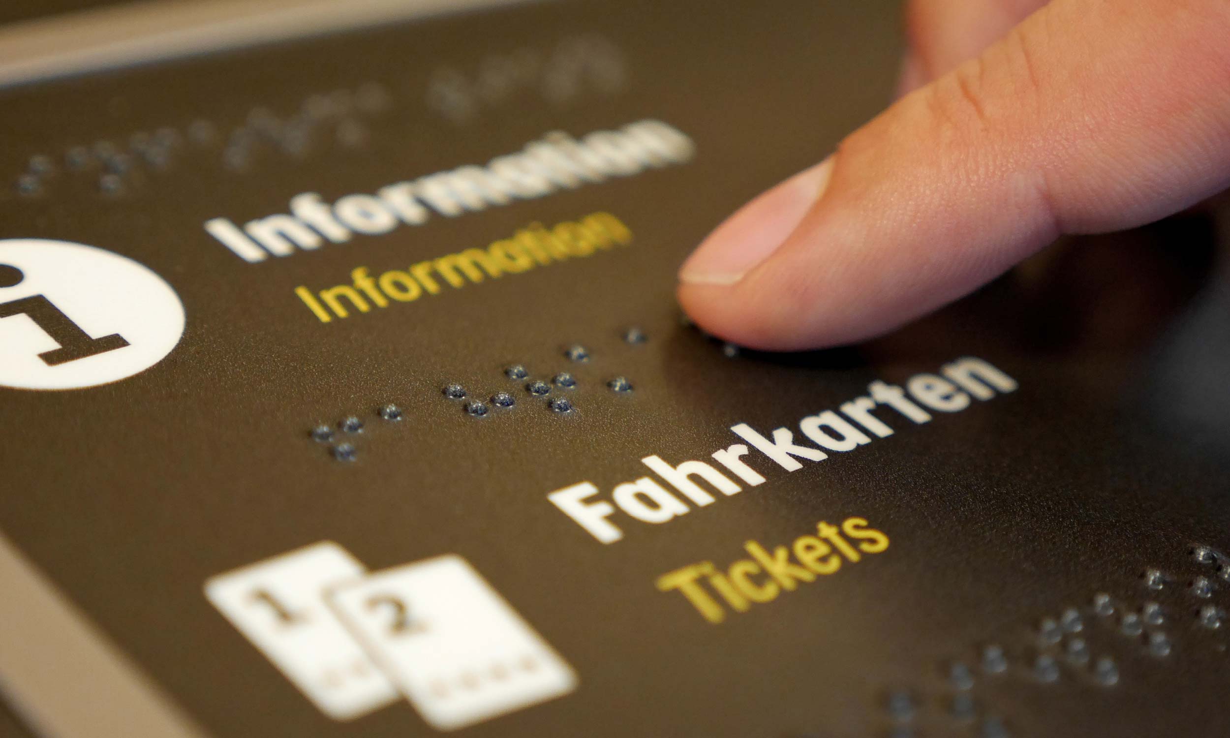
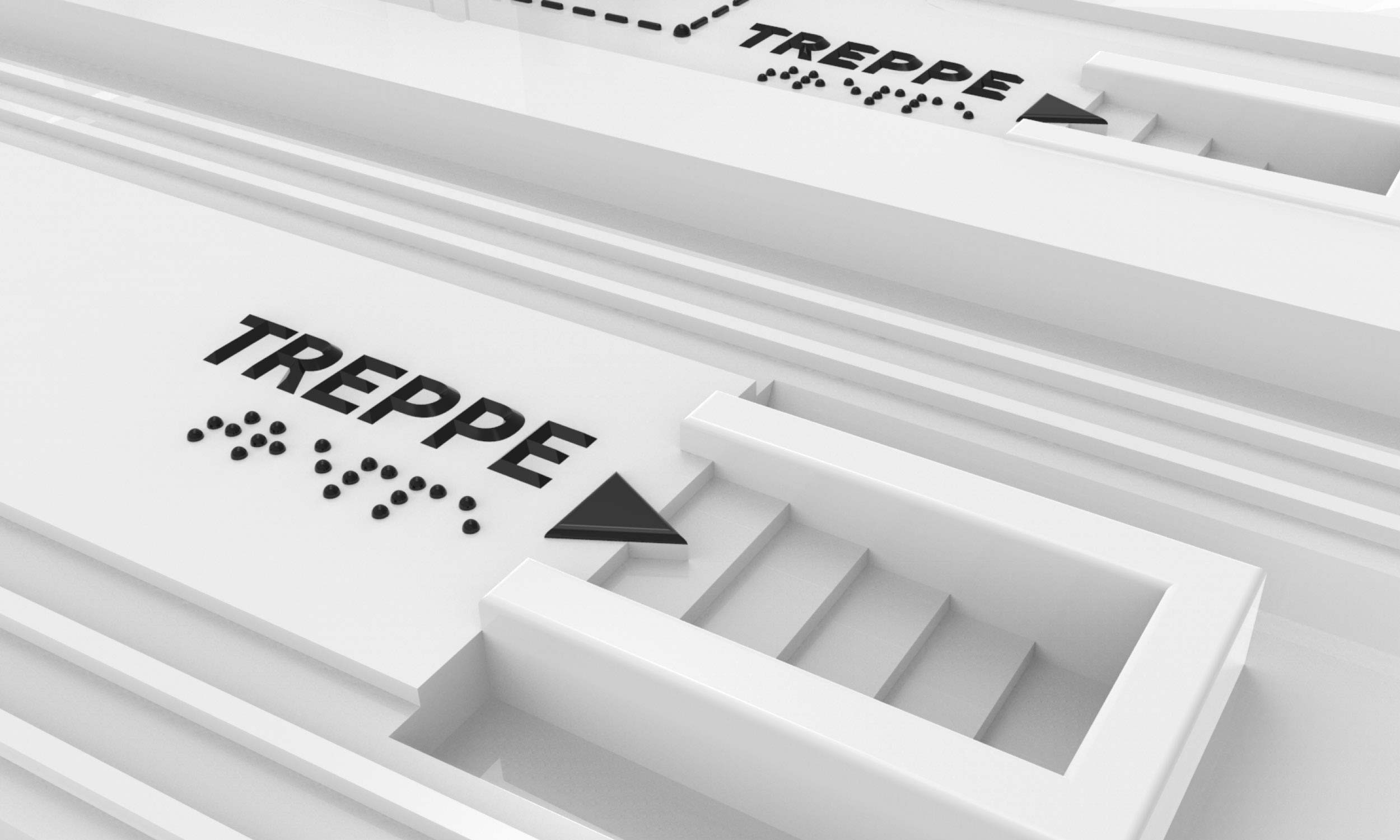
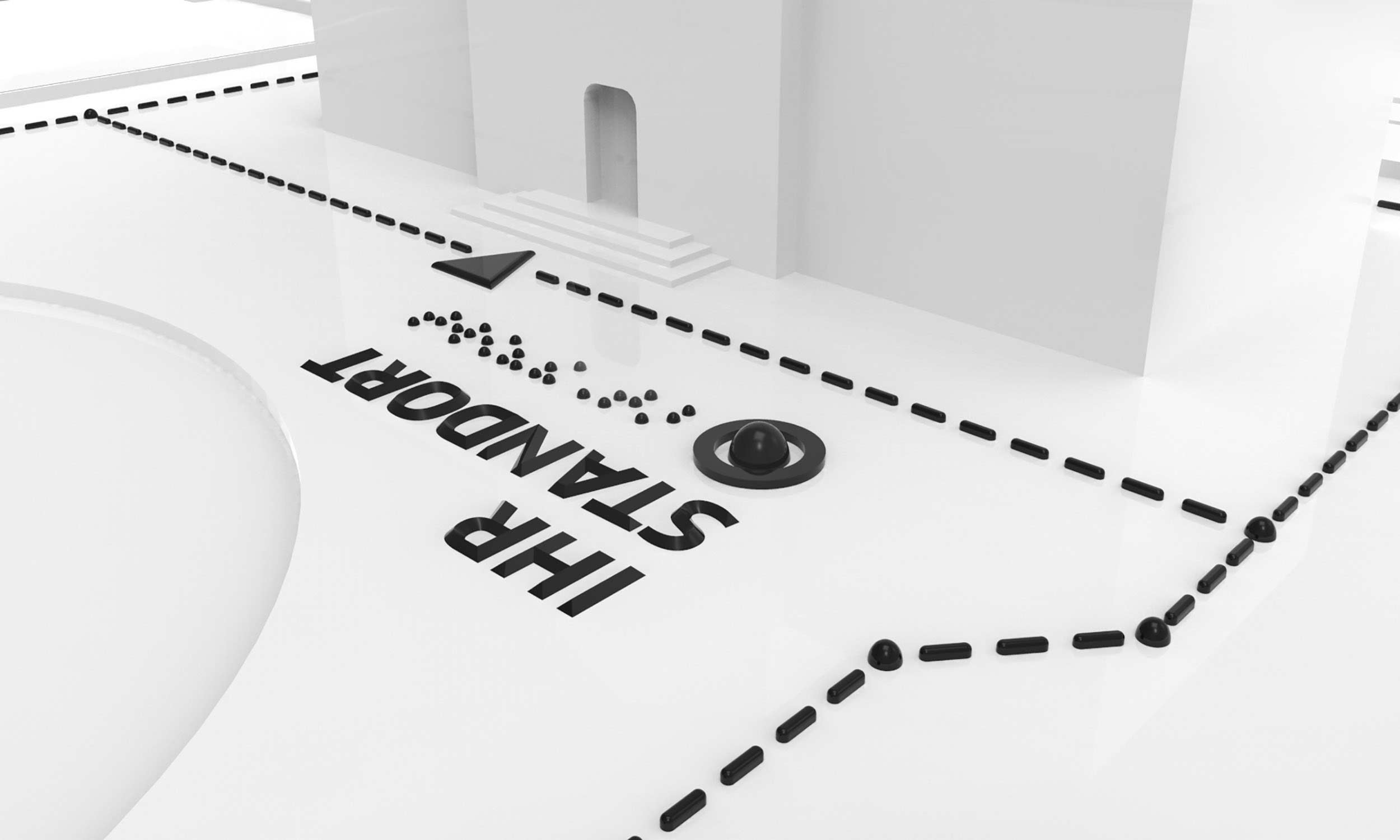
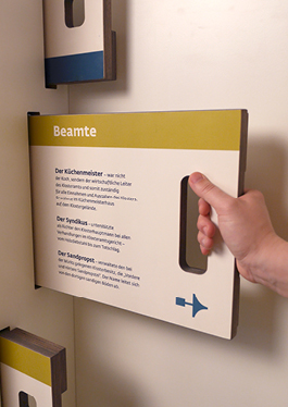
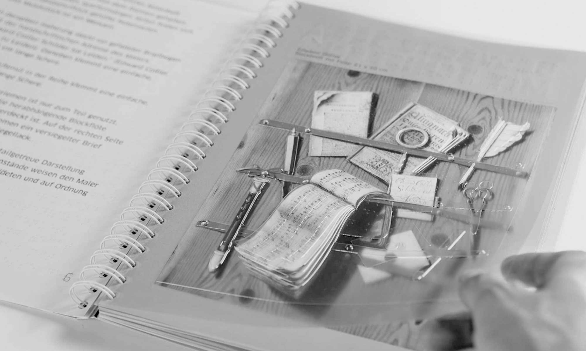
For better orientation within the building, there is also a mobile tactile map with which visitors can move around in the museum independently.

Tactile Models in the Room

The photo shows an exhibition room of the Schlossbergmuseum Chemnitz. The floor and ceiling are made of wood, white walls divide the large room into different areas. In the foreground, one of the four tactile models stands on a white metal table. A visitor can be seen shadowily to the left and right of the table. He is touching the tactile model of the city.
Foto eines der taktilen Stadtmodelle von einer Ecke des Tisches aus aufgenommen. Im Vordergrund daher ein vergrößertes Detail des Modells in orangenem Farbton. Es zeigt beispielhaft die damalige Größe und Anordnung der Bebauung von Chemnitz. Im Hintergrund ein weiteres Modell der Stadt in einer großen Glasvitrine sowie eine Wand mit Gemälden.
Two close-up photos: On the left, a legend of the model - the word "Rathaus" as a high-contrast, tactile inscription and in Braille lettering. On the right, some houses as an enlarged detail.
An exhibition room of the Schlossberg Museum in which an older city model is displayed in a large glass case. Next to this model under glass are the four tactile models by inkl.Design, which invite you to touch them.
One of the tactile city models in an exhibition room. Paintings on the walls in the background. A visitor, who is only faintly visible, touches the clearly recognisable church of St. Jacobi on the city model.
Close-up: In each of the four tactile models, an enlarged section of the urban structure is shown three-dimensionally at one corner of the model. This photo shows the buildings in 1930.

Studio Photos

The tactile city model of the year 2020 in an overall view. The basis is a tactile ground plan. Some of the city's sights, such as the town hall and St. Jacobi's Church, are located on it as three-dimensional buildings. They are contrastingly made of a deep black material. In one corner of the model is a three-dimensional detail of the urban structure, also in high-contrast orange. High-contrast lettering can be seen all around. The model rests on a white metal table with orange accents.
Detailed image of the tactile inscription. Here the word "Chemnitz".
A close-up shows two hands touching the corner of the model where a three-dimensional detail of the building can be found. The base is clearly recognisable: a white metal table with the engraving "inkl. design", on top of which is a likewise white metal tray that supports the model. Between the two is an orange board.
A close-up shows the tactile floor plan and the tactile inscription of one of the models.
Two hands, coming into the picture from the right, are touching one of the models.
Detailed view of the tactile, three-dimensional buildings of the Town Hall and St. Jacobi Church.
Close-up of the enlarged detail of the urban development, which is located in the corner of each model. Here is the model of the planned city from 1964, showing a high-rise building and a congress centre.
A hand, coming into the picture from the left, touches the tactile lettering of the model of the planned city from 1964.

Inclusion in Detail

Detail of the tactile inscription "Red Tower", also in Braille.
Fingers touching a Braille inscription. The tactile model is blurred in the background.
Close-up of the tactile floor plan, which forms the basis of the tactile model. Highlighted here in orange is the section within the floor plan, which is shown in the corner of the tactile model as a three-dimensional detail. A tactile dotted line connects the section and the three-dimensional detail.
Two detailed photographs showing the course of the Chemnitz River on the tactile floor plan. The river is highlighted in blue and touchable wavy lines make it tactilely comprehensible.
Detail of the engraving "inkl. design" on the white table supporting the model.

Accompanying Medium

There are five tactile cards in the picture. One card in the foreground is opened by a hand. On the first page there is a tactile map.
A close-up of a tactile map of the building. You can see the tactile print of the text and braille.
There are four open mobile cards shown. They have different pages open. You can see tactile writing and a tactile floor plan.

Project Details

Project Scope: Didactic concept for conveying the
of the exhibition content to blind and visually impaired people, Moderation and organisation of focus group workshops, Conception and realisation of the tactile models including product design, 3D data creation, graphic design, production support and supervision.

A shot from the office of inkl.Design: the team examines one of the three-dimensional models
The photo on the left shows the base plate of a tactile model lying on a wooden pallet - preparation for transport.
The photo shows two hands working on the base plate of a tactile model with a tool.
Orange tension belts labelled with inkl.design lie on the asphalt, a car in the background.
An employee of inkl.Design in a bright room with several of the white metal tables. She is working on assembling the tables.
Two employees of inkl.Design in a transporter. They load the tactile models.
A close-up of the tactile base plate of a model. Clearly recognisable different tactile structures and colours.
Close-up of one of the three-dimensional buildings in a matt, dark grey colour.
An employee of inkl.Design preparing the tactile model in the museum.
Several of the black three-dimensional buildings lie on a plastic sheet.
A shot from above shows four tactile floor plans of the tactile models arranged in a square on a large table.
Gregor Strutz from inkl.Design touches one of the tactile models in the museum with a satisfied expression on his face.
Gregor Strutz of Inkl Design tests a rotating tactile model in the museum.

St. Nicholas’ Church Museum

Understanding Architecture

Look at that! Almost on our own doorstep and in the historical center of Berlin, we “inkl.Designers” realised for the first time an inclusive museum project. Needless to say that here at home we were particularly happy to implement all that inkl.Design stands for.

In the converted Nikolaikirche (“St. Nicholas’ Church”) the church history of Berlin is told. Five new tactile models and audio guides are now available to guests from all over the world, enabling them to understand church architecture over the course of time. These models can be used by everyone, regardless of whether they are living with or without a disability.

The essence of the idea of inclusion has come to life here in inspiring teamwork: On the way to an exhibition that is easy to use for all visitors, we and our colleagues at the Stadtmuseum have coordinated all the planning steps with a focus group. Representatives of the Association for the Visually Impaired, students of the European University Viadrina in the Master’s programme Protection of European Cultural Assets, as well as blind and visually impaired museum friends critically tested our designs and thus made the result even better.

The new, high-quality 3D models for the permanent exhibition now illustrate the step-by-step development of the Nikolaikirche. The origins of the church, made of field stone, brick extensions, later a copper roof and an interior with a cross vault, can thus be traced in different models on site. Innovative tactile guidance as well as the sensible use of different materials are aesthetically appealing and inclusive.

The audio texts are conceived in the same inclusive sense, for everyone: they give both blind and sighted people orientation on the models and descriptive explanations.

The pilot project in cooperation with the Stadtmuseum Berlin was realized in only half a year. This was a sporty project, we Berliners would say. And a great hit anyway.

Photo from the focus group meeting at which the concept is explained using threshold prints. Here a blind woman is feeling the west façade of the Nikolaikirche.
Inkl staff member Franziska reads out her draft text in the focus group meeting. Inkl staff member Mia listens in.
The photo shows a stack of different swell paper prints made for the focus group meetings.
Colleague Gregor explains the design ideas to a blind person using a cardboard model of the Nikolai Church.
The photo shows a stack of different swell paper prints made for the focus group meetings
A blind man tries to grasp a cardboard model of the vault of St. Nicholas Church with the help of Gregor.
Photo of a hand feeling the west façade of the large church model of the Nikolaikirche.
Group photo of the incl. staff at work in the Nikolai Church
The hands of a blind person feel the swell pressure of the west façade. The hand of a sighted person accompanies the hands of the blind person.
In the photo you can see various swell paper prints of the Nikolaikirche and an aluminium plate, which is intended as a base for the mobile map.

A Glance at the Tactile Displays

Left: The photo shows the material samples of the west facade, in the background it shows the complete model of the Nikolaikirche. Right: This photo shows the complete model of the Nikolaikirche, in the background the church room is visible.
This photo shows the first station of the exhibition from the back. In the foreground is the back of the Nikolaikirche, in the background is the model of the west facade with the material samples.
This photo shows the model of the west facade. Beside the west facade are material samples of the west facade.
Left: The photo shows the second station of the exhibition. There is the vault model, the wall model and the tactile cross-sectional graphic. Right: This photo shows the tactile inscription of the tactile station, the lower ends of the vault model and two figures which serve as a reference for the size of the mode
This photograph shows the wall elevation with tactile caption.

Renderings

Left: Graphic of the complete tactile model of the Nikolaikirche. Right: Graphic with the view of the north side of the Nikolaikirche.
This graphic shows the complete model with the cut open interior of the Nikolaikirche.
Left: This graphic shows the interior of the Nikolaikirche with the organ gallery, four pillars and the vault. Right: This graphic shows the complete model with the cut open interior of the Nikolaikirche.
Left: This graphic shows the vault model of the Nikolaikirche. Right: This graphic shows the vault model of the Nikolaikirche from below.
This graphic shows the model of the wall cutout of the Nikolaikirche.
Left: This graphic shows a detail of the wall cut-out: the vault approach. Right: This graphic shows the detail of the choir circumference of the wall cut-out.

Accompanying Media

This photo shows the front of the flyer for the exhibition extension. On the front of the flyer you can see the interior of the Nikolaikirche which is overprinted with red braille dots and the logo of the city museum.
This photo shows the front and back of the flyer for the exhibition extension. On the inside the text is in white on a red background. Here the Braille dots are printed transparent.
This photo shows the mobile maps of the Nikolaikirche. These cards can be borrowed at the cash desk of the Nikolaikirche for blind and visually impaired visitors.

Inclusion in Detail

Sighted and blind visitors will explore the large model of the Nikolai Church at the opening.
Left: A blind visitor feels the model of the west facade. She uses the audio guide to get information about this section of the Nikolaikirche. Right: Four visitors stand in front of the second tactile station and explore the three different models.
Hands feel the material samples of the west facade, which are mounted next to the model of the west facade.
Left: Hands feel the model of the vault of the Nikolaikirche. Right: In the foreground of the photo, the second station of the exhibition is depicted, at the end of the station two men are standing having a conversation.
The photo shows the large model of the Nikolaikirche. Behind the model, on the cut side, two visitors look at the interior of the church model

Project Details

Project Scope: Guidance and part-moderation of the focus group meetings, conception and implementation of the tactile station including product design, 3D data creation, graphic design, involvement in the creation of comprehensive audio description texts for image description suitable for blind and visually challenged people, production support and monitoring

State Library
Mecklenburg-Western Pomerania

Library for All

Imagine an aged library building. Can you picture the dusty signs with lots of long complex numbers on them? Anyone looking for something here, really needs the patience to find it. We at inkl.Design cracked this tough nut joined forces with Schwerin interior designer Michael Baldauf! After a comprehensive accessibility analysis and a concept for accessibility for the building also the needs of people with limitations are considered. Therefore we have not only graphically polished up the wayfinding system, but also moved half of the library.

Our biggest challenge: in the library, the book stock is changing constantly. Nothing remains where it is forever. Therefore the labelling had to be changeable and must allow for all possibilities. Inkl. took drastic measures on the former chaos and turned it into little bites that are easier to digest.

Instead of numbered rooms you will now find only numbers for subject areas. If the inventory moves, the number still remains the same. If the book stock moves the number will remain the same. The labeling system we came up with uses innovative magnets, so it can be expanded, reused and further developed at any time.

To further enhance the quality of the stay at the library we also set up reading corners. Striped wallpapers (it looks like a bookshelf) in the colours of the respective section create a good atmosphere.

And if you’re wondering why an ordinary library should consider people who are restricted in their mobility, are visually challenged or blind, we would like to bring up some politics here: Germany is one of the first countries to acknowledge the UN Convention on the Rights of Persons with Disabilities. It has been committed to the comprehensive inclusion of people with disabilities since 2009.

So it is about time for a reorganisation – also in the Schwerin library.

Photo of one of the orientation boards on a rolling pallet in the manufacturer's factory
A young woman in a wheelchair in close-up; smiling, she holds a tactile overview plan in her left hand, with her right hand she gives a "thumbs up".
square sign to mark area B (white capital letter B on light green background)
Pictogram signalling lockable storage of bags and backpacks
Photo with section of the brightly coloured rod elements
Photo of the circulation counter, which picks up on the design of the library entrance with the brightly coloured rod elements.
square sign to mark area C (white capital letter C on magenta background)
Close-up of a pictogram indicating quiet areas; on the left the silhouette of a head, in front of it a hand with index finger in front of the mouth, in addition the lettering "Psst".
Close-up of the self-check-in; here the slot for entering the user card is marked by an infographic, below it the pattern with the coloured lines on a grey background.
Photo of the circulation counter, which picks up on the design of the library entrance with the brightly coloured rod elements.
Shot during the implementation of an instruction manual; some elements of the infographic are crossed out, plus handwritten additions and improvements on the printout.
Pictogram informing about video surveillance: a white exclamation mark on a dark grey triangle, to the right of it a stylised video camera and the writing "Video"
Photo of a signalisation for the use of the lifts in the house

Graphic Concept

2Overview sign with exchangeable information on the area, subject areas and room numbers".
Overview sign with the room assignments on the 4 levels of the Landesbibiothek.

Instruction Manual

Operating instructions for the central printer with infographics and text.
Photo of the book return with infographic and text
Operating instructions for self-checkout of loans with infographics and text
Operating instructions for the lockers with infographics and text

Design in Detail

Photo of a coloured signage in the staircase of the library for orientation in the building complex
Photo looking into the work area with reading tables, book shelves and notice boards.
Photo of the main entrance staircase to the first floor with signposts for routing and area marking.
Interior of a locker with the corresponding operating instructions
Photo looking at a glass door with a strip of coloured sticks as door signalling
Photo looking at a wall surface consisting of a carpet of coloured sticks in a hallway
Left photo: Photo showing a view of a coloured lift sign Right photo: Photo showing the front of a shelf of the open access library with magnetic signs for stock indication and a book deposit table
Photo with view into a stairwell with tactile overview plans and information signs

Inclusion in Use

A blind young woman feels the tactile overview plans at the service counter of the State Library.
two-part image; left: Close-up of tactile fingers on a tactile overview map of the State Library; right: four tactile overview maps embedded in the service counters also offer sighted people the opportunity to find their way around within the library.

Project Details

Project scope: Comprehensive accessibility analysis, inclusion concept for visitors with disabilities, analysis of orientation needs, advice on planning services for tactile floor indicators in outdoor and indoor areas, conception of a wayfinding system, product design of a wayfinding system with updatable elements, conception of barrier-free elements of a wayfinding system (2-sense principle), pictograms, layout and graphic design, production support

Citymuseum Oldenburg

Tactilely precious

Two valuable paintings from the permanent collection of the Citymuseum Oldenburg are no longer just a feast for the eyes. The tactile paintings from the “inkl Idea Workshop” invite you to grasp them on all levels. Literally.


Touch me! The little girl in the magnificent robe is just three years old when her parents had the portrait of the “Little Princess” painted by Pieter Leermanns. A sumptuously designed view of the good match that the little one will one day be. An advertisement for those hoping to get married. The second painting shows a classical Italian landscape. Decorative column ruins, lovely hills, a body of water. These two completely different masterpieces were created to be experienced by blind and visually challenged people.

As a logical development of our inclusive painting guide we have developed tactile paintings. In combination with an accompanying booklet, which introduces the contents of the paintings step by step, as well as extensive audio descriptions of the pictures, the enjoyment of art leaves nothing to be desired.

Framed by an artistic relief frame, a colour print of the original painting lies under a highly transparent key relief. Touchable dots at the lower edge of the paintings serve as orientation for the picture description on the associated audio track.

Starting from concise details, the complex pictures can be experienced in a structured way. Information about the tulip at the bottom of the picture, the meaning of the little white dog, the fact that the three-year-old is painted like an adult woman, give deep insights into the symbolism of the painting. All audio texts have been produced in collaboration with art historians of the museum.

In addition, each picture is accompanied by a printed supplement in Braille and black. Here blind people will find a QR code that makes the audio files available with the help of a smartphone. For people who do not use a smartphone, the same information can be retrieved from the museum’s audio tour device.

Unlike conventional exhibitions, our paintings do not hang on the wall, but are displayed on a wheelchair accessible desk. The booklet and the tactile paintings are available as a set in a wooden case, made to measure in a sheltered workshop for people with disabilities.

As with all of our groundbreaking projects, we do not rely on our gut feeling at inkl, but consult the experts of everyday life at every step. The palpable paintings were also created in cooperation with blind and visually impaired people from Oldenburg. Your suggestions and ideas are our measure.

Tactile Paintings

Photo of the tactile painting "The little princess" with frame in front of a grey background
Photo with detail of the lower right part of the tactile painting "The Little Princess" with depiction of the white dog and the symbolic tulip
Photo of a detail of the touch painting "The little princess" showing the festively dressed girl with a bouquet of flowers

Listen here to the text of the interpretation of the painting “Little Princess” by the painter Pieter Leermanns

Photo of a hand touching the lower left half of the tactile painting "The Little Princess
Photo of the tactile painting "Painter in front of a Roman ruin" with frame in front of grey background
Photo of the touch painting and the tactile accompanying booklet "Painter in front of a Roman ruin" with enclosed hearing pen on grey table surface
Photo with cutout from the upper left margin of the tactile painting "Painter in front of a Roman ruin", on which a group of trees can be recognized

A Glance at the Booklets

Photo of the tactile booklet accompanying the painting "Painter in front of a Roman ruin" on grey tabletop
Photo with detail of the tactile accompanying booklet "painter in front of a Roman ruin", on which the combination of Braille and black letters is easily recognizable
Photo with detail of the tactile painting "painter in front of a Roman ruin", on which the tactile structure of the figures of the painter and his companion is clearly visible
Photo of the tactile booklet of the "Little Princess" with enclosed hearing pen on grey table surface
Photo with detail of the "Little Princess", on which one hand feels the outline of the princess
Detail photo of the tactile accompanying booklet of the "Little Princess" with representation of the combination of Braille and black writing
Detail photo with close-up view of the "Little Princess" on the title of the tactile accompanying booklet
Photo of the accompanying booklet of the "Little Princess", on which the structure of the relief prints is clearly visible
The photo shows the tactile painting of the "Little Princess" in a custom-made case, the opened lid of which serves as a slanted desk. On the left side of the tactile painting is the open booklet accompanying the painting, which covers part of the tactile painting. A detailed illustration is open, as well as the page with the matching inscription in Braille and black lettering, and the QR code and the label for the hearing pen are also visible. On top of the accompanying booklet is a smartphone whose screen shows that an audio file is being played.

Inclusion in Use

Photo of a sitting blind woman touching a painting lying in front of her with her hands.
Photo of a tactile painting that is palpated by two hands. Photo with lateral view of a woman scanning the edge of a tactile painting
Photo with a view from above of a table on which a tactile painting and the accompanying booklet with tactile illustrations and a hearing aid pen are located.
Detail photo of two hands scanning the surface of a tactile painting.

Project Details

Project Scope: Didactic concept for conveying the contents of the painting to blind and visually challenged people, planning and implementation of 2 tactile paintings including product design and 3D data creation, graphic design of one accompanying booklet each with detailed tactile illustrations, creation of extensive audio description texts for image description suitable for blind and visually challenged people, production of audio files, production support and monitoring
Photo of our French designer Sarah holding the still unfinished transparent tactile painting "The Little Princess" in her hands.
Photo of the presentation of the tactile accompanying booklet of the "Little Princess" at a trade fair stand of our company
Image of a light blue area
Photo of a detail of the "Little Princess" with correction note on the sublimity of the relief print
Foto eines Handmusters aus Karton für die Produktion der "Kleinen Prinzessin
Surface with greenish-yellow hue for the design of printed products
Photo with detail of the relief print "Painter in front of Roman ruins", depicting the painter and his assistant
Photo with blind and visually impaired test readers examining the tactile painting "The Little Princess".
Photo of our Chief Gregor explaining the structure of the tactile painting "The Little Princess" to a test reader
A dark blue area.
Photo with detail of relief print "Painter in front of Roman ruin" and correction note on contour line thickness
Group photo of our focus group in the Oldenburg City Museum with the tactile painting "The Little Princess" , standing in front of the original painting
Photo of a hand touching the lower left half of the tactile painting "The Little Princess
Photo of a hand feeling the contours of the tactile painting "The Little Princess
Photo of a blind test reader attentively examining with his fingers a relief print of the painting "Painter in front of Roman Ruin" by Johann Heinrich Wilhelm Tischbein.

Museum of City History Leipzig

Bling Bling at Luthers

In 2017, in the Luther Year, the Museum of Leipzig’s History in the Old Town Hall redesigned its exhibition and supplemented the collection with a focus on Luther in Leipzig. One room in the imposing building became the Luther Room. We “inkl. Designers” reformed it into a model of inclusion.


Reformer women are like footballer women. They love jewellery. The centre and showpiece of the entire exhibition is therefore the Ring of Catherine of Bora, which served as the ring for the couple at their wedding in June 1525. In the original, the ring with the ruby measures just under two centimetres in diameter. We thought: bigger is better. Even people who can see well now have a chance to see all the motifs that an unknown artist subsequently placed on the ring.

Jesus on the cross, three cubes with which the soldiers rolled around the crucified man’s clothes. Nails, ropes, lance and the staff with cloths soaked in vinegar to refresh Jesus. All the Passion tools associated with the suffering and death of Christ are hardly recognizable in miniature. On the tactile model at 15x magnification, however, the artistic decoration becomes visible and palpable.

Below the model there is also a rotating plate on which all 13 elements can be individually recognized and felt. Detailed explanations can be heard via the museum’s audio guides.

A palpable painting, which shows Martin Luther from the perspective of Lucas Cranach the Older, rounds off the offer. The tactile painting is located on a swivelling desk so that it is easily accessible for wheelchair users and their companions. The fat chin, the massive figure, the folds that Luther’s robe throws are easy to feel and bring the picture to life under your fingers.

Projects like these make the obvious even more visible: design that considers all users is an enrichment – for everyone.

Photo of the tactile painting "Martin Luther" by Lucas Cranach the Younger being felt by one hand
Photo in the exhibition room with view of the touch station
Photo of the richly decorated gold wedding ring of Luther's wife Katharina von Bora
Photo of a standing blind woman feeling the Luther painting integrated into the touch station
Photo of the exhibition room "Luther in Dispute" in the Stadtgeschichtliches Museum Leipzig with various showcases and exhibits
Photo with our employee Mia setting up the touch station in the Leipzig City Museum
Photo of enlarged reproductions of ornaments of the wedding ring of Katharina von Bora and a colour fan for testing the colour quality
Photo of the Old Town Hall in Leipzig, which houses the Museum of City History
Photo of our employees Franziska and Mia assembling the full-size functional model of the touch station out of cardboard
Photo with a view of sketch sheets and a screen with digitised designs for the implementation of the wedding ring as button elements
Photo of enlarged replicas of ornaments of the wedding ring of Katharina von Bora as components of the tactile model
Photo of the complete tactile model of the wedding ring of Katharina von Bora, enlarged fourteen times compared to the original.
Photo of a blind woman as a test person checking the complete touch station
Photo of enlarged replicas of ornaments of the wedding ring of Katharina von Bora as components of the tactile model
Photo of a functional sketch of the touch station to illustrate its underride capability

A Glance at the Tactile Display

Photo of the tactile model, consisting of a Luther portrait, enlarged replica of the wedding ring of Katharina von Bora and information boards with Braille and profile lettering on a wooden table that can be driven underneath.
Hören Sie hier den Einführungstext zur Taststation und dem Ausstellungsraum

Photo of the tactile model, consisting of a Luther portrait, enlarged replica of the wedding ring of Katharina von Bora and information boards with Braille and profile lettering on a wooden table that can be driven underneath.

Renderings

Graphic of the complete tactile model with the Luther portrait, the enlarged wedding ring of Katharina von Bora, its decorations as individual elements as well as information boards in Braille and profile lettering
Detailed graphic of a rotating disc with palpable decorations of the wedding ring of Katharina von Bora
Graphic of the complete tactile model with Luther portrait, enlarged wedding ring of Katharina von Bora, its decorations as single elements as well as information boards in Braille and profile lettering

Inclusion in Detail

Photo with view on the tactile model wedding ring of Katharina von Bora and the exhibition room
Detail photo of a section of the tactile model with Braille lettering and profile lettering. Detail photo of a section of the tactile model with inscription " Touch required".
Detail photo of the tactile model with rotating disc on which the decorations of the wedding ring are applied as tactile elements.
Detail photo of the tactile station with the rotating Luther painting on a plate with inscriptions in Braille and profile lettering
Detail photo of the tactile head as part of the Luther tactile painting
Detail photo of the Luther touch painting with depiction of tactile elements such as the open Bible, his hands and a Latin saying
Detail photo of the Luther tactile painting, on which a hand feels the structure of the Luther head

Tactile Display in Use

Photo of a sitting blind woman at the tactile model of the wedding ring of Katharina von Bora
Left: Photo of a standing blind woman palpating the tactile model of the wedding ring of Katharina von Bora. Right: Detail photo of two hands palpating the Braille of the tactile station.
Detail photo of a sitting blind woman feeling the enlarged embellishments of the wedding ring of Katharina von Bora
Detail photo of hands palpating the enlarged replica of the ruby at the wedding ring of Katharina von Bora

Project Details

Project Scope: Didactic concept for conveying the exhibition contents to blind and visually challenged people, conception and implementation of the tactile station including product design, 3D data creation, graphic design, creation of extensive audio description texts for image description suitable for blind and visually challenged people, production of audio files, production support and monitoring

Museum Kalkriese

Romans and Teutons

Who was Varus? And what was that old Roman’s business here? How could a certain Arminius beat him and his legions so devastatingly? And how do we even know, where those dramas took place centuries ago? Archeology and history are not dry or old news at all. The Varusschlacht-Museum (Battle of the Teutoburg Forest Museum) in Kalkriese shows how to impart German history to students in a vivid way. With help from us.

From their most thrilling excavation findings inkl.Design and the „Museum und Park Kalkriese“ drafted learning materials for students. It is free to download and finally designed in a fresh way that will make even the most demanding teenagers take a look.

Two figures will take the students on a wild ride. The booklet is geared to its target audience with being playful and sporting an appealing collage technique.

The content consist of four modules – ‚The Romans‘, ‚The Germans‘, ‚Archeology‘ and ‚Research and Information about the excavation site of Kalkriese‘. We wanted to get away from dry school book design, that makes it obvious that adults were trying to be cool here. inkl. has always been a bit of a rebellious teenager at heart. And we think that’s perceptible here.

Detail photo of the learning material folder with the cover page The Romans
Illustration of several males all doing different things
Photo of two girls filling out the learning material
Photo of a learning material page with an image of Oskar, one of the two protagonists
Illustration with two Roman warriors, one of them on a horse, the other with an axe
Photo of the inner cover of the learning material with funny vignettes
Photo of a learning material page with illustration of a Roman warrior and photos of found weapon parts
Illustration with two Germanic warriors, one of them on a horse, the other with an axe
Photo with illustration of a Roman warrior for the chapter Romans in Germany
Photo with detail of an illustration of the territorial distribution of the Germanic tribes
Photo from above on the illustrator's work table, who is currently drawing scenes with Sophie and Oskar
Cover photo of the folder The Learning Centre with Oskar and Sophie
Illustration of three warriors
Illustration of several males all holding different things in their hands
Detail of an illustration by Sophie marking a place in pencil
Illustration of an orange surface - house colour of the museum and design tool of the learning material
Detail photo of a learning material page with historical explanations and questions
Photo of a folder sheet for the section Kalkriese and the Varus Battle

Oskar and Sophie

Illustration introducing Sophie to guide you through the worksheets.
Illustration of Sophie's younger brother Oskar, who also guides through the worksheets
Illustration of Oskar and Sophie in combination with photographic images of Roman and Germanic statues

Graphic Concept

Photo with illustration of the worksheets "The Romans" and "Archaeology and Research
Photo of the next project: Museum Kalkriese with the topic "Romans and Germanic tribes". The photo shows a detail photo of the learning material - Oskar and Sophie in dialogue about the Germanic tribes.
Detail photo of the learning material page The tribes of the Germanic tribes
Detail photo of the learning material page The tribes of the Teutons

Worksheets

Worksheet on the topic description "Kalkriese and the Varus Battle" with illustration by Oskar and Sophie
Worksheet "The luckless general" with an Oskar and Sophie comic strip to deepen knowledge
Worksheet "The site of the Varus Battle", on which Sophie illustrates the most important battle sites on a map.
Worksheet "Even more finds", on which Oskar explains further excavation and find sites with the help of a map.

Overview

Photo of a smiling girl proudly showing the folder "The Learning Centre with Oskar and Sophie".
Photo of a joyful looking girl at her desk with learning materials and pens.
Photo with a view of the page Teutons in Numbers, which is just being filled in by a girl with a pencil
Photo with view of the learning material page: Where archaeological finds feel at home
Photo of the draughtswoman drawing

Project Details

Project Scope: Character­ Design, Graphic Design, Graphic Concept, Illustration

Grevesmühlen

A Station for Citizens

A draughty passageway you try to leave as quickly as possible – that’s exactly what the northern German town of Grevesmühlen did not want. When Deutsche Bahn put the run-down brick building in the centre of the town up for sale, the town bought it without hesitation. Together with a network of inkl.Design and partners they want to make the train station a central venue for the citizens again.

Right from the beginning we “inkls” have been involved in this project. Because the citizens of Grevesmühlen want it to be not only functional but also innovatively and finely designed. And that involves all the people using the train station. In cooperation with the disability counselor of the district, we are responsible for accessibility inside the station, as well as a pioneering sign­posting system.

And that’s the “Citizens’ Station” in Greves­mühlen today: the ground floor offers an inviting café, travellers find all the infrastructure they need. The centerpiece: a glass waiting room under a historic porch, where travellers and locals meet. The upper floor accommodates more community facilities.

The station is a prime example of inclusion in every detail. All charmingly designed pictograms in the building are tactile. The markings on the glass surfaces in the winter garden, making life safer for visually challenged people, are customdesigned for Grevesmühlen station.

An elegant and harmonious solution away from the usual dot and string monotony was found: besides signs in braille a system of guidance strips and full accessibility to the platform, a tactile model of the entire station facility completes the accessibility for differently abled people. The model in front of the main building is, of course, designed for wheelchair users as well and thus truly leading the way for the whole project.

After a walkthrough with the Disability Advisory Board the praise was unanimous: The citizens’ station of Grevesmühlen is a prime example of accessibility for the whole region.

That’s really good, because the guests from one out of two hotels on the baltic sea coast, that are suitable for blind people usually travel through Grevesmühlen.

Exterior view of Grevesmühlen station. The platform with a red train in the foreground. In the background we see the station with the glass façade of the winter garden.
A green area with different indicated features
Individual pane marking according to DIN 18040
Many people with and without disabilities during the opening of the Bürgerbahnhof Grevesmühlen
Pictograms of a person in a wheelchair and a person with a wheeled suitcase, to mark the barrier-free accesses
Historical photograph of the platform of Grevesmühlen railway station, ca. 1900
Test print with different colour fields for the signage of the civic railway station
Photograph taken from an interior room of the station before the start of the refurbishment in 2014
Inclusion brand in Germany
A light blue area with different indicated features
Gregor Strutz next to one of the signs of the guidance system
Photo of a hand with smartphone taking a picture of a section of the tactile overview plan of the ground floor of the Bürgerbahnhof.
Photo with blue and white balloons for the inauguration ceremony
hoto shows a craftsman adjusting the refurbished historic station clock.
Illustration of the waiting room pictogram
A purple surface with different hinted features
Photo of a visitor at the tactile map in the entrance area of the Bürgerbahnhof
Photo of a tactile handrail inscription in Braille and profile lettering
Photo of the glazed conservatory with café and waiting room at the Bürgerbahnhof
Detail photo from the process of creating a city map, which is displayed in the Citizens' Railway Station
Historical photo of a train arrival at Grevesmühlen station over 100 years ago
Detail photo of the door signage of all rooms in the Bürgerbahnhof: the tactile room numbers in Braille and profiled lettering are easy to recognise
 

Graphic Concept

Layout of a black sign. In large letters it says "Welcome to Grevesmühlen". Above it is a hand raising a hat in the old-fashioned way of greeting.
Section of the general plan of the station showing the different routes from the station building to the platform.
Illustration of the Grevesmühlen town map with route markers from the Bürgerbahnhof (citizens' railway station)
Illustration of pictograms for route orientation to and from the platforms
Illustration of pictograms for orientation in the civic station and for tourist activities
Image of stylised trains. They are used in different places in the station building to visually mark panes for visually impaired people
Dimensioned drawing of the Bürgerbahnhof with the Grevesmühlen station sign redesigned by inkl. design

Wayfinding System

Exterior photo of the renovated Bürgerbahnhof with Grevesmühlen station sign. In the foreground, the newly built winter garden as a waiting room with large window panes marked with our train motifs.
Layout for the location of information pillars in the vicinity of the Civic Station
Detail photo of window panes with stylised railway motifs
Photo of a sign with information about the entrance for wheelchair users
Photo with a view of the entrance area and the arrangement of visually impaired-friendly orientation signs
Photo of orientation signs in the entrance area
Photo in the depth of the entrance hall with toilet hint
Photo with orientation board for floor identification in one of the two staircases
Photo of an orientation board for marking rooms on a floor

Inclusive Elements

Photos of the toilet signage with tactile pictograms and separate marking in Braille
Photo of a tactile plan for the ground floor in the Bürgerbahnhof
Detail photo of a horizontally arranged information sign with Braille

Tactile Model

Three-dimensional view of the station building and its surroundings with the help of a computer programme. The building itself and the surroundings have a glossy white surface. The tactile elements, such as dotted lines and inscriptions in Braille and profile writing, are black.
gif animation of the various work steps
Three-dimensional detailed view of the tactile plan with the help of a computer programme. The platform with stairs is shown, including the inscription "Stairs" in profile and braille. A black triangle shows the direction.
Three-dimensional detailed view of the tactile plan as a rendering. The area in front of the station building is shown, where the tactile plan will later be installed. The directions and the inscription "Your location" in profile letters and Braille can be seen.
 

Project Details

Project Scope: Analysis of orientation needs, consulting for planning services of the tactile floor indicators in the outdoor area, conception of wayfinding system, conception of barrier-free elements (2-sense principle), conception and creation of 3d-data of tactile models and scanning plans in exterior and interior, icon family, city map of Grevesmühlen, maps of the railway station, layout and graphic design, production management

Dobbertin Abbey

Exhibition Abbey Office

Abbeys in Mecklenburg were not only places for worship and ecclesiastical life but centres of bustling commercial activity. Dobbertin Abbey was no exception, and it was this aspect of its existence, which was to be the main focus of an exhibition celebrating the abbey’s past. The historic site, which nowadays houses a residential complex and workshops for people with disabilities, was to play host for this excursion into its own heritage. Our job was to make the story of its life as an economic hotspot, in all its rich variety, as vivid as possible for visitors.

We soon realised that these venerable rooms called for a decidedly modern exhibition. inkl.Design joined forces with Schwerin interior designer Michael Baldauf, a team of curators (Friederike Thomas, Sabine Kahle, and Heidrun Derks) and together we came up with a contemporary design for the event that drew on a wealth of historic references.

Combining ancient texts from the monastery’s cultural heyday with modern buzz-phrases, we designed special wallpaper, wrapping the exhibition in an evocative mixture of past and present. Displays pick up playfully on these contrasts between our modern world and a bygone era. For visitors who want to find out more, rotating cubes and futuristic glass spheres display further insights into life and work at Dobbertin Abbey.

In the attic of the monastery we look at the aspect of “judiciary“ of a monastery. The theft of of a silver spoon, „Holzmauserey“, adultery or intoxication – the list of human delinquencies punished at the monastery of Dobbertin is long. Once the court in the monastery had passed a sentence the prisoner was taken to the detention cell immediately.

Nowadays visitors find a lovingly designed oversized book in that very place, which teaches them everything about crimes and punishments.

Just as detailed is the 3D organigram we made about the people that held office in the monastery. With its info sliders it seems like a miniature theater and makes history come alive. We inkl designers know: It’s people and their fates that make history come alive in the present. By the examples of five monastery men from different centuries we tell additional fascinating stories.

Historical aerial view of the monastery complex. On top a signet of the monastery office from 1883
Detail photo of a movable slide of the organigram with information on the officials of the monastery head office
A golden yellow coloured surface.
Photo looking into the offence book displayed in one of the holding cells. Court records are displayed in it.
Detail photo of the organigram to introduce the office holders via movable silhouettes with photos of the function holders
Photo of an information board on the history of the district court
The open presentation booklet of the exhibition concept photographed on an old honey-brown wooden table. The opened page presents the wall design concept. The opened page shows a historical type cut in detail in the colours black and yellow.
The staircase in the exhibition Klosteramt Dobbertin looking down from above. The staircase hatch is framed with a white grille. The wooden steps lead along a wall decorated with yellow, blue and grey historical lettering. A curved white banister is mounted on the wall.
Detailed view of an exhibit. A miniature representation of a windmill is enclosed in a transparent sphere.
A dark blue coloured surface.
The photo shows a shot from the working process. It shows cut-out black and white print-outs of drawings of historical male fashion figures of the 19th century pinned to a wall. The cut-out figures are pasted with blue and green Post-It notes.
A historical photograph of a residential street in the municipality of Dobbertin. Sandstraße leads out of an avenue of large trees that dominates the left half of the picture. On the right side are two farmhouses, in front of which is Sandstraße, delimited in the foreground by two stone posts.
Photo of an exhibition information enclosed in a transparent sphere
Photo of the open offence book in a holding cell
Photo with exhibition elements and signet of the monastery office from 1915

Graphic Concept

The wall design concept. A historical typeface in the colours yellow and blue is explained in detail.
Detail photograph into the offence book of 1844 with description of a case.
Graphic processing of the history of two offences
Extract from the organigram: layout of the allocation of information to the individual officials of the monastery head office
Schematic representation of man-sized silhouettes of the monastery captains as exhibition panels in the exhibition

A Glance at the Exhibition

Photo of the exhibition room with silhouettes of some of the monastery captains as information carriers
Photo of the exhibition room with various exhibition elements. In the background a wall-sized map showing the dimensions of the monastery office, in the foreground tables with the different branches of the economy.
Photo of the realised organigram to present officials in different hierarchical levels. The organigram consists of movable silhouettes and additional information
Photo of a holding cell with silhouette of a prisoner sitting on a cot and an information board
Photo of a detention cell wall with graphically prepared information on offences and the respective sentences
Photo in a holding cell. The oversized offence book is fixed on a table.
Photo of a wall with photo motifs of abbey ladies and monastery grounds

Project Details

Project Scope: Exhibition concept, exhibition didactics, exhibition design, graphic concept, graphic design, concept for the implementation of the exhibition contents in Easy-to-Read language, production management

Schwerin National Museum

Painting Guide

Schwerin National Museum has been organising special guided tours for the blind and partially sighted since 2005, but now they were to embark on an even more ambitious extension of that work, by offering a permanently accessible set of resources for the visually impaired!

The National Museum has well deserved reputation as a leader in the field of inclusivity. It was this leading example that prompted us to create a groundbreaking way of accessing their displays with the development and design of a multi-sensory guidebook for everyone.

In particular we were determined to devise a new way of exploring one of the museum’s main attractions, the internationally renowned collection of 17th-century Dutch painting. ‘The Golden Age’ introduces eight paintings from the vast array of the museum’s most prominent collection, making them accessible for blind and visually impaired people alike for the first time. Each of these wonderful paintings is described in great detail. Transparent Braille texts are superimposed onto standard print or images, acting as mini works of art in their own right.

Tactile versions of the paintings in heightened relief, accompany these, giving everyone the chance to explore the works of art, in the fullest possible way. And if you don’t want to read or touch or look, nothing could be easier: you can listen. The accompanying audio CD rounds off our complete art package for all user groups. All in all, we’re delighted to say, that we lived up to both our own and our client’s expectations.

The success of our multi-sensory painting guide has been recognized with numerous awards, amongst others, the ADAC (German Automobile Association) Tourism Award and the International Design for All Foundation Award in 2013.

Image of the cover of the accessible painting guide "The Golden Age". Below the logos of the Design for all Award 2013 and the ADAC Tourism Award 2013 with which the book was honoured.
Photo showing details of a historical map of Holland in the 17th century. The coloured image of the topography is complemented by a transparent description in Braille applied to the map.
A sun-yellow coloured surface.
Photo showing a view into an exhibition hall of the Staatliches Museum Schwerin. On a light grey wall hang many paintings of Dutch painting of the 17th century in massive golden and dark frames. At some distance from the wall is a wooden bench on the parquet floor.
Photo of a test group of blind and visually impaired people in an exhibition hall of the State Museum Schwerin. Three women are sitting in the front row, framed by two men. In the row of seats behind them are two more people. They are checking Braille prints, relief transparencies and relief prints of our painting guide for legibility. Obviously with success, as can be seen from their faces.
Detail photo of a braille print with transparent varnish on black print. The braille image is neatly finished and easy to read.
Detail photo of a transparent deep-drawn relief foil on the painting motif The Geographer with palpating fingers of one hand. The reliefs reproduce the contours and surfaces of important details of the painting visible below, making it palpable.
View of a double page with the painting Pegboard with Flute. The painting has been optimised for the visually impaired with increased contrast. On the painting a deep relief film that makes the contours of the painting palpable. From the lower right edge of the picture, a hand protrudes into the photo and has lifted the lower edge of the relief foil.
In the background, the original painting "Moving Sea with Ships" in a wooden frame with golden ornaments. Next to the painting stands the museum educator with the open painting guide in her hands. The open page shows the image of the original painting. With one hand, the woman holds the relief foil upwards.
Illustration of the motto on the cover of the painting guide. Quote: "A painting can be written in words as well as feelings can be painted in poems." It comes from Pablo Picasso.
Detail photo of a foil print. You can see the applied lines and dots of varying thickness and height. They symbolise outlines and areas with which image compositions become recognisable.
Detail photo of a print of tactile capital letters on a cover.
The book is opened: the inside cover can be seen on the left and the book block on the right at the edge of the picture. On the inside cover, you can see part of a large-format photo with representatives of the Schwerin area group of the BSVMV on a museum visit. On top of the book is the black DAISY CD, which makes the book audible.
View of the pattern for the relief foil of the painting Pegboard with Flute. The numerous objects attached to the pegboard, a kind of pinboard, require high skills in cardboard model making in order to distinguish them well from each other.
Photo of a group of blind and visually impaired people, sitting in the museum. In the foreground is an elderly gentleman with white hair wearing a black leather jacket. On his jacket is a badge with the three black dots on a yellow background. With the fingers of his right hand he is feeling the foil print of a painting.

A Glance at the Book

View of the title of the closed book lying on a white background. The title shows in the background, blurred and dark, a detail of the painting "Lady at the Harpsichord". On it, in large sun-yellow letters, the title of the book: The Golden Age, which is also applied in Braille with the help of a sticker.
The book is opened: the inside cover can be seen on the left and the book block on the right at the edge of the picture. On the inside cover, you can see part of a large-format photo with representatives of the Schwerin area group of the BSVMV on a museum visit. On top of the book is the black DAISY CD, which makes the book audible.
View of a double page with the painting Pegboard with Flute. The painting has been optimised for the visually impaired with increased contrast. On the painting a deep relief film that makes the contours of the painting palpable. From the lower right edge of the picture, a hand protrudes into the photo and has lifted the lower edge of the relief foil.
This is followed by a tactile detail illustration of a flamed tulip belonging to the painting Garland of Flowers and Fruits. The Dutch tulip mania, which led to the bursting of the first speculative bubble in economic history in 1637, is discussed in detail on the right.

Rough Sea with Boats

An illustration of the painting Moving Sea with Ships by the Dutch painter Ludolf Backhuyzen. It shows four different sailing ships at sea in a strong swell. On the horizon is an island on which a lighthouse stands.
View of the pattern for the relief foil of the painting "Pegboard with Flute". The numerous objects attached to the pegboard, a kind of pinboard, require high skills in cardboard model making in order to distinguish them well from each other.
A view of the page with the painting Moving Sea with Ships by Ludolf Backhuyzen.

Listen to the description of the painting “Rough sea with boats” by Ludolf Backhuisen. (Audio only in german)

Inclusion in Use

Detail photo of a braille print with transparent varnish on black print. The braille image is neatly finished and easy to read.
Detail photo of a transparent deep-drawn relief foil on the painting motif The Geographer with palpating fingers of one hand. The reliefs reproduce the contours and surfaces of important details of the painting visible below, making it palpable.
A tactile detail illustration to the side head of the scholar depicted in the painting The Geographer. The picture is part of a workshop painting made by a pupil of the famous Gerard Dou. The palpable structure of a beard worn by the scholar can be seen in the image.
Photo of a swell print. Individual elements of the image can be printed in relief on a special paper by a swell printer. The head, glasses, beard, headgear and outer clothing of the old man depicted have distinguishable line widths and screenings.

Project Details

Project Scope: Development of a publication concept for the first inclusive painting guide of Germany, development of book content (selection of paintings and background information), development of a novel production method for the large-scale printing of transparent Braille, development of texts and audio descriptions of paintings for visually impaired readers, concept and digitizing of tactile illustrations, layout and graphic design, support studio recordings Audio CD, production management